13.03.2025 by Infogram
Infogram is giving you even more ways to tailor your visualizations with the release of a new feature: lightweight HTML support in line chart tooltips. This update is part of our ongoing custom tooltip initiative and allows you to add styling, structure, and even interactivity to your tooltips – helping you explain complex data in simple, engaging ways.
Whether you want to emphasize a specific number, organize details in a table, or add line breaks for clarity, you can now customize your tooltip content using lightweight HTML code. It’s the perfect upgrade for anyone looking to bring more personality, clarity, or branding to their charts and maps.
How Can This Feature Help You?
Tooltips are one of the easiest ways to guide your audience through data. With lightweight HTML support, you can now do more than just show numbers – you can format, organize, and style those numbers for greater impact.
Want to highlight a key metric in bold? Add a colored badge around a number? Organize details in a simple table? Now you can.
What You Can Do with Custom HTML Tooltips:
- Add Line Breaks & Headings
- Use Bold, Italics, and Font Sizes
- Insert Tables for Comparisons
- Create Lists with Highlights
- Style Text & Add Visual Cues
For example:
- Business dashboards: Show quarterly profits with custom text size, bolded labels, and colored highlights.
- Marketing reports: Highlight campaign data using headings, styled paragraphs, and visual separators.
- Executive Reports: Include detailed context, disclaimers, or data sources in a subtle, non-intrusive way.
- Internal Dashboards: Provide background details or clarifications for metrics, without cluttering the chart.
- Strategic Briefings: Highlight methodology, assumptions, or supporting notes right where the data appears.
- Business Presentations: Add callouts, footnotes, or source references inside your tooltip using italics or small text.
You don’t need to be a developer – just copy one of the examples below, adjust the labels, and paste it into your tooltip editor.
A Few Examples of Lightweight HTML in the Tooltips
1. Basic Highlight with Large Font
Great for adding emphasis and color to key values.
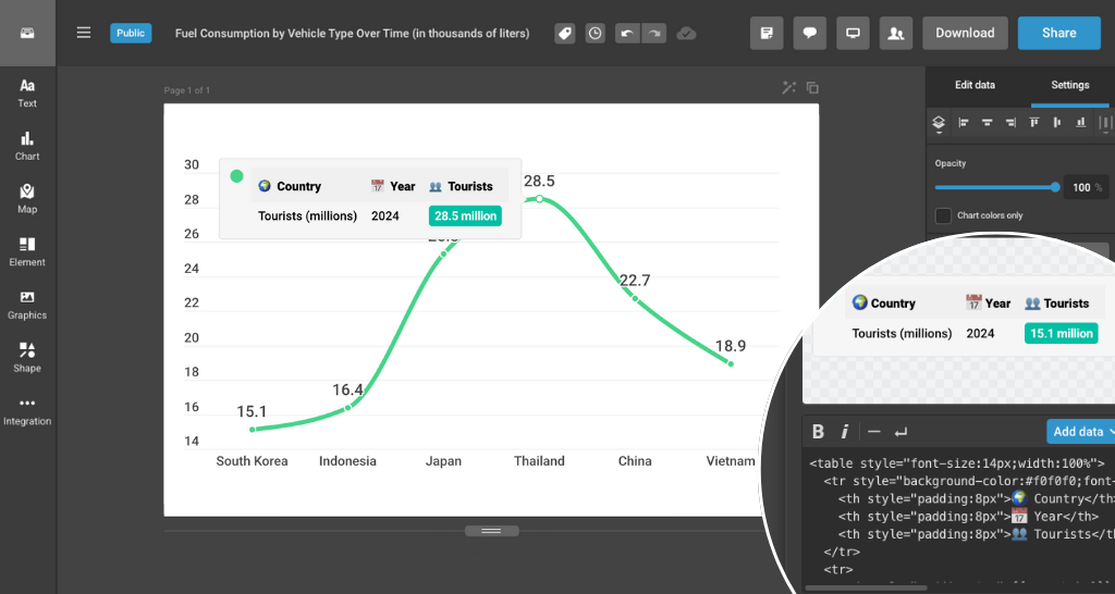
2. Data Table Tooltip
Perfect for maps or comparative data views. Works best with light theme tooltips.
3. Styled List with Key Highlights
Use this format to show grouped insights in a clean, readable way.
4. List with Text Highlighting
Highlight key numbers using color blocks and structured text.
5. Heading with Source & Value Highlight
A compact layout for chart-heavy presentations.
How to Add HTML Code to a Tooltip?
HTML Code Used in Examples
Example No. 1: Basic Highlight with Large Font
<div style="font-size:18px"><b>{{groupLabel}}</b></div>
<hr />
<br />
Number of Tourists:
<span style="background-color:#FDE085;padding:2px 4px;border-radius:4px">
{{yLabel}}k
</span>
Example No. 2: Data Table Tooltip
<table style="font-size:14px">
<tr>
<th style="padding:4px 16px 4px 4px;text-align:left">👥 Tourists</th>
<td>
<span style="color:groupColor;font-weight:bold">
{{yLabel}}M
</span>
</td>
</tr>
<tr>
<th style="padding:4px 16px 4px 4px;text-align:left">📅 Year</th>
<td>2024</td>
</tr>
<tr>
<th style="padding:4px 16px 4px 4px;text-align:left">🌍 Country</th>
<td>{{xLabel}}</td>
</tr>
</table>
Example No. 3: Styled List with Key Highlights
<div>
<p style="font-weight:bold;font-size:16px">✈️ Key Highlights</p>
<hr style="border:none;border-top:1px solid #DA7F61;margin:6px 0" />
<ul style="padding-left:0;margin:0;font-size:14px">
<li>Region: <b>{{groupLabel}}</b></li>
<li>Month: <b>{{xLabel}}</b></li>
<li>Avg. Ticket Price:
<span style="background-color:groupColor;padding:2px 4px;border-radius:2px;color:white;font-weight:bold">
${{yLabel}}
</span>
</li>
</ul>
</div>
Example No. 4: List with Text Highlighting
<div style="font-weight:bold;margin-bottom:12px;border-left:2px solid #DA7F61;padding-left:8px">
<p>Hotel Occupancy Info</p>
</div>
<p style="font-size:14px">City – <b>{{xLabel}}</b></p>
<hr style="border-top:unset;opacity:0.5;border:0.5px solid #ddd" />
<p style="font-size:14px">Year – <b>2024</b> </p>
<hr style="border-top:unset;opacity:0.5;border:0.5px solid #ddd" />
<p style="font-size:14px">Occupancy Rate – <span><b>{{yLabel}}%</b></span></p>
Example No. 5: Heading with Source & Value Highlight
<p style="margin:4px 0;font-size:14px;line-height:150%">
Week: <b>{{xLabel}}</b><br />
Airport: <b>{{groupLabel}}</b><br />
Flights:
<span style="background-color:#464646;padding:0px 3px;color:white;font-weight:bold">
{{yLabel}}
</span>
</p>
<div style="display:flex"><div style="width:100%;border-bottom:2px solid groupColor;margin-right:6px;margin-bottom:6px"></div>  ✈️ </div>
<p style="font-size:12px;opacity:0.6;font-style:italic">
Source: International Flight Tracker
</p>
With lightweight HTML support in tooltips, your charts become smarter, clearer, and more interactive – giving your audience a better way to understand your story. Start customizing your tooltips in Infogram today and take your data storytelling to the next level.
Get data visualization tips every week:
New features, special offers, and exciting news about the world of data visualization.