18.01.2017 by Infogram
When used properly graphs, tables, and text form an unstoppable team. Each brings something special to the table. In this post, we will focus on text and how it can become a powerful communication tool when combined with tables and graphs.
Data visualization expert Edward Tufte explains the importance of words in his book, The Visual Display of Quantitative Information, Second Edition. He writes, “Words and pictures belong together. Viewers need the help that words can provide.”
Tufte understands that text can be useful when explaining the data, labeling outliers or interesting bits of information, writing equations, and integrating captions and legends into the design so viewers don’t have to work extra hard to understand the graphic.
Types of Text
There are multiple types of text you can use to give your infographic or chart context that enhances readability and comprehension:
- Title
- Subtitle
- Body text
- Captions
- Data labels
- Legends
- Tooltips
- Quotes
- Facts & Figures
Each of these types of text play a crucial role when designing an effective visualization. Let’s go over the different ways text can be used to tell better data-driven stories.
Role of Text in Data Visualization
Data visualization author Stephen Few outlines the various ways text can complement or enhance tables and graphs in his book, Show Me the Numbers: Designing Tables and Graphs to Enlighten:
Label – Text (words and numbers) is often used to label information. Labels offer critical information to help readers interpret visualizations.
Introduce – Text is often required to set the reader on a clear path to understanding. An introduction should give readers a preview of what the graphic will show.
Explain – Text can be used to clarify something about the message, right where it is needed in the graphic. This is for information too specific to be included in the introduction.
Reinforce – Some information is so important you need to say it more than once. Text can help increase the likelihood your graphic will be fully understood.
Highlight – Text can be used to visually highlight important data. This is different from reinforcement because you aren’t repeating yourself, you’re simply calling the reader’s attention to it.
Sequence – Showing the order in which your reader should examine the contents of your visualizations can be tricky. Text can help instruct your readers to navigate your graphic in a specific way.
Recommend – Recommendations for action are best communicated in words. Sometimes you aren’t simply informing the reader – you may be recommending what could or should be done.
Inquire – The visual display of quantitative information frequently invites questions. Don’t be afraid to ask them. Sometimes one well-timed question is more useful than a series of answers.
Text in Action
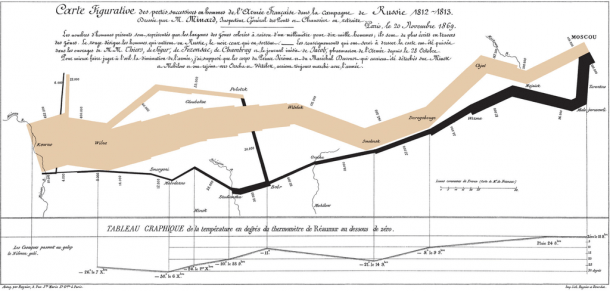
The classic visualization below from Charles Joseph Minard is a great example of effective text use. Minard’s combination of data map and time-series, drawn in 1869, shows a sequence of losses suffered in Napoleon’s Russian campaign of 1812.
A total of six variables are plotted to form this brilliant visualization. Without the title, subtitle, body paragraph, data points, and legend – his comprehensive story would have been much harder to tell. Click here to view the graphic in more detail.
Side Note: Remember that too much of anything can distract from your visualization and ruin your intent. Less is more! If the text doesn’t add to your message, leave it out. You want to be concise and pointed when choosing text to include on your chart or infographic.
We hope you found this post useful. If you’d like more helpful tips visit our Tutorials and Resources section. Here you’ll find ‘how to’ articles, fun examples, and techniques.
Get data visualization tips every week:
New features, special offers, and exciting news about the world of data visualization.
