22.09.2015 by roberts
The pie chart is one of the most recognizable and widely used chart types of all time. Its familiar circular shape makes it intuitive for many people. However, this visual representation can be easily misleading if not used properly. Here at Infogram, we’ve decided to take a deeper look at this controversial chart to help you avoid common mistakes and determine when it’s the right choice for your data.
Who invented the pie chart?
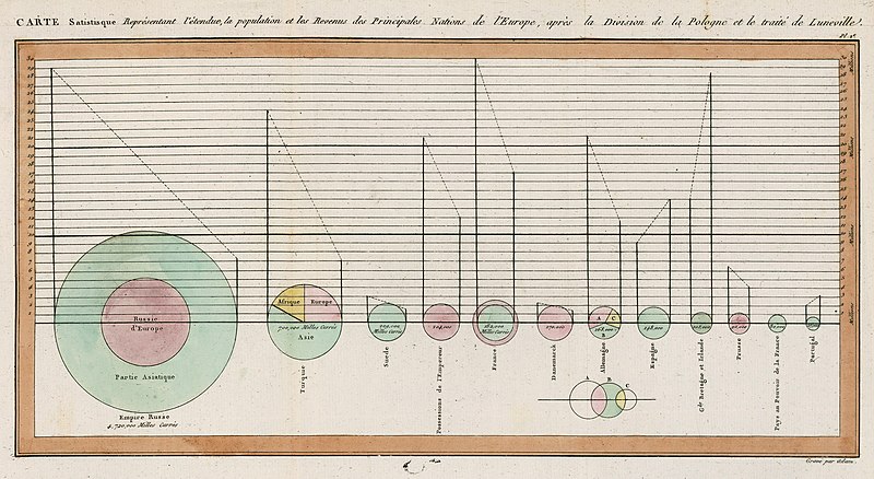
The pie chart has been around for over 200 years. It was first invented in 1801 by Scottish writer on political economy William Playfair (1759-1823). At the time Playfair believed “making an appeal to the eye when proportion and magnitude are concerned, is the best and readiest method of conveying a distinct idea” (William Playfair, The Statistical Breviary, T. Bensley, 1801, p. 4) and the pie chart and bar chart were born.
His first notable use of the pie chart was to compare geopolitical territories represented by circles, sometimes segmented in slices, like in the case of that of the Turkish Empire (second circle from the left).

The evolution of the pie chart
The pie chart’s journey since its invention in 1801 has been one of both innovation and controversy. Here are some key milestones:
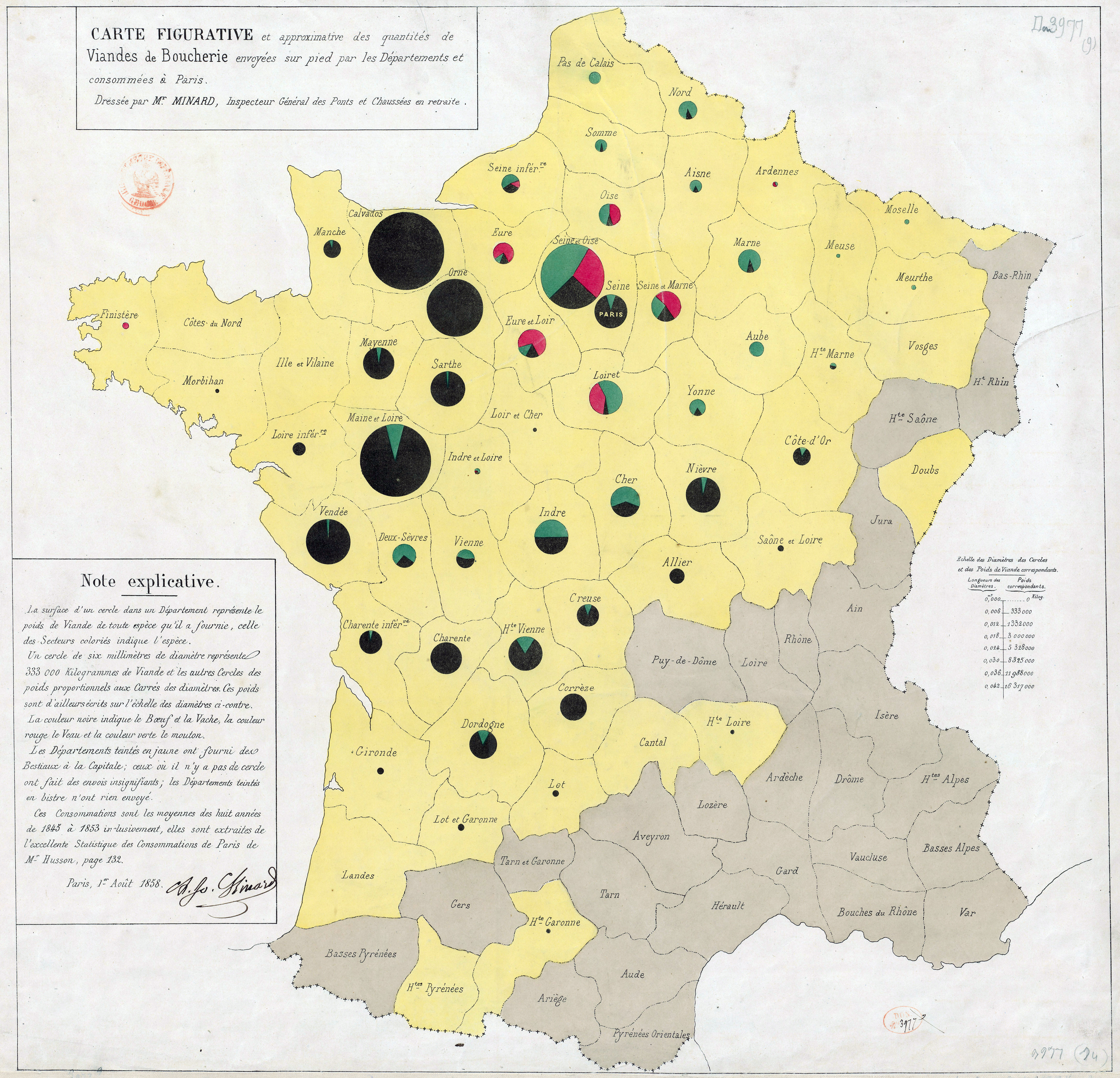
- 1858: French civil engineer Charles Joseph Minard created a divided-circle map, showing the amounts and proportions of butcher’s meats supplied to the Paris market. This innovative use of the pie chart format showcased its potential for depicting trends and patterns over time. Learn more about Minard’s influence in data visualization from Sandra Rendgen’s keynote at Malofiej 23.

- 1858 (around the same time): Florence Nightingale, the English nurse, social reformer, and statistician, used a polar area diagram (invented by André-Michel Guerry) to show the dynamics of mortality causes of the British Army in the east. This visualization, though not a true pie chart, shared some similarities and further explored the use of circles for data representation.

- Late 19th and early 20th century: Pie charts became increasingly popular, finding their way into various publications and presentations. However, concerns about their accuracy and limitations began to emerge.
- Mid-20th century: Data visualization pioneers like Edward Tufte and Stephen Few began to critique pie charts, arguing that human perception is better suited to comparing bar lengths than pie slice angles. They advocated for alternative visualizations like bar charts and line charts.
- Late 20th and early 21st century: Software advancements made pie charts easier to create and manipulate, leading to an increase in their use. However, the debate about their effectiveness continued.
- Today: Pie charts remain a popular choice, but data visualization best practices emphasize using them strategically and with limitations in mind. There’s a growing emphasis on understanding the data and choosing the most appropriate visualization tool for the message you want to convey.
Variations of the pie chart
The familiar circular pie chart has spawned several variations, each with its own advantages and disadvantages. Here’s a look at some of the most common:
- Doughnut chart: Similar to a pie chart but with a hollow center. This space can be used to display additional information, such as a total value or a legend. However, doughnut charts can suffer from similar readability issues as pie charts, especially when there are many slices.
- Irregular pie chart: Emphasizes a particular slice by pulling it away from the rest of the pie. While this can draw attention to a specific category, it can also distort the overall proportions and make comparisons with other slices more difficult.
- Sunburst chart/nested pie chart: A hierarchical visualization that uses multiple pie charts nested within each other. This can be helpful for displaying complex data with multiple categories and subcategories. However, sunburst charts can become visually cluttered and difficult to interpret when there are many levels.
Choosing the right chart: Pie chart vs. alternatives
While pie charts have a place in data visualization, they are not always the best choice. Here’s a breakdown of some common scenarios and the most appropriate chart type:
- Comparing a few categories (up to 5): Pie chart can be a good option, especially if you want to emphasize the part-to-whole relationship.
- Comparing many categories (more than 5): Bar chart is generally preferred, as it allows for easier comparison of values across categories.
- Showing trends over time: Line chart is ideal for visualizing trends and changes in data points over time.
- Highlighting relationships between variables: Scatter plot is a powerful tool for identifying correlations and patterns between two variables.
Pros and cons of pie charts
Pie charts are one of the most popular data visualization tools, but they have their limitations. Here’s a breakdown of the pros and cons to help you decide when to use them:
Pros of pie charts
- Intuitive for beginners: The circular shape and sliced representation are familiar concepts, making it easy to understand part-to-whole relationships.
- Emphasizes part-to-whole relationship: Pie charts inherently show how each data point contributes to the whole dataset.
- Limited data friendly: Effective for displaying a small number of categories (typically 5 or fewer).
- Visually appealing: Well-chosen colors and clear labels can create an engaging presentation.
Cons of pie charts
- Accuracy issues: Comparing slice sizes, especially with many slices or small differences, can be difficult. Our brains struggle with angles compared to lengths (like in bar charts).
- Limited usability: Pie charts become cluttered and hard to interpret with many categories. The human eye struggles to distinguish small slices and too many colors can overwhelm viewers.
- Data manipulation potential: Color, 3D effects, and exploded slices can be used to manipulate data’s visual impact, leading to misinterpretations.
- Ineffective for complex data: Pie charts struggle with complex data sets, trends over time, or relationships between variables.
Additional considerations
- 3D pie charts and exploded slices: These variations distort data proportions and make comparisons even harder. Generally avoid them.
- Color choices: Use clear and contrasting colors, avoiding too many or overly bright/saturated tones that strain the eye.

Pie chart best practices: Making the slice
While these variations offer more options, the classic pie chart remains a popular choice. Here are some key things to remember when using them:
- Limit the slices: Our brains struggle to compare many angled shapes effectively. Aim for a maximum of 5 categories to ensure clarity.
- Slice order matters: Arrange slices from largest to smallest value. This creates a natural flow and highlights the most significant data points.
- Embrace round numbers: When possible, focus on data points that translate to easy-to-visualize percentages (25%, 50%, 75%, etc.) on the pie chart. This makes comparisons between slices much more intuitive.
- Ditch the side-by-side comparisons: Resist the urge to place two pie charts next to each other for comparison. Line charts or bar charts are better suited for this task.
- Focus on the “whole”: Pie charts are excellent for displaying parts of a single entity that add up to 100%. Avoid using them for ratios or proportions that don’t adhere to this structure.
- Get creative (but keep it clear): Play with colors and labels to improve the visual appeal of your pie chart. However, prioritize clarity over excessive decoration. Don’t let aesthetics overshadow the data itself.
Would you like to experience the full power of data visualization? Try Infogram for Teams or Enterprise for free! With a Team or Enterprise account, you can create up to 10,000+ projects, collaborate with your team in real time, use our engagement analytics feature, and more. Request your free demo here.
Get data visualization tips every week:
New features, special offers, and exciting news about the world of data visualization.