30.09.2015 by roberts
Many sources give credit for the line chart invention to Scottish engineer and political economist William Playfair. He is the author of “The Commercial and Political Atlas” (1786) where he uses 43 line chart variants to explore time-series data about political and economic matters. However the history of line chart goes back to 10th or 11th century. An unknown author draws multiple lines on a grid to compare time-series data about the “classical planets” of Venus, Mercury, Saturn, Mars, Jupiter, the Sun, and the Moon.
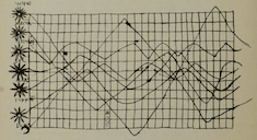
Image: Graphic Presentation, W.C. Brinton, 1939
Another use of a line chart appears shortly before Playfair. In 1767 Swiss mathematician, physicist, philosopher, and astronomer Johann Heinrich Lambert uses it regularly to illustrate his discoveries in physics. The chart below illustrates the evaporation of water vs. time:

When to use a line chart
From the chart’s history you can tell that the best use of the line chart is data that changes over time. Charts that show things like variations in stock prices, number of daily visitors to a site or month-over-month changes in turkey consumption are all line charts for one simple reason: it is the best way to show trends. The slopes that connect dots on a grid let you know whether the data is growing or decreasing.
You can apply a time dimension to almost every data-driven story. Nevertheless line charts can be also used to show tendencies based on other continuous periodic values as temperature, distance, age, etc. Just make sure the periods are equally distributed on the x-axis.
This is an example made by one of our users:
As with any chart type, the line chart also has it’s “pros” and “cons”:
Pros
- Good for showing trends over time
- Good to show relationships with continuous periodical data
- The best way to visualize changes
Cons
- Works only for periodical data
- Easy to look messy if more than 7 categories are being compared
Best practices
The good news is that there are several best practices you can follow to make the best use of your line chart:
- Remove the grid. Less is more. Why crowd your chart if you want to show a trend? If your trying to show the actual values of the data point, tables are a much better option.
- Start from zero on the x-axis, especially if you are comparing trends across many categories. Take a look at the examples that Willard Cope Brinton gives in his book Graphic Presentation (1939).
- Zoom in by changing the scale on the y-axis only if it’s really necessary. You may run into situations where you’re depicting data in only one category and it looks almost as a straight line. Change the scale on the y-axis to take a closer look at the trend and explore the details closer.
- Highlight what the story is about. It’s tempting to compare the economical growth of every country in the world. But remember the reason you are visualizing data in the first place. The story is most likely about your country, so color all the other lines gray and highlight the data for your country.
- Use 5 – 7 lines maximum. Visualize only what your story needs. Not more, not less.
Would you like to experience the full power of data visualization? Try Infogram for Teams or Enterprise for free! With a Team or Enterprise account, you can create up to 10,000+ projects, collaborate with your team in real time, use our engagement analytics feature, and more. Request your free demo here.
Get data visualization tips every week:
New features, special offers, and exciting news about the world of data visualization.