13.01.2016 by Infogram
Treemaps have gained wide acceptance in the online data visualization community over the past decade. They are flourishing in organizations that require daily monitoring of complex activities with thousands of products, projects, or salespeople.
While spreadsheets can show multiple rows of data, treemaps can accommodate hundreds of thousands of items in one organized display, making it easy to spot patterns in seconds. Plus, if made correctly, they make very efficient use of space.
Easy to Read: Treemaps show parts of a whole. They display hierarchical information as a cluster of rectangles varying in size and color, depending on their data value. The size of each rectangle represents a quantity, while the color can represent a number value or a category. Treemaps allow you to view trends and make comparisons quickly – especially if one color is particularly prominent.
History
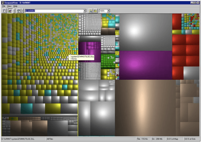
Area-based visualizations have been around for a long time. But, the treemap was invented by professor Ben Shneiderman at the University of Maryland in the early 1990’s. Shneiderman was obsessed with finding a solution to the common problem of a filled hard disk. He needed to know how and where space was being used on his computer, so he created a ‘compact visualization of directory tree structures’ – better known as the treemap.
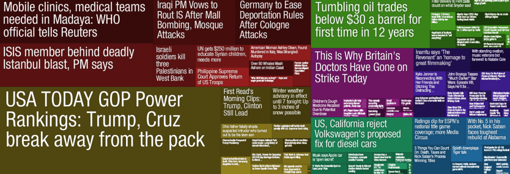
The treemap gained steam in 2004 when designer Marcos Weskamp created the Newsmap, which organizes news stories by popularity and volume of reporting in a colorful visual. Let’s go over a few great examples of treemaps in the news and talk about the best way to design one of your own.
Treemaps in the News
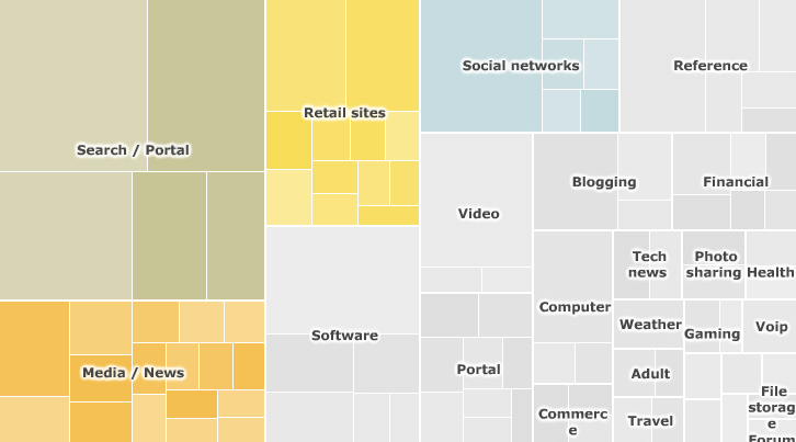
Visualizing the Internet (BBC News) – Explore this interactive graphic to find out which are the biggest sites on the internet, as measured by the Nielsen company. Filter by top 100 sites, search engines, social networks, retail sites, media/news, or by country.
Eurozone Members Exposed to Greece’s Debt (Euronews) – This article from Euronews posted in March 2015 features multiple treemaps created with Infogram. Here you see the impact Greece’s debt has on members of the Eurozone.
Obama’s Budget Proposal: How $3.7 Trillion is Spent (The New York Times) – Explore every nook and cranny of President Obama’s 2012 budget proposal. Rectangles are sized according to the proposed spending. Colors show severity of cut or increase from the previous year. 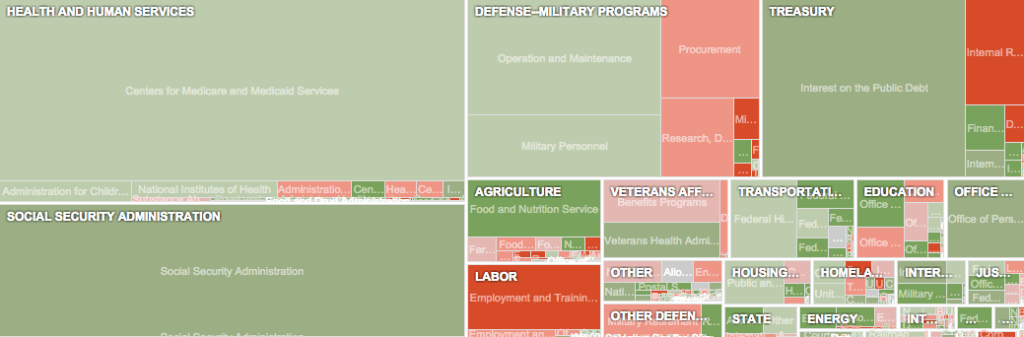 Top 20: Commodities carried through Port of Hamburg (CNN) – Every year the Port of Hamburg handles over 78 million tons of container cargo. CNN crunched the numbers to see how it all adds up.
  The Threat of Donald Trump in Iowa (Politico) – This Infogram treemap shows Politico’s weekly survey of the leading strategists, activists and political operatives in Iowa. They wanted to know which Republican candidate is hurt most by Trump’s rise in the polls.
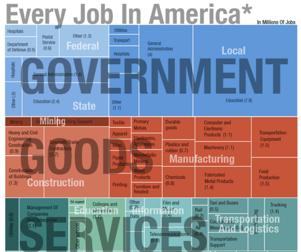
Every Job In America, In One Graph (NPR) – There are roughly 137 million jobs in this country. NPR breaks it down for you. Click the image to view the full treemap.
Treemap Do’s and Don’ts
A well designed treemap makes patterns, trends, relationships, and clusters visible in seconds. Here are the best practices to use when creating a treemap.
Do:
- Start with clean data and a clear message
- Use bright, contrasting colors so each region is easily defined
- Label each region appropriately with text or numbers
Dont:
- Label every box if you have a lot of data – leave the small boxes empty
- Clutter your treemap with too many boxes – treemaps can contain any number of boxes, but space is limited! You don’t want your treemap to be hard to read.
You can make simple interactive treemaps with Infogram! Just plug in your data and watch the boxes appear right before your eyes. Click below to get started.

Get data visualization tips every week:
New features, special offers, and exciting news about the world of data visualization.