22.12.2015 by Infogram
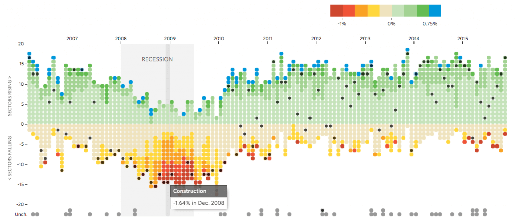
1) Job Market Tracker (Wall Street Journal)
The Wall Street Journal provides a few charts and graphs that track the number of sectors gaining and losing jobs each month. They simplified a complex data set in a visually stimulating and interactive way. You can highlight different sectors on the timeline to see the percentage increase or decrease for that time period.
2) Trump Won the Debate—or at Least Talked the Most (Politico)
Politico wrote an article in August focusing on one of the GOP debates. They used data to show what candidates talked about, how much they talked, and for how long. The Infogram bar chart below shows the amount of turns each candidate had to talk, and how many words they spoke. The data speaks for itself – Trump is a talker. Politico did a great job using data visualizations to highlight a hot political topic. The article also features a fun word cloud showing which words were spoken the most by Trump compared to other candidates. Check it out!
3) Music Timeline (Google)
I hope you are ready to get lost in Google’s interactive music timeline. This incredible area chart shows the popularity of certain genres of music over time! You can highlight specific sections for detailed information on artists in that category, search for albums or artists to see where they fall, and explore the relationships between different artists in your favorite genre over the decades. 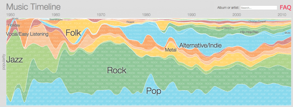
4) Media Usage Among US Adults (Nielsen)
Nielsen’s stacked column chart, created with Infogram, beautifully displays the way U.S. adults consume various forms of media throughout the day. Their findings may suggest ways for advertisers and marketers to switch up their strategies to take advantage of these patterns. You can easily switch between the stacked column and 100% stacked column view to see what media adults like to use and when – in a colorful, interactive way.
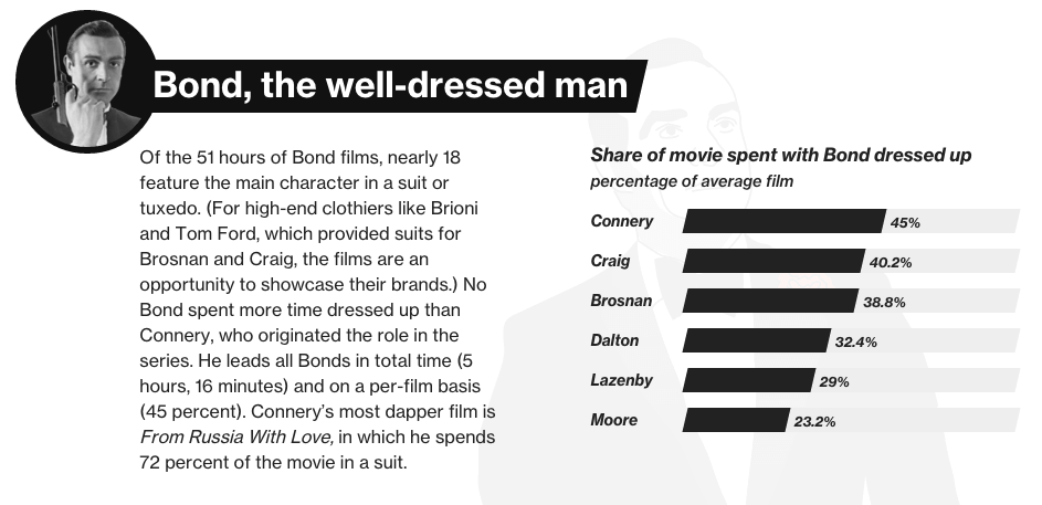
5) The James Bond Index (Bloomberg)
Over the past 53 years, 6 men have played James Bond. Bloomberg Business identified eight traits that typify the immortal British spy and tracked them across all 3,053 minutes and 33 seconds of the 24 James Bond films. Sean Connery was the best dressed, Daniel Craig was scolded the most, while Pierce Brosnan used the most gadgets. Bloomberg’s James Bond charts are fun for everyone – not just the Bond fanatic in your life.
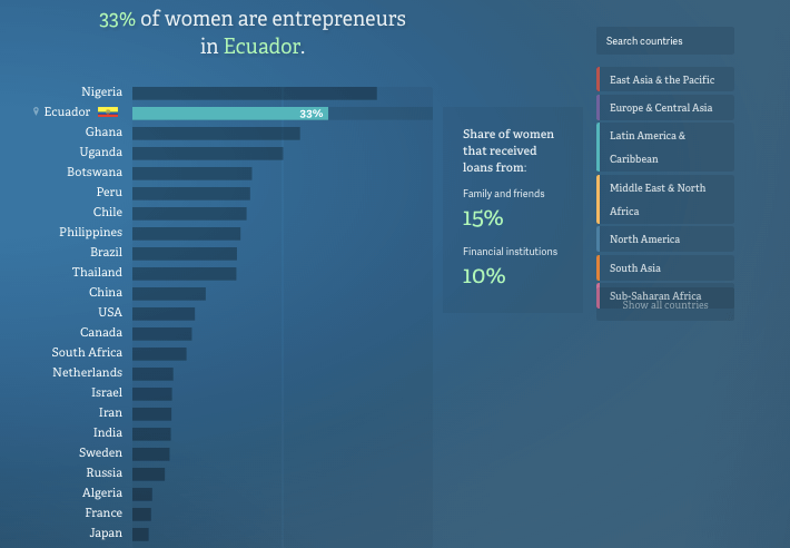
6) No Ceilings (Fathom)
The Clinton Foundation and the Gates Foundation joined forces to gather and analyze data that shows the gains made for women and girls over the last two decades, as well as the gaps that remain. The No Ceilings initiative website is home to 850,000 data points, spanning more than 20 years, from over 190 countries. Users can see the entire data set mapped by country from 1995 to the present. No Ceilings hopes to end gender inequality by sharing data visualizations and powerful stories with the world.
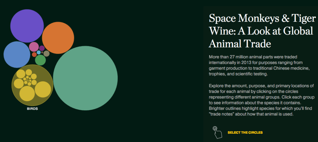
7) A Look at Global Animal Trade (National Geographic)
More than 27 million animal parts were traded internationally in 2013 for purposes ranging from garment production to traditional Chinese medicine, trophies, and scientific testing. Nat Geo’s brightly colored interactive bubble chart let’s you explore the amount, purpose, and primary locations of trade for each animal by clicking on the circles representing different animal groups. Their chart is eye-catching and informative, enhanced by its interactivity.
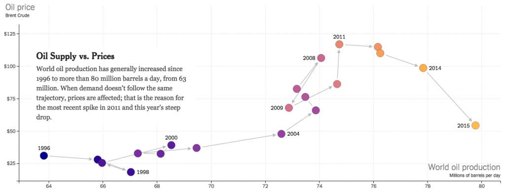
8) How the U.S. and OPEC Drive Oil Prices (New York Times)
Simply scroll up and down to navigate your way through this interactive scatter plot from the New York Times. They worked hard to transform a serious topic with multiple sets of data into a detailed visual story. You can easily shift between 14 different graphs, each telling a very different message.
9) Google Quarterly Financials (The Verge)
The Verge created a grouped column chart with Infogram that compares Google’s earning statements over the years. They explained – in a clean, straightforward way – that Google’s first quarter of 2015 proved to be another healthy financial period. Their simple style and color scheme is easy to read and keeps the viewers attention on the numbers.
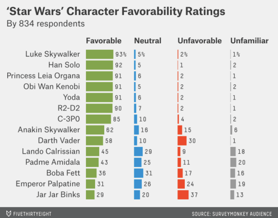
10) America’s Favorite ‘Star Wars’ Movies – And Least Favorite Characters (FiveThirtyEight)
There is nothing we love more than when Star Wars and the world of data visualization collide. FiveThirtyEight interviewed hundreds of people to find out which Star Wars movies they had seen, which one was the best, and which characters they liked (or disliked) the most. The table below measures each character’s favorability. Luke Skywalker came out on top, while Jar Jar Binks fell to the bottom.
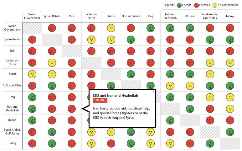
11) A Guide to Who is Fighting Whom in Syria (Slate)
Slate’s most updated version of its “Middle East Friendship Chart” clearly states the relationships between groups in the Middle East. They did a good job of explaining a complicated subject in a way everyone can understand. Their interactive table offers additional information and resources if you want to learn more.
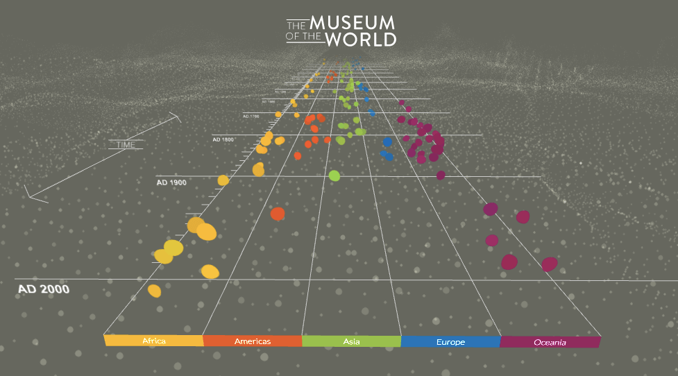
12) The Museum of the World (The British Museum)
Have you ever wanted an entire museum at your fingertips? Thanks to the British Museum and Google Cultural Institute you can digitally explore objects in the museum’s collection using the most advanced technology possible. Their interactive timeline lets you jump back in time and explore art across continents and cultures.
Get data visualization tips every week:
New features, special offers, and exciting news about the world of data visualization.
