17.08.2017 by Infogram
Nothing makes a presentation more persuasive than backing it up with cold, hard facts. Adding data to your story is great for multiple reasons – it builds trust and keeps your audience engaged.
When you present data in charts and maps it becomes easier to read, easier to understand, and much more memorable. This is why data visualizations are such great presentation tools. Don’t let the idea of presenting data intimidate you! Instead, follow these 4 tips for telling a simple, effective data story:
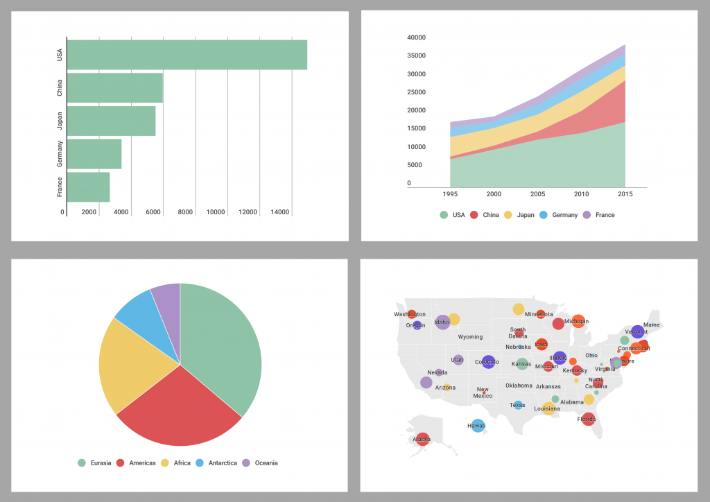
1) Don’t Show More Than Two Charts
Data strengthens your presentation, but too much data can overwhelm and confuse the viewer. If you want to make a bigger impact and keep your audience focused, we suggest you show one or two visualizations at a time. Once you display a chart or map, you have the chance to provide context and tell a story. That way your audience will have a much easier time following your presentation beginning to end.
Google’s Digital Marketing Evangelist Avinash Kaushik understands the importance of honing in on the data. “Bring insane focus to your data presentation. If you can, focus on a singular metric for each module/slide/element. Then present the data as simply as you possibly can,” he wrote.
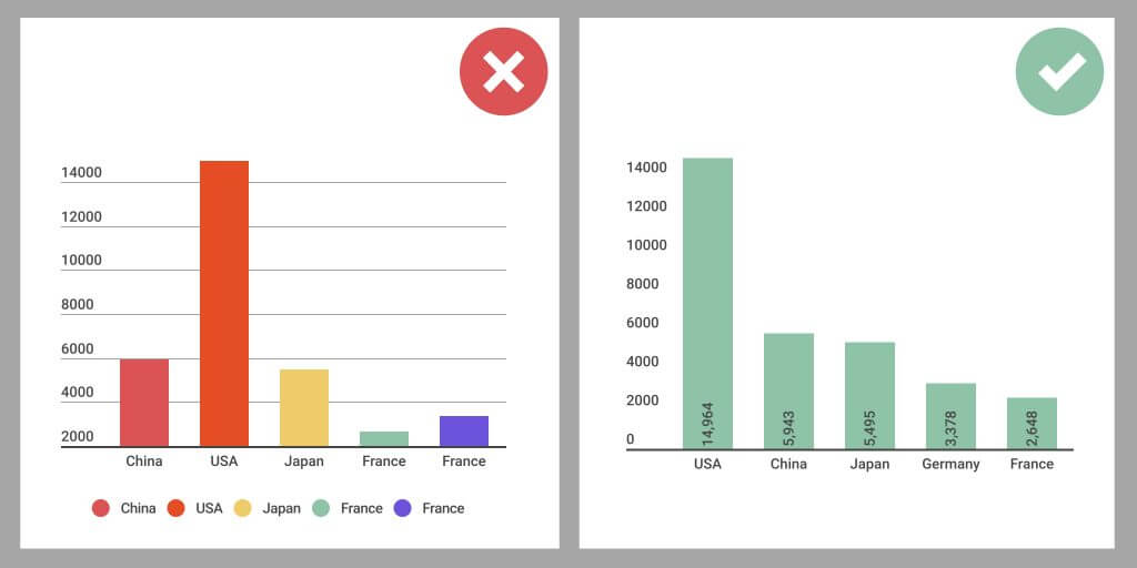
2) Scale Appropriately and Watch Your Colors
It’s important to follow best practices when designing data visualizations. While your data might work with multiple chart types, it’s up to you to figure out which one best tells your story. Nothing hurts your credibility, or your message, more than misrepresented or misleading data.
Take the column charts below, for example. Column charts are used to compare different items or show a comparison of items over time. The chart on the left is hard to read due to its rainbow color palette, grid lines, and unnecessary legend. It also isn’t scaled appropriately, with the y-axis starting above zero. The chart on the right corrects these issues and orders the columns by height so they are easy to compare at a glance.
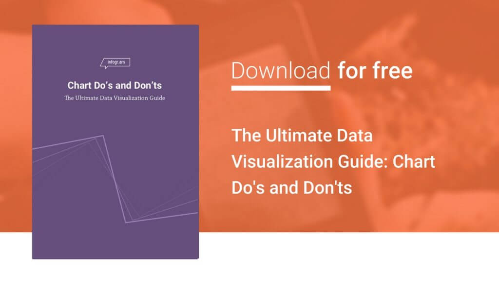
For more great visualization design tips, check out The Ultimate Data Visualization Guide – Chart Do’s & Don’ts.
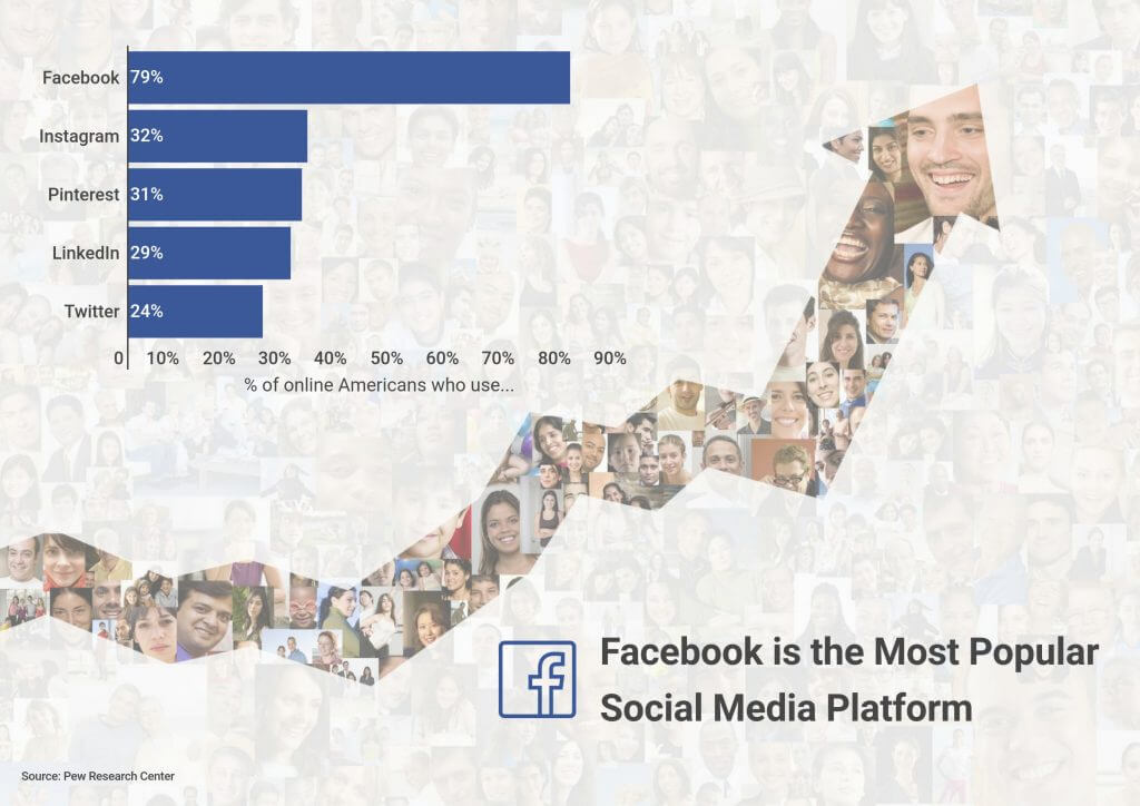
3) Use Images and Icons to Support Your Data
They say ‘a picture is worth a thousand words’ – add data and you have one compelling presentation. Strong visuals help trigger an emotional response. You should switch up the variety of your visuals to keep people excited and curious. A statistic, paired with a related visual, makes your presentation more visual, and therefore more engaging.
If you aren’t sure where to start, think about the story you are trying to tell and how you want your audience to react. Presentation design experts Alison Macondray and Matt Clark of Alimat Inc explained how to balance visuals and data in a recent webinar.
“If you’re tempted to fill the page with data, really think about the idea you’re trying to convey with that particular slide. Is it an emotional message? Use a big emotional image. Is it data-driven? Use a simple chart that has some visual element to it, beyond just the numbers,” they said.
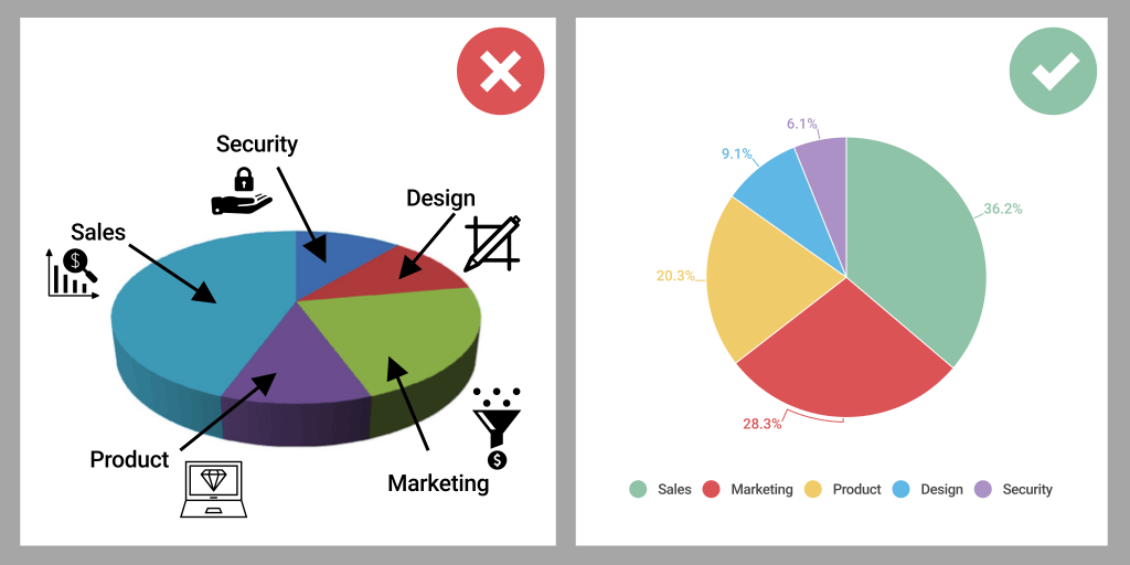
4) Keep the Design Simple
When sharing data you need to remember to keep it simple. Get rid of any elements that don’t add to your story. In the same way that clean visuals help people absorb complex information, unnecessary elements can be a distraction. Avoid confusing grid lines, cluttered legends, 3D imagery, drop shadows, wild color palettes, illustrations, and anything that may detract from your message.
Author and public speaker Cole Knaflic believes decluttering your charts doesn’t take as long as you think. “Often, it is minor changes that will help you take a visual from good to great. Decluttering is a great place to start improving the effectiveness of your graphics. Ask yourself: does this need to be here? Is it adding any informative value? If the answer is no, then take it out,” she wrote.
You don’t have to be a professional designer to tell a powerful data story. For more tips on presenting data watch our webinar, Visualizing Your Data Story – and don’t forget to download The Ultimate Data Visualization Guide.
Get data visualization tips every week:
New features, special offers, and exciting news about the world of data visualization.