25.08.2020 by Infogram
The Infogram dataviz community keeps growing by the day, and we’re beyond excited to see so many of you creating impactful projects, reports, and infographics.
But what matters even more is being able to exchange that data visualization knowledge and learning tips and tricks from other creators, thus continuously improving your experience and projects.
Learn from the best, they always say. So, as a part of our Infogram Customer Spotlight series, we reached out to PEI Media, a B2B publishing company that has been creating engaging and informative reports with Infogram for nearly four years.
Keep reading to learn their pro data visualization tips on how to create better dataviz projects.
Providing business news and analysis
PEI Media is a global provider of insight, market data, and business conferences covering alternative asset investment markets, such as private equity, debt, real estate, and infrastructure.
To connect with its financial sector audience, PEI Media provides a range of highly respected websites, magazines, and leading market events to customers worldwide.
In this piece, we chatted with Mike Simlett, Managing Editor – Production, and Miriam Vysna, the Head of Design at PEI Media, who reveal that they came across Infogram when looking for an easy-to-use chart maker for PEI.
“We cover private finance, so most of our stories involve data. Pretty much every story we have involves a chart at some point,” says Mike.
The early reports PEI Media created with Infogram were so popular that their editorial team started making more. Here’s one of their very first projects, a colorful report using the same color and formatting throughout for a memorable effect:
As the number of projects increased, PEI began to think less about creating individual designs, but rather focusing on the actual content. The team decided they would create a standard template to help their reports look similar to each other to boost brand recognition.
But interactive presentations make up only a small fraction of all of the content PEI Media creates – there are also many charts embedded in news websites and articles.
Drawing upon years of experience and countless gorgeous reports, Mike and Miriam were kind enough to share their best data visualization tips with us.
1. Invest your time
There’s always a learning curve when getting to know a data visualization tool and learning to create new charts, infographics, and other formats. But consistent effort pays off, meaning that the more projects you create, the better they’ll become.
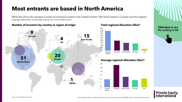
That’s why for Mike, his favorite data visualization is always the last one. “I always try to add something that wasn’t included in the previous projects,” he adds. Here’s one of his latest reports, “Inside the Global Investor 100”, using plenty of color, interactivity and a great variety of charts:
2. Keep it simple
Mike’s been a business journalist for almost 30 years and in his experience, nothing can beat a good old-fashioned column chart, bar chart, or line chart.
“People often try too hard. They have all these tools and buttons they want to add, and they actually get fundamentally away from the main thing: Telling the story as quickly and clearly as possible,” Mike emphasizes.
“When I’m working on a project, I always ask: What will the reader think when he or she gets this project – will it immediately make sense to them?”
Miriam agrees: “I was in a workshop a few years back and the speaker was showing different types of charts, step-by-step stripping them down to a bar chart as the best possible way to display data. Because everybody can understand it.”
3. Find a balance between content and design
Miriam, who heads PEI Media’s editorial design team in London, explains that in their earlier projects, PEI focused on the visual aspect of reports using many design elements and images. Their “LP of the future” report is a great example of visual storytelling using an anatomical illustration of a building to walk the reader through data and trends:
Over time, however, their data visualizations evolved shifting towards a more chart and data-oriented approach. Design is important, but the main goal of the data visualization is to tell the story.
To find the right balance between design and content, ask yourself these questions:
- What is the reader seeing?
- Does the data visualization make sense – or is the design too overwhelming?
- Does your data visualization tell exactly the story you wanted to convey?
Also, remember your website. Infogram reports can be shared and many of PEI’s appear on LinkedIn and other company’s websites. In order to drive traffic, PEI’s reports have links on every slide that take the reader to a web story with more detail on the data they are looking at.
4. Make the reader stick around
While simplicity is key, it’s also important to think of ways to make the readers think about the numbers they’re seeing, press a button, and spend more time exploring your data visualization.
“I start with a bar chart, then add things to it – like callouts that you can hover over and add extra information about a single entry,” explains Mike. “They’re brilliant. Based on our analytics feature, callouts are really popular in our projects.”
Mike also suggests coming up with new ways of helping the reader stick around on your project: “You don’t want the reader to work too hard to understand the data. But you do want them to be curious enough to go deeper and deeper, and deeper.”
For example, in PEI’s recent reports, Mike has added several charts per slide instead of just one to encourage the reader to engage with the content:
Add several charts per slide to make the reader stick around.
5. Create a consistent style
One of the reasons the reports from PEI Media stand out from the crowd is the consistent style and color scheme that’s used in all of their projects.
“Our rules are quite strict, and we stick to brand guidelines as much as possible,” Miriam explains. “For example, our brands have up to 7 colors. Each brand has its main color – the one you find in the logo – and all the other colors are secondary colors, but listed in the way how we want our colors to appear.”
Miriam recommends creating a set of rules for fonts, font size, colors and sticking to it. That way, everyone working on the project will know what design elements to use.
6. Add your brand logo
Last, but not least: Add your company or brand logo to your data visualizations.
That way, people who view your dataviz – no matter whether it’s shared on social media or embedded on a website or news article – will be able to trace it back to the creator (you) and give you the proper credit.
Learn how to remove the Infogram logo and add your own logo with the Business, Team, and Enterprise plans.
Final conclusions
We hope these data visualization tips from PEI Media will help you succeed and share your stories in a more meaningful way. Remember that simplicity is key, your charts are the main ingredient of the data visualization, and sticking to your design guidelines will help you create memorable content.
If you’d like to learn more about how Infogram has helped businesses visualize and communicate with data, visit our Customer Stories page.
Get data visualization tips every week:
New features, special offers, and exciting news about the world of data visualization.