19.04.2018 by Infogram
Nothing feels better than experimenting with content on social media and seeing the gamble pay off. We recently experienced that joy and want to share the results.
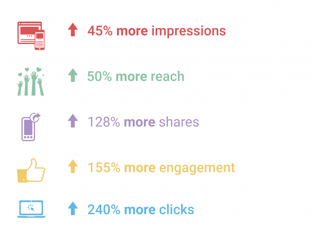
A few months back we launched our ‘chart of the day’ series: a collection of interesting or newsworthy data, visualized with our tool. This campaign followed the launch of our new designer social media templates and we wanted to lead by example on Infogram’s channels. The charts were a hit. Our ‘chart of the day’ posts on Facebook reached 50% more people than links alone, received 155% more engagement, and 240% more clicks!
You too can easily achieve this kind of social media success. Just check out three of our most popular bite-sized chart examples below, along with a step-by-step video guide to making your own data-driven social media assets.
Winning ‘Chart of the Day’ Examples
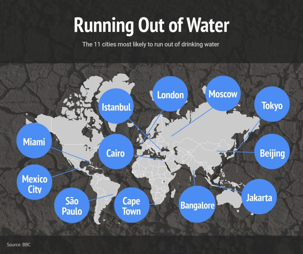
Running Out of Water – The BBC published an article about the 11 cities most likely to run out of drinking water. We decided to visualize this geographical data using an Infogram world map. The chart helps people understand the depths of this global issue in just seconds. Our simple drag-and-drop editor made it easy to add shapes and city names to emphasize the locations under threat. This image post reached thousands of people and received peak engagement.
Apple Financial Results – People love Apple as much as they love tech news. According to a recent study, Apple beat out companies like Amazon, Disney, and Google as the brand that inspires the strongest emotional bond with U.S. adults. When Apple announced its best quarter in history, we decided to utilize Infogram’s wide variety of text and icon options to visualize the stats. The result? Click, click, click.

Oscar Winners 2018 – Jumping on the news of the day can be a great way to get traction online. The moment may be fleeting, but the social interaction is worth it. We knew posting the 2018 Academy Awards winners the morning after the broadcast was a nice way to ride the momentum of public interest. We used our pictorial charts and icons to quickly show the biggest wins of the night. The post performed really well, bringing in record clicks and engagement.

How to Build Social Images with Infogram
Data visualizations, maps, and infographics are a fantastic way to increase your social following and attract new fans. Fun facts and impressive statistics, transformed into eye-grabbing visuals, instantly light up your feed. They are also a quick way to gain credibility, build trust, and establish yourself as a leader in your field.
Would you like to experience the full power of data visualization? Try Infogram for Teams or Enterprise for free! With a Team or Enterprise account, you can create up to 10,000+ projects, collaborate with your team in real-time, use our engagement analytics feature, and more. Request your free demo here.
Watch this video for a quick guide on how to build data visuals with Infogram for your next social media campaign.
Can’t wait to build social media charts of your own? Sign up for a free trial of Infogram to unlock all of our amazing features. You’ll gain access to over 40 chart types, 550 maps, 1 million images and icons, premium templates, and full download capabilities.
Interested in discovering how Infogram can enhance your team’s work? Join a brief Zoom session with our Infogram representative to explore key features, get answers to your questions, and understand how we can assist. It’s quick, informative, and just like a coffee break chat. Schedule your call now!
Get data visualization tips every week:
New features, special offers, and exciting news about the world of data visualization.