09.05.2017 by Infogram
We have all sat through boring PowerPoint presentations. They are often long, wordy, and utterly forgettable. You might even be guilty of having made lackluster PowerPoint presentations in the past. But, making a great one is easier than you think!
You don’t need to be a good designer, public speaker, or writer to create a powerful presentation. Here are a few tips to help you design a professional presentation that people will be talking about tomorrow.
1) Brainstorm and Preparation
Put Away Your Laptop
Before you even think about typing up your presentation, you need to draft an outline. Take a step away from your computer and layout your content – think about your audience, write down key points, and plan visuals that support your message. Feel free to use a whiteboard, notepad, sticky notes, or good old-fashioned pen and paper to help you solidify your message and get your creative juices flowing.
Write Your Story
Whether you’re writing a sales pitch, earnings report, or trying to raise capital – remember that content is king. People come to see you and hear your message, not see your slides, so you need to tell a good story.
Structure your presentation like any good piece of writing, with a beginning, middle, and an end. Start with telling the audience what you plan to cover or highlight a problem. The middle is where you explain the bulk of your content or offer a solution. End by summarizing your content; remind the audience what you just went over.
Good presentations tell a compelling story, elicit an emotional response, and engage the audience. Don’t be afraid to use examples and share personal stories to help support your major points.

Short and Sweet
Your message needs to be clear and concise. Try to keep your presentation short and sweet. We all know from experience that longer presentations don’t mean better presentations. If you take too long to tell your story you risk losing the attention of your audience. If someone asks you what your presentation is about, you should be able to explain it in under 45 seconds.
Ask yourself: If your audience could only remember three things about your presentation, what would you want them to remember?
2) Create Your Own Template
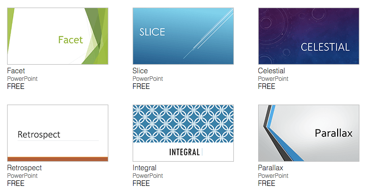
Avoid PowerPoint’s Presentation Templates
We know it’s tempting to pick one of PowerPoint’s specially designed templates to create your presentation. But, chances are your audience has seen them all before, and nobody gets excited about a cookie-cutter presentation that feels pre-packaged.
You can design your own background templates tailored to meet your needs. Then you can save the PowerPoint file as a design template and it will appear along your standard Microsoft templates for future use.

Use the Right Colors
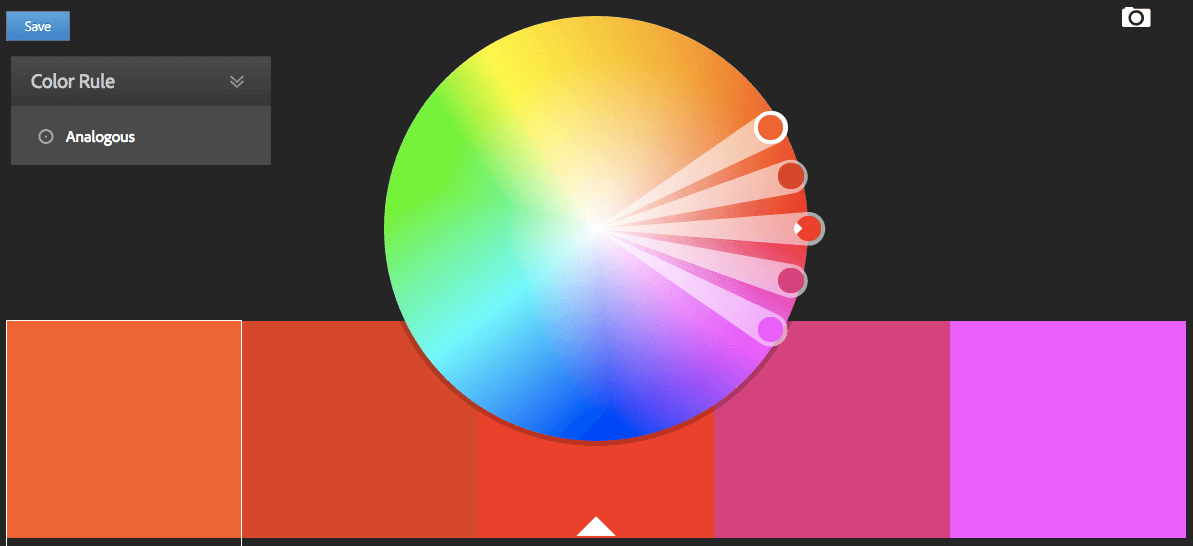
The right colors make your presentation visually pleasing, easy to read, and more memorable. Try to skip complex gradients or textures and simply use contrasting colors with a nice mix of warm and cool tones. This is also an excellent chance to focus on branding. Mix in your company’s colors to remain consistent and professional.
PowerPoint offers color palettes for you to choose from if you don’t feel comfortable picking the colors yourself. You can also use online color tools like Adobe’s color wheel and Piknik to help you find the right hues.
Pick the Right Fonts
The font you use sends a message. Use the same font set throughout your entire slide presentation, and use no more than two complementary fonts (i.e. Arial and Arial Bold). The best font choices are the ones where readers don’t notice the font – just the message.
Know the difference between a serif font (Times New Roman) and a sans serif font (Arial or Helvetica). According to presentation expert Garr Reynolds, serif fonts were designed to be used in documents filled with lots of text. Serif fonts are said to be easier to read at small point sizes, but for on screen presentations they get lost due to the relatively low resolution of projectors. Sans serif fonts are great for PowerPoint presentations. Helvetica is incredibly popular, so you might want to go with a lesser-known option like Gill Sans.
3) Keep it Simple
Less is More
Slides are essentially simplified, visual notecards that support main ideas, not complete thoughts. They make it easy for your audience to follow along and retain information, without getting bogged down reading a bunch of words. But, let’s be honest, it’s harder to be concise than it is to share everything you have.
The biggest mistake people make when creating a PowerPoint presentation is including way too much information. Don’t use full paragraphs, long quotes, or wordy bullet points. Simply use keywords or ‘big picture’ words. You can even break up bullet points into separate slides, which gives your viewer a second to breathe and refocus on the topic at hand.
Don’t be afraid of ‘white space’ or ‘negative space’ on your slides. You don’t need to fill empty areas with unnecessary logos, graphics, or text, that don’t do anything to enhance your message. The less clutter you have on your slide, the more powerful your message becomes.
Try the simple 5×5 rule: Never have more than five lines of text, or more than 5 words per line.
Don’t Overdo It
Just because PowerPoint has a ton of fun options for animating your presentation, doesn’t mean you need to include all of them. Try to avoid flying text, distracting transitions, generic clip art, and cheesy animations. The last thing you want is for your audience to get distracted and discredit your efforts.
The 10/20/30 Rule of PowerPoint
Guy Kawasaki, venture capitalist and social media specialist, created the 10/20/30 Rule of PowerPoint. It’s quite simple: a PowerPoint presentation should have ten slides, last no more than twenty minutes, and contain no font smaller than thirty points.
Ten slides: Ten is the optimal number of slides in a PowerPoint presentation because a normal human being cannot comprehend more than ten concepts in a meeting.
Twenty minutes: You should give your ten slides in twenty minutes. Sure, you have an hour time slot, but you may have technical difficulties and people may arrive late or leave early. In a perfect world, you give your pitch in twenty minutes, and you have forty minutes left for discussion.
Thirty-point font: Force yourself to use no font smaller than thirty points. Guy guarantees it will make your presentations better because it requires you to find the most salient points and know how to explain them well.

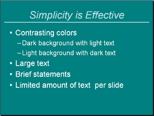
Too much text can ruin a PowerPoint presentation.

Less is more with your PowerPoint slides.
4) Use the Right Visual Imagery
Find Good Photos
High-quality photos make a strong visual statement. Good photos make your presentation unique, attractive, and void of cliches. Don’t get stuck using stock clip art and photos people are probably familiar with. Finding free high-quality stock photos online is easier than ever – try websites like Unsplash and Pexels.

Incorporate Data Visualizations (Charts, Graphs, and Infographics)
Chances are you have data you’d like to incorporate into your PowerPoint presentation that helps support your message and tell your story. Data visualizations are the best way to present data. Charts, graphs, and infographics help your audience visualize complicated data sets and large batches of information. They have also been proven to help people better understand information and retain it.
Remember to use best practices when creating data visualizations for your presentation. Pick the chart or graph that best tells your story, make it simple and easy to read, and give your audience context. Tell them what the data shows, don’t force them to draw their own conclusions.
Graphs in Excel are great for detailed reporting but they don’t work in a presentation. Use awesome online tools like Infogram to build colorful, interactive, brand-driven charts, graphs, and infographics.
5) Practice Makes Perfect
Rehearse, Rehearse, Rehearse
Spend as much time practicing your presentation as you did creating it. If you spend 10 hours writing and designing, you should spend 10 hours working on your style and delivery. Your verbal presentation is just as important as the slides you put together. If you lack confidence and conviction, your audience may feel you don’t know your subject well and lose interest. Don’t be nervous! The more you practice the more on top of your material you’ll be.
Make a Handout
There is a good chance your audience will only retain a few key points from your speech, so it’s helpful to have a handout complete with the information you covered in your presentation (not just a print out of the slides). It’s also nice to include extra information, beyond what you covered, in case someone wants to delve deeper into the material.
Would you like to experience the full power of data visualization? Try Infogram for Teams or Enterprise for free! With a Team or Enterprise account, you can create up to 10,000+ projects, collaborate with your team in real time, use our engagement analytics feature, and more. Request your free demo here.
Get data visualization tips every week:
New features, special offers, and exciting news about the world of data visualization.

