29.03.2018 by Anete Ezera
We love helping our customers succeed and sharing their stories. That’s why we’ve gathered some of the most engaging tales of data visualization success from our customers for this series: Infogram Customer Spotlight. From the classroom, to the newsroom, to the boardroom — this is how real people are using Infogram to change the way they visualize data.
In this piece, we chat with Jennifer McDermott, Communications Manager and Consumer Advocate for Finder.com.
Making everyday financial life decisions such as choosing a credit card, buying a home, and getting insurance can be daunting. That’s where Finder steps in. Finder is a personal finance comparison website that makes it easier for people to decide where to spend their money and feel good about it in the process.

Finder collects massive amounts of data – data consumers can search through, including survey results, statistics, trends, and reports. But, they like to put a ‘cheeky’ spin on otherwise dry topics. “We are a really quirky company, as you can see from the content on our site. We want to make finance fun and remove the taboo associated with talking about money,” explained Jennifer.
The Problem
Finder was founded in Australia in 2006, and they now have a presence in over 40 countries. While the company is large, their office in the United States is fairly new and still rather lean. Their U.S. team needs to wear many hats, and one of those hats includes data visualization creator.
“We don’t have a team of designers, so we rely heavily on tools like Infogram to illustrate our content and make it easy to digest. In general, people who come to our site are not finance experts, they are everyday people who want to make better decisions with their money. When data is beautiful and simple to understand, it’s much less intimidating.”
The Solution
Finder uses Infogram to build infographics, reports, and individual charts. They love how user-friendly the tool is, and how much engagement it adds to their work. Almost every page of their site, whether its Black Friday trends, millennial spending habits, or Game of Thrones streaming stats, features some form of data visualization.
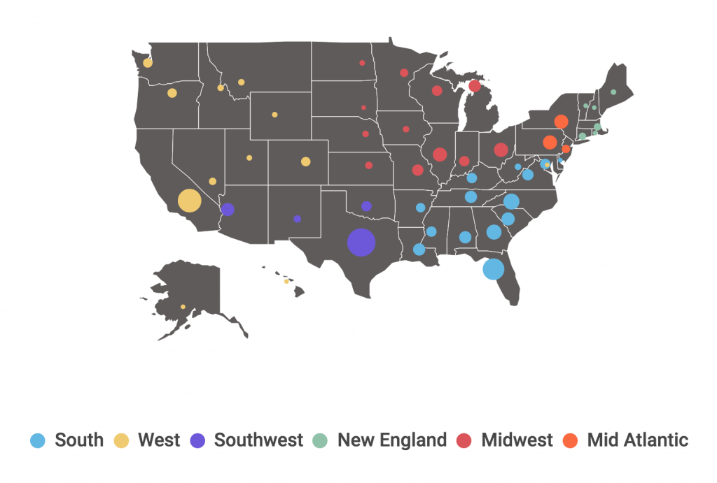
Click the image to view the interactive version of Finder’s drunk driving statistics report.
The Results
Infogram charts are also a great way to get their latest reports picked up by the media.
“From a PR standpoint, it has been key to getting our stories more coverage. Most of our story angles are data-driven, and most journalists don’t want to sift through rows of numbers. They typically want something their readers can quickly make sense of and interpret at a glance. They are able to use our charts in their own pieces, and we’ve seen that quite a bit,” she said.
Infogram has made tough subjects and complex datasets more accessible to people visiting Finder, ultimately helping them make crucial life decisions. “We start with so many different data points. It’s our job to pull out the most important information, visualize it, and share what we feel will be most relevant to visitors of our site and the problems they are trying to solve.”
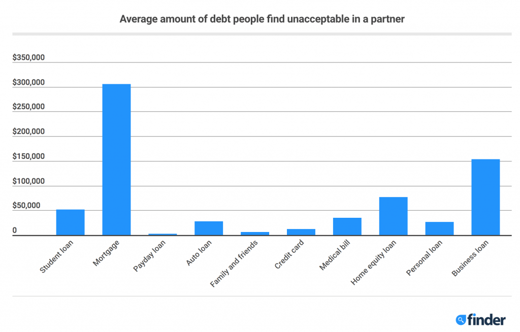
Click the image to view the interactive version of Finder’s partner debt report.
For additional examples of Finder using Infogram, view their work on Black Friday, student loans, and payday loans.
If you’d like to learn more about how Infogram has helped businesses visualize and communicate with data, visit our Customer Stories page.
 Jennifer McDermott is a Consumer Advocate for personal finance comparison website, Finder.com. She has over 10 years experience consulting some of the world’s largest brands on consumer communications strategies. At Finder, she is passionate about breaking down complex ideas to help people make better financial decisions.
Get data visualization tips every week:
New features, special offers, and exciting news about the world of data visualization.