21.12.2023 by Infogram
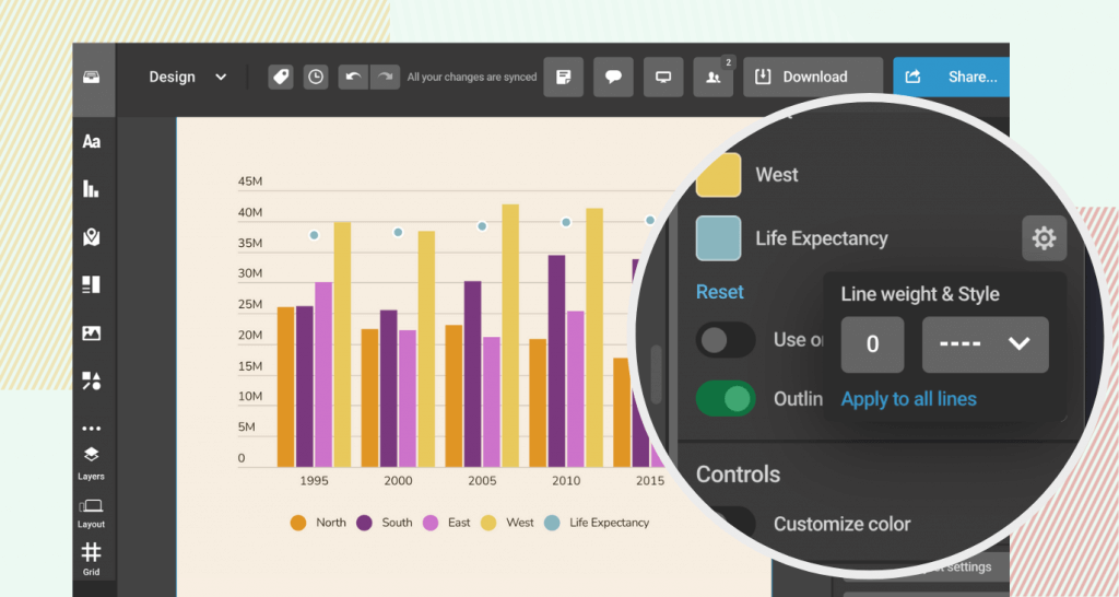
We’re excited to announce an update to our line charts. Now, you have the option to set the line width to zero, effectively disconnecting the line dots in combination charts. This feature also enables you to hide specific lines in the line chart, providing greater flexibility and precision in data presentation.
How does it benefit you? This new feature addresses a common issue in data visualization, where lines in combination charts could only be used with data that is tied across all the categories. By allowing you to set the line width to zero or hide specific lines, you can attain a clearer and more accurate depiction of data. This is particularly useful in interactive content, where clarity and precision are crucial.
What can you achieve with it?
- Enhance the accuracy of your storytelling. Present data in a way that stays true to the facts, avoiding any visual misinterpretations that could arise from unnecessary lines in your charts.
- Elevate the aesthetic appeal of your visual content. This feature allows for a cleaner, more minimalist design in your infographics and data presentations, ensuring that your audience focuses on what matters most.
- Enjoy refined control over data representation. This feature empowers you to present complex data sets in a more digestible format, highlighting key data points without the distraction of extraneous lines.
- Communicate your impact more effectively. Use this feature to simplify your data visualizations, making them more accessible and understandable to your stakeholders and supporters.
For a step-by-step guide on how to set the line width to zero, please read our instructional article.
How to?
Get data visualization tips every week:
New features, special offers, and exciting news about the world of data visualization.