15.06.2016 by Infogram
We see computer-generated charts and graphs every day. But, have you ever wondered about the origins of our major chart types? Are you curious how they came to be and what impact they’ve had on the world today?
The history of data visualization is full of incredible stories marked by major events, led by a few key players. We’d like to introduce you to some of the amazing men and women who paved the way by combining art, science, and statistics.
William Playfair (1759 – 1823)
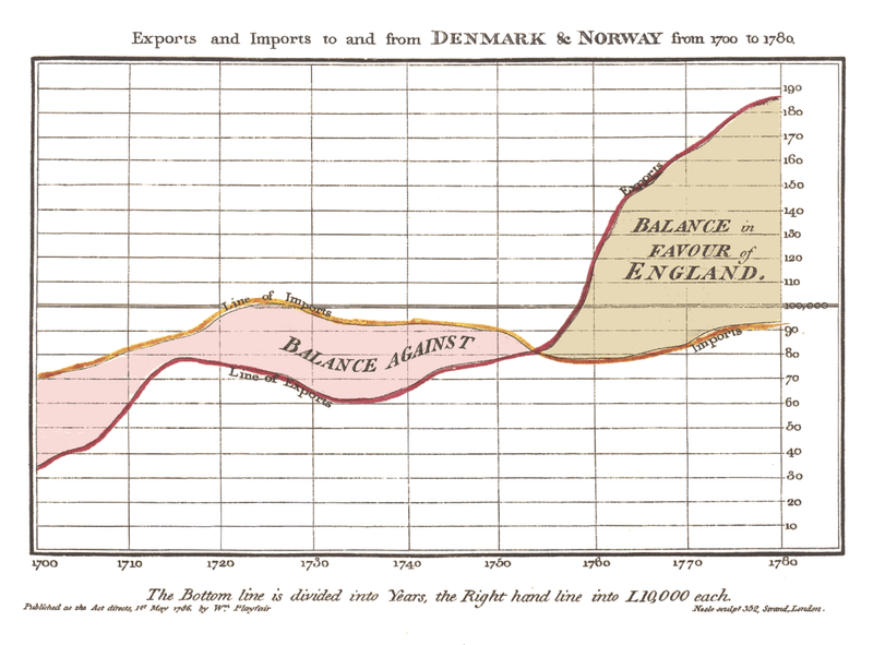
William Playfair is considered the father of statistical graphics, having invented the line and bar chart we use so often today. He is also credited with having created the area and pie chart. Playfair was a Scottish engineer and political economist who published The Commercial and Political Atlas in 1786.
This book featured a variety of graphs including the image below. In this famous example, he compares exports from England with imports into England from Denmark and Norway from 1700 to 1780.
Florence Nightingale (1820 – 1910)
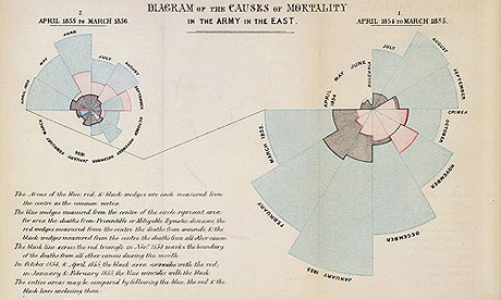
Florence Nightingale is famous for her work as a nurse during the Crimean War, but she was also a data journalist. She realized soldiers were dying from poor sanitation and malnutrition, so she kept meticulous records of the death tolls in the hospitals and visualized the data.
Her ‘coxcomb’ or ‘rose’ diagrams helped her fight for better hospital conditions and ultimately save lives. Click here for an interactive version of her famous diagrams.
John Snow (1813 – 1858)
In 1854, a cholera epidemic spread quickly through Soho in London. The Broad Street area had seen over 600 dead, and the remaining residents and business owners had largely fled the terrible disease.
Physician John Snow plotted the locations of cholera deaths on a map. The surviving maps of his work show a method of tallying the death counts, drawn as lines parallel to the street, at the appropriate addresses. Snow’s research revealed a pattern. He saw a clear concentration around the water pump on Broad Street, helping to find the cause of the infection.

Charles Joseph Minard (1781 – 1870)
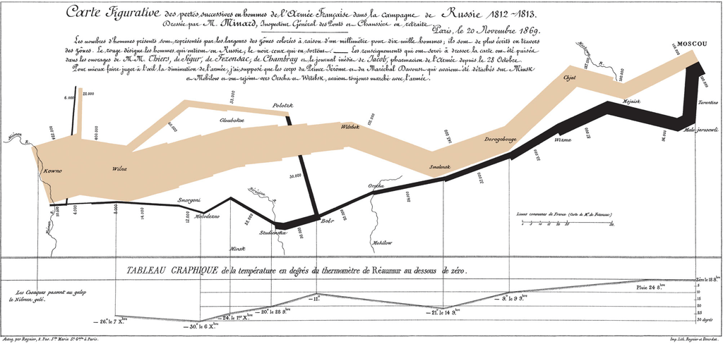
Charles Joseph Minard was a French civil engineer famous for his representation of numerical data on maps. His most famous work is the map of Napoleon’s Russian campaign of 1812 displaying the dramatic loss of his army over the advance on Moscow and the following retreat.
You can see how many soldiers are still marching and how many died. Drawn in 1869, it is described by many as the best statistical graphic ever drawn. It represents the earliest beginnings of data journalism.
Edmond Halley (1656 – 1742)
Edmond Halley was an English astronomer, geophysicist, mathematician, meteorologist, and physicist who is best known for computing the orbit of Halley’s Comet.
According to the BBC, Halley developed the use of contour lines on maps to connect and describe areas that display differences in atmospheric conditions from place to place. These lines are now commonly used to describe meteorological variation common to us from weather reports.
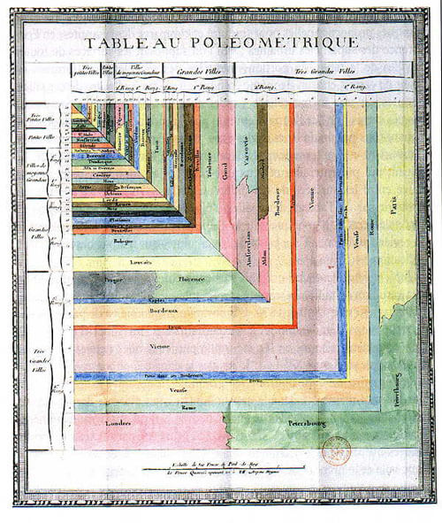
Charles de Fourcroy (1766 – 1824)
Charles de Fourcroy was a French mathematician and scholar. He produced a visual analysis of the work of French civil engineers and a comparison of the demographics of European cities.
In 1782 he published Tableau Poléometrique, a treatise on engineering and civil construction. His use of geometric shapes predates the modern treemap, which is widely used today to display hierarchical data.
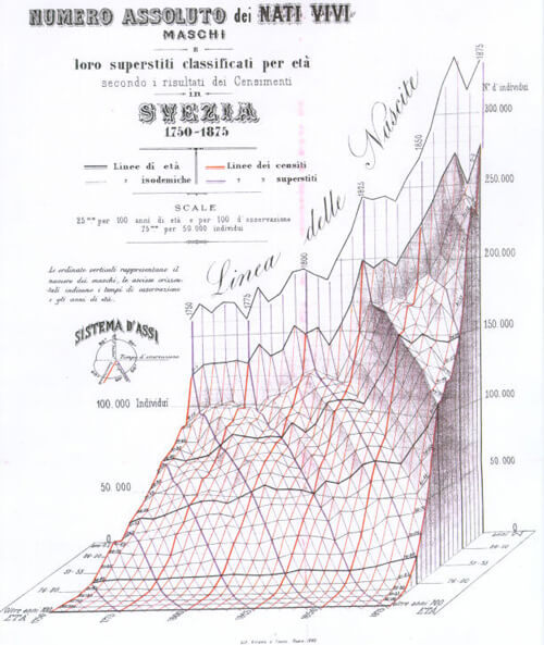
Luigi Perozzo (1856 – 1916)
Luigi Perozzo was an Italian mathematician and statistician who stood out for being the first to introduce 3D graphical representations, showing the relationships between three variables on the same graph.
Perozzo published one of the first 3D representations of data showing the age group of the Swedish population between the 18th and 19th centuries.
Infogram makes it easy for you to create the charts and graphs pioneered by these amazing people. Simply pick a chart type, enter your data, design, and publish!

Get data visualization tips every week:
New features, special offers, and exciting news about the world of data visualization.