21.09.2017 by Infogram
Maps are a great way to display interesting location-based data. When done right, they are informative and eye-catching. Advances in technology have led to increasingly exciting map experiences. Every day we see amazing interactive or animation-based maps we can’t wait to share. Enjoy these mind-blowing maps from around the web.
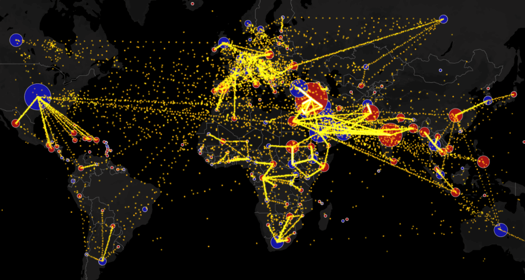
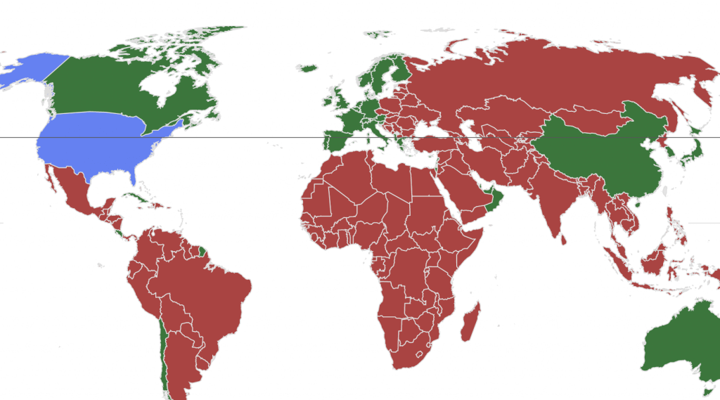
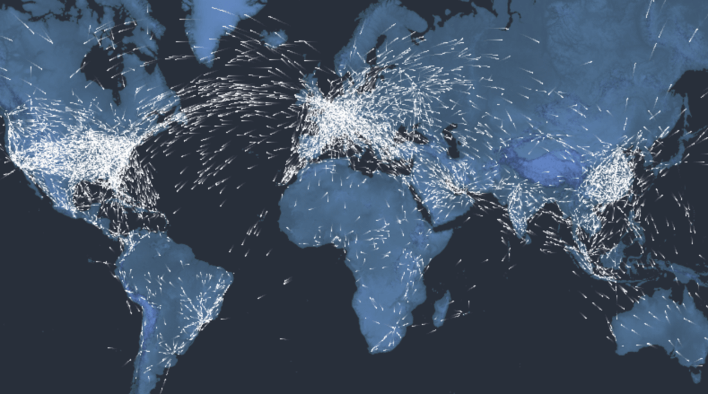
1) World Migration Map
Based on data from the U.N. Population Division, Max Galka’s map shows the estimated net migration (inflows minus outflows) by origin and destination country between 2010 and 2015. Blue circles = positive net migration (more inflows). Red circles = negative net migration (more outflows). Yellow dots represent 1,000 people.
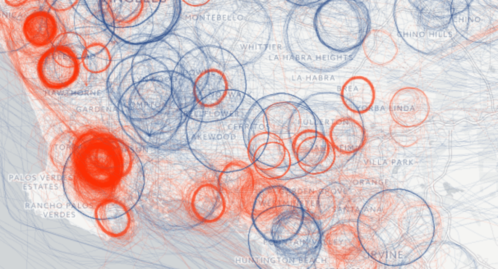
2) Spies in the Skies
America is being watched from above. Government surveillance planes routinely circle over most major cities — but usually take the weekends off. BuzzFeed News has assembled an unprecedented picture of the operation’s scale and sweep by analyzing aircraft location data. Their project won Gold in the Data Journalism category at the 2016 Kantar Information is Beautiful Awards.
3) The Food Capitals of Instagram
Discover the popularity of some of the world’s favorite foods – from global classics to local favorites – as tagged on Instagram. Use this interactive map to discover Instagram’s capital of curry, which cities are big on burgers, and where pulled pork is most prolific. Where is your favorite food most popular?

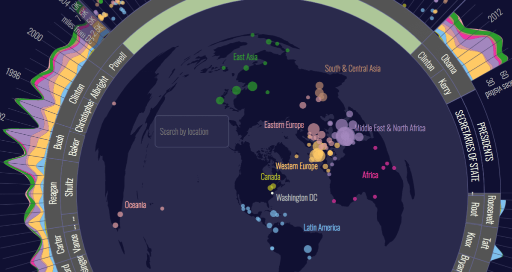
4) The Executive Abroad
No sitting American president traveled outside the country before Theodore Roosevelt traveled to Panama in 1906 to see the construction of the Panama Canal. A century later Air Force One regularly carries the head of the executive branch to all corners of the world. The Executive Abroad maps the international trips of presidents and secretaries of state.
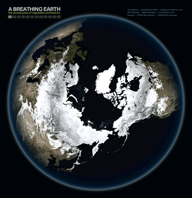
5) A Breathing Earth
Here’s a view looking at one year of seasonal transformations on Earth. Made possible by the folks on NASA’s Visible Earth team, John Nelson downloaded the twelve cloud-free satellite imagery mosaics of Earth at each month of the year from their “Blue Marble Next Generation” series – then he made two breath-taking GIFs.
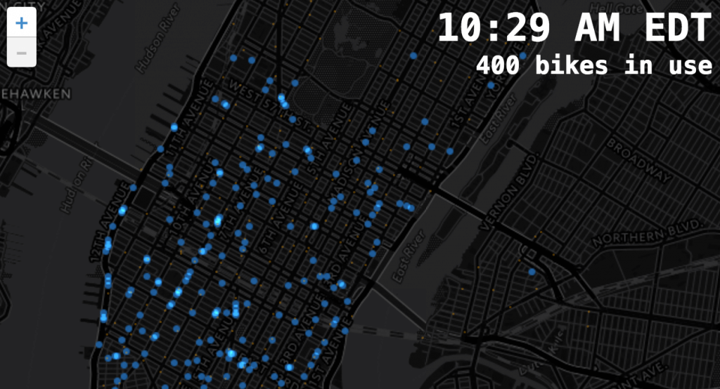
6) Citi Bike Rides
Where do Citi Bikers ride? When do they ride? How far do they go? Which stations are most popular? What days of the week are most rides taken on? Todd Schneider decided to visualize public data released by New York City’s popular bike share program. He pinpoints the answers to the above questions and more.
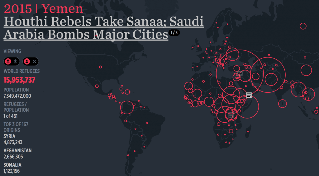
7) The Refugee Project
In 2016, nearly 66 million people were forced to leave their homes due to conflict and persecution – one of every 113 people on the planet. The Refugee Project allows for map-based exploration of refugee migrations over time. UNHCR data is complemented by original histories of the major refugee crises of the last half-century.
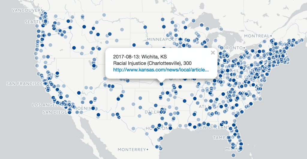
8) Count Love
Demonstrations represent one way to communicate to our elected leaders. Yet, it’s easy to lose track of exactly where and when protests took place and how many people participated. That’s why Tommy Leung and Nathan Perkins started Count Love – which features a map showing demonstration statistics broken down by state.
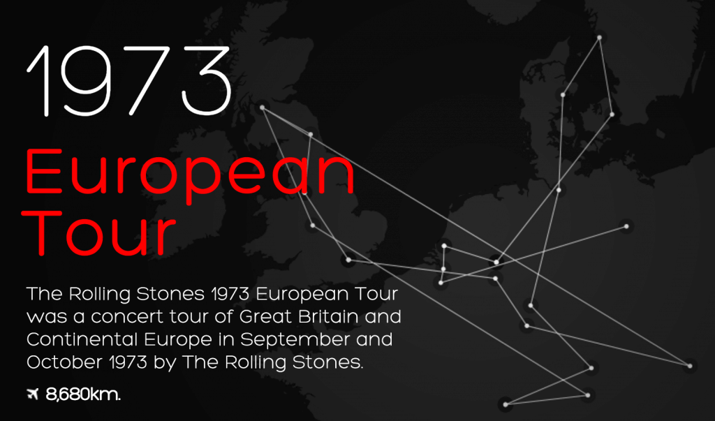
9) 50 Years of the Rolling Stones
The Rolling Stones 1963 British Tour was the first Rolling Stones concert tour, running from the end of September to the beginning of November. This interactive map gives an in-depth look at over 50 years of Rolling Stones live-shows.
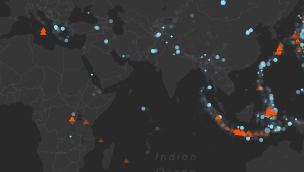
10) Eruptions, Earthquakes, and Emissions
The Smithsonian’s “Eruptions, Earthquakes, & Emissions” web application (or “E3”) is a time-lapse animation of volcanic eruptions and earthquakes since 1960. It also shows volcanic gas emissions (sulfur dioxide, SO2) since 1978 — the first year satellites were available to provide global monitoring of SO2.
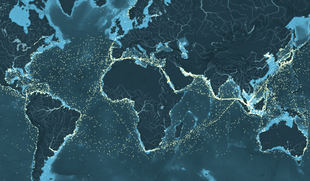
11) The Ship Map
This award-winning interactive map shows the movements of the global merchant fleet over the course of 2012. You can pan and zoom in the usual ways, and skip back and forward in time using the timeline at the bottom of the screen. The map was created by Kiln based on data from the UCL Energy Institute.
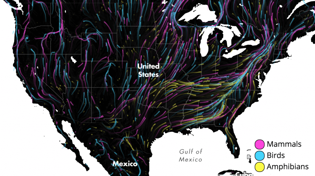
12) Migrations in Motion
As climate change alters habitats and disrupts ecosystems, where will animals move to survive? Researchers from the University of Washington and The Nature Conservancy made a map that shows the average direction mammals, birds, and amphibians need to move to track hospitable climates as they shift across the landscape.
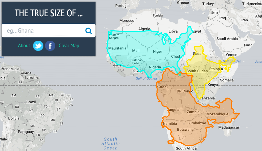
13) The True Size…
It is hard to represent our spherical world on a flat piece of paper. Every map projection introduces distortion, and each has its own set of problems. This app was created by James Talmage and Damon Maneice. Use it to see just how big the world truly is. Simply drag and drop countries to compare their size.
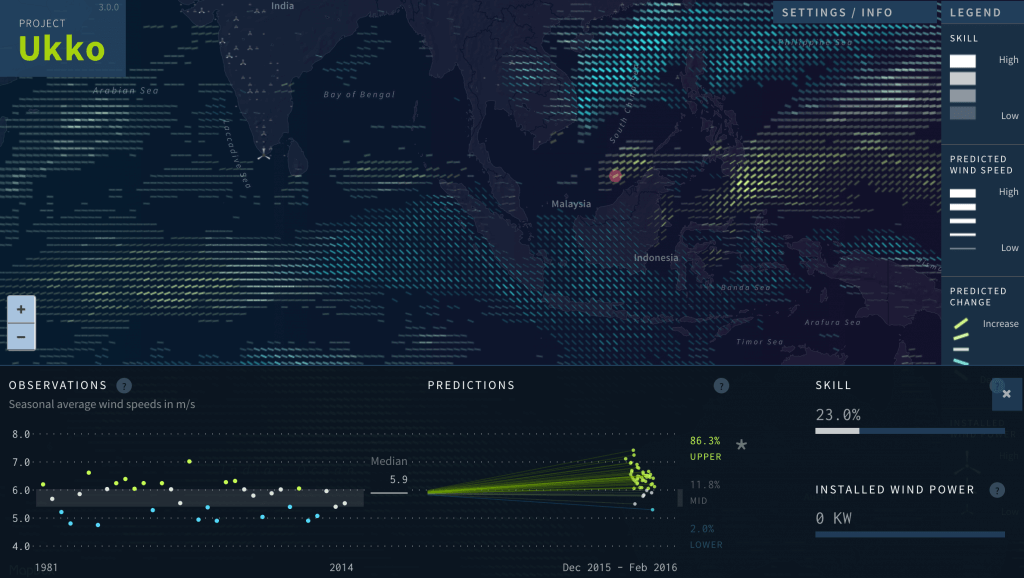
14) Seasonal Wind Predictions
Access to credible seasonal forecasts has the potential to improve the resilience of society to climate variability and change. Project Ukko is an interactive climate service interface for wind industry users to explore wind speed predictions for the coming season. You never knew wind could be this fascinating.
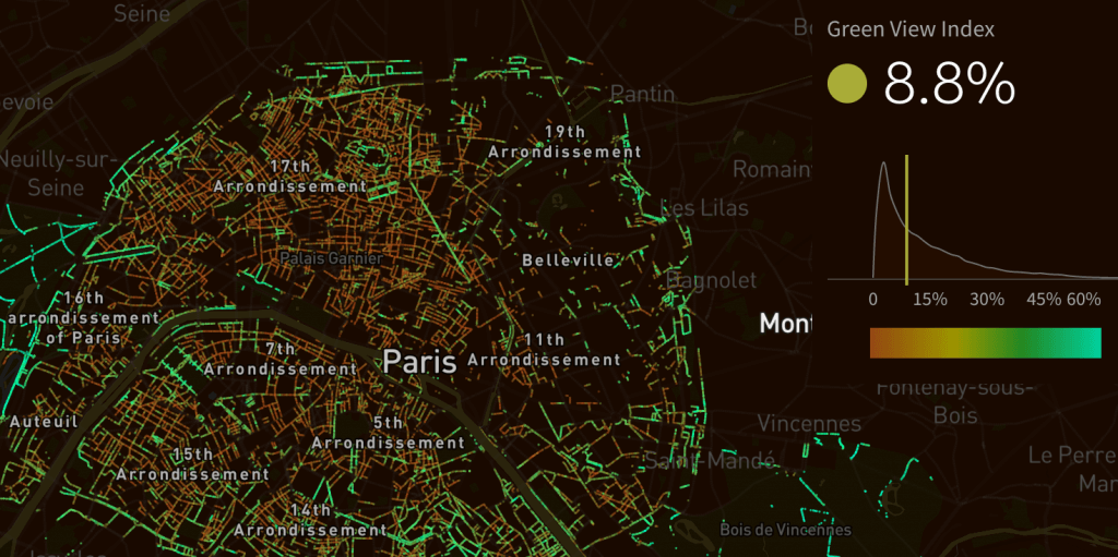
15) Treepedia
How green is your city? Researchers at MIT, in collaboration with the World Economic Forum, launched Treepedia, a platform that uses Google Street View data to measure and compare the green canopy in cities around the world. The visualization maps street-level perception only, so your favorite parks aren’t included.
16) The World Population Project
Population.io, brought to you by World Data Lab, aims to make demography (the study of human populations) accessible to a wider audience. Enter your date of birth, country of birth, and sex to see how long you might live and where you fit in the population.
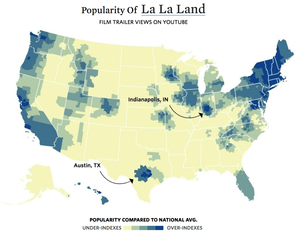
17) Geographic Divide of Oscar Films
Using trailer views on YouTube as an approximation for who watched what, The Pudding analyzed the geographic hotbeds of last year’s Oscar-nominees. See which movies were more popular coast-to-coast across the United States. The geographic diversity may surprise you.
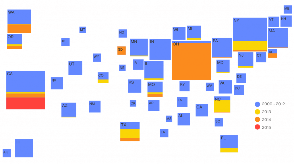
18) Measles
In 2000 measles was declared wiped out in the U.S. There have been sporadic outbreaks since then, and 2014 saw the most measles cases since its elimination, causing growing concern. These innovative, animated Bloomberg maps show recent measles outbreaks and vaccination rates around the country.
19) New York City Subways
Many New Yorkers travel by taxi, but many rush underground to get from point A to point B on the subway. Will Geary took data from the MTA and made a nearly four-minute video set to classical music, showing the intricate subway system in all its glory.
20) In Flight
To mark 100+ years of passenger air travel, The Guardian’s stunning interactive uses live data from FlightStats to show every one of the thousands of commercial planes currently in the air, charts the history of aviation since 1914, and asks what comes next for the industry.
21) Turning Point
Fifteen years after September 11, 2001, violent extremism has spread, gained favor among a new generation, and now casts an ever-larger shadow over the globe. The Center for Strategic & International Studies put together a series of interactive maps to show terrorist incidents from 2012-2015.

Are there any awesome online maps we missed? We want to hear from you! Reach out to us on Facebook and Twitter to share your favorites.
If you love maps or want to learn how to make one with Infogram, check these out:
Get data visualization tips every week:
New features, special offers, and exciting news about the world of data visualization.