15.09.2015 by roberts
Abstract bars, lines, pie and bubble charts can get daunting without the familiar pictorials that bring every data-driven story to life. Here, we provide some insight into how pictorials work and how to make the best use of them.
History
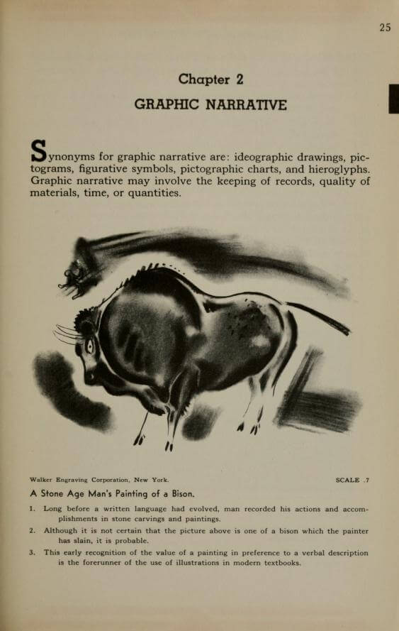
The history of pictorial chart goes hand in hand with the evolution of humanity. The “graphic narrative”, as Willard Cope Brinton calls it in his book “Graphic Presentation” (1939), has been around since the Stone Age. Ideographic drawings, pictograms, figurative symbols, pictographic charts and hieroglyphs all serve to tell stories in a universal graphical language.
“Graphic Presentation” by Willard C.Brinton, 1930
The idea of the universal language of pictorials was best developed by an Austrian social scientist Otto Neurath and a German designer Gerd Arntz in the late 1920’s. At the time Neurath had developed a method to communicate complex information on society, economy and politics in simple images. Arntz was a socially inspired and politically committed artist who depicted the life of workers and the class struggle in abstract figures on woodcuts. Together, they were the perfect fit to develop an ISOTYPE (International System Of TYpographic Picture Education) – a set of 4000 pictograms that could express almost anything.
The power of images
The beginning of the 20th century in Europe saw a lot of social class disputes and wars, therefore it was essential to inform and educate large masses of illiterate people. The familiar shapes of pictorials laid out to represent their mutual relationships and narratives was the most effective way to teach, provide instructions or report on essential statistics. As Neurath explains: “To most men the reading of long lines of numbers is a great trouble – they put down a book when they see it has in it numbers or curves. But pictures are an attraction. This fact gives the ISOTYPE system a special value for all sorts of education.”
“International Picture Language”, Otto Neurath, 1936, p.39
Data visualization best practices
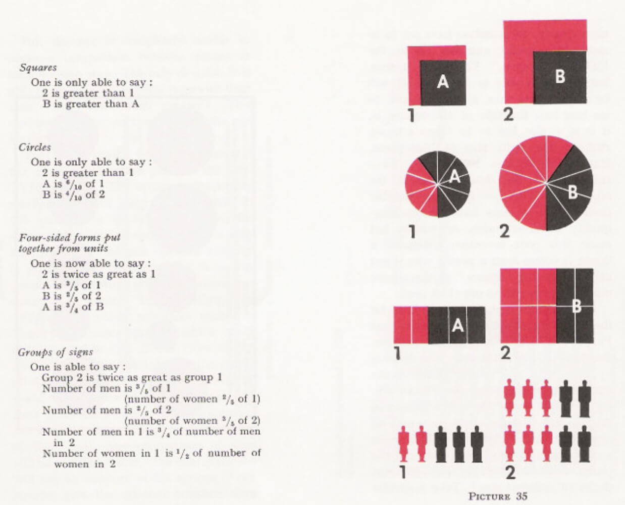
Since then pictorials are widely used to compare data. The relative sizes or repetitions of the same icon, picture, or symbol shows the relationships between data points.
“International Picture Language”, Otto Neurath, 1936, p.75
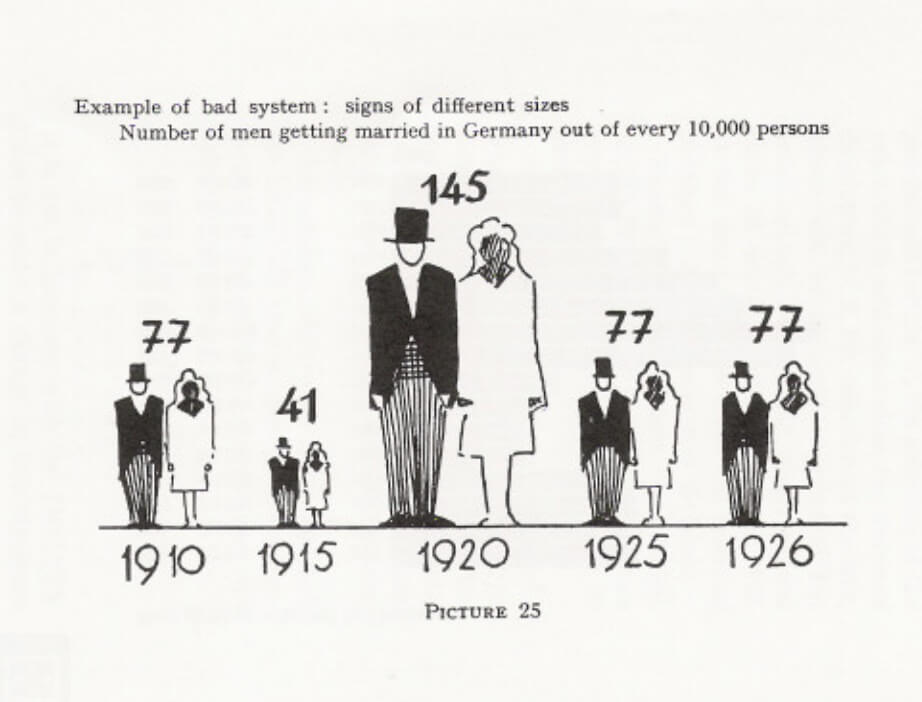
However, the size comparison approach is considered a bad practice by some people. “The eye is able to make a comparison between amounts of signs,” Neurath explains, “ and it is able to see how much longer one line is than another [..]. But the eye is completely unable to make a comparison between planes (for example) in a precise way. The only decision it is able to make is “this plane is larger than that”. But how much larger? This question will get no answer from the eye by itself.”
This phenomena is better explained on the image below.
“International Picture Language”, Otto Neurath, 1936, p.97
What pictorial chart type to choose
Infogram has four different chart types that represent quantitative and qualitative data with pictorials. Here is a short guide on how to use each of them.
Would you like to experience the full power of data visualization? Try Infogram for Teams or Enterprise for free! With a Team or Enterprise account, you can create up to 10,000+ projects, collaborate with your team in real time, use our engagement analytics feature, and more. Request your free demo here.
Amount comparison
The amount comparison chart is similar to a stacked bar chart with only one bar. It is a good choice if you have not more than five categories to compare. The power of pictorials is in their familiar shapes, so try to find an icon that represents your categories. Take it to the next level by assigning different colors to each category as shown on this example.
Size comparison
The key to success when using size-comparison pictorial charts is choosing not more than three categories to compare with very different values. Remember, the human eye can only tell which category is greater, not how much greater. Small changes in values you compare will make the visualization useless.
Pictorial bar
This is probably the most effective use of pictorial charts. You can use it every time you want to show how much something is in relation to the whole. Just define how many icons get colored and add a text to display to the right side of the bar.
Tip: The more icons you set to represent the “whole” the smaller they will get. Use no more than 10 icons. One colored icon will represent 10% from the whole.
Facts and figures
Choose this chart type to highlight quality data you may have. This is a good choice if you need more than 7 words to express your message. The trick here is to choose powerful facts and find the right icon to represent it.
Now it’s your turn!

Get data visualization tips every week:
New features, special offers, and exciting news about the world of data visualization.