17.01.2020 by Infogram
As the pace of the new year picks up and we’re taking in as many fresh ideas of the new decade as we can, it’s also time to reflect on what’s been achieved in 2019.
It wasn’t easy picking just the top 10 projects — so many creators did an excellent job of visualizing data, shining the light on important topics, and increasing media and data visualization literacy.
But we put our heads together, counted the votes, and the results are in.
Would you like to experience the full power of data visualization? Try Infogram for Teams or Enterprise for free! With a Team or Enterprise account, you can create up to 10,000+ projects, collaborate with your team in real time, use our engagement analytics feature, and more. Request your free demo here.
Without further ado, here are the best Infogram projects of 2019! See our fantastic winners and get inspired.
Click the images or arrows below to navigate and explore.
1. Customer loyalty in the local health system in the US
By NRC Health
This is by far one of the most extensive dashboard maps we’ve seen this year. At first glance, it might look like a single map – but it’s so much more. The main project has been hyperlinked to separate state-level dashboards. Explore the map by clicking the + icon and get an in-depth look into consumer trends and expectations, customer loyalty drivers, and more for each US state.
Also, a round of applause to NRC Health for making the top 10 for the second year in a row!
2. Chilling with Jens
By Danfoss
Who said infographics can’t be used in podcasts? In this “Chilling with Jens” series, Danfoss Cooling invites you to discover the world of refrigeration with the help of podcast host Jens Andersen. He shares insights gained from over 40 years spent working in the industry.
Each episode is embedded in the infographic and accompanied by fitting icons that reflect the topic of the episode. Bravo!

3. It’s about time
By UNICEF
UNICEF’s “It’s about time” campaign focuses on supporting parents to bring up happy and healthy children and promoting family-friendly policies that would make a difference to family life. Check out their Mini Parenting Challenges (created using Infogram slides), learn tips for spending more quality time with your children, and discover how each activity benefits your relationship.

4. The state of gaming app marketing
By AppsFlyer
Gaming is the main driving force in the app marketing economy, and there was a lot of growth in this sector in 2019. Much of the momentum can be connected to “hyper-casual” games (simple gameplay that can be played anywhere instantly). The genre erupted in the market in 2018 and continued to grow immensely in 2019. For other trends and statistics, explore the AppsFlyer 2019 report on gaming app marketing.

5. The Not Enough Impact report
Amnesty International is a global movement of more than 7 million people who take injustice personally and who campaign for a world where everyone can enjoy basic human rights. In their “Not Enough Impact” report, they reveal 8 stories that celebrate the gains the movement has made, as well as the people that helped make them possible. See how they used slides to emphasize each individual’s personal story and impact.

6. Private equity funding in Africa
By Private Equity International
According to the latest report by Private Equity International, Africa’s private equity is scaling up, with regionalization emerging as a key strategy. See where the activity is the highest and where the next opportunities might strike. Discover Africa, the world’s fastest-growing continent in 10 slides. Happy to see Private Equity International also making the top 10 second year in a row!
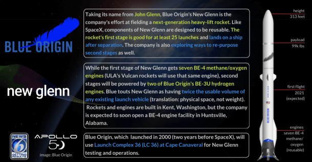
7. Let’s talk rockets and such
By News 6 WKMG
If you ever tried to keep up with Space 2.0, or America’s return to the Moon, you’ve undoubtedly encountered many names and a lot of rockets (and crew vehicles). Here’s an amazing interactive slideshow created by News 6 WKMG to help you catch up.
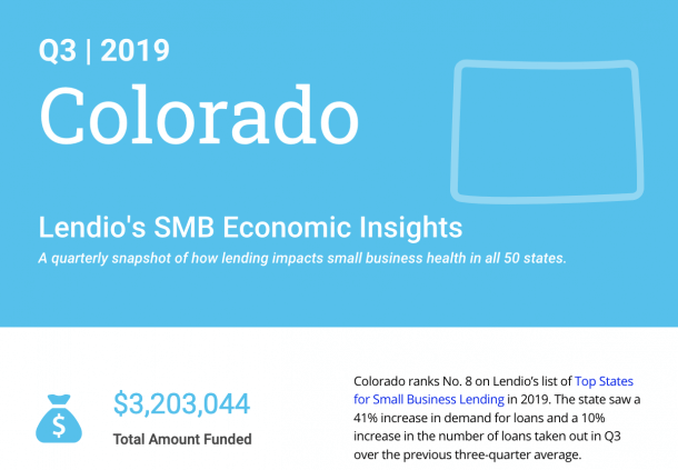
8. SMB economic insights
By Lendio
Every quarter, Lendio – the largest small business loan marketplace in the US – publishes a snapshot of how lending impacts small business health in all 50 states. Discover the statistics for each state and see how they compare to the national average on important lending metrics in their interactive infographic.
9. Fuel taxes in the EU
By the European Federation for Transport and Environment
Are Europeans paying more at the pump because of increasing taxes? How much more in taxes do petrol car drivers pay than diesel drivers, even though diesel engines are the main cause of the air pollution crisis in our cities? This interactive infographic by Transport and Environment collects data from all 28 EU member states since 1995 and displays it in an easy-to-understand way to answer all your questions.
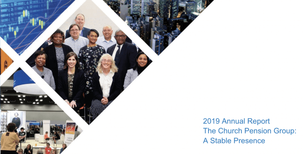
10. 2019 annual report
The Church Pension Fund has been operating since 1917 and was founded to ensure the highest possible level of financial security for retired clergy in the US. Their annual report includes messages from the people within the organization, an overview of the yearly highlights, as well as a financial snapshot of its assets.
Feeling inspired? Create interactive, professional, and data-driven content just like this and make the top 10 project list in 2020.
Interested in discovering how Infogram can enhance your team’s work? Join a brief Zoom session with our Customer Success Manager to explore key features, get answers to your questions, and understand how we can assist. It’s quick, informative, and just like a coffee-break chat. Schedule your call now!
Get data visualization tips every week:
New features, special offers, and exciting news about the world of data visualization.