
Transform Your Data with Interactive Dashboards
Create interactive dashboards and visualize complex data easily with Infogram.


4.7 out of 5 stars


Overview
Why
Types
Examples
Reviews
Tips
FAQ
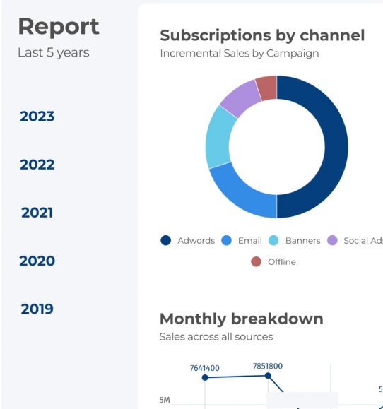
Create a Simple and Easy-To-Read Dashboard
Creating effective dashboards can be a challenging endeavor for many individuals and businesses. The complexity of handling and presenting data in a visually engaging and understandable format poses significant obstacles.
Firstly, there's the struggle of data overload. Organizations accumulate vast amounts of data from various sources, and condensing this information into a coherent dashboard can be overwhelming. Deciding which data to include, how to visualize it, and ensuring it tells a meaningful story can be a daunting task.
Secondly, static dashboards often fail to capture attention. Traditional charts and graphs lack interactivity, making it difficult for users to explore data further. This limitation hampers engagement and restricts the depth of insights that users can gain.
Furthermore, the need for real-time insights is growing rapidly. Businesses require up-to-the-minute data to make informed decisions promptly. Manually updating dashboards with fresh data can be time-consuming and prone to errors, hindering the accuracy of information.
Infogram's interactive dashboards offer a solution to these challenges. With its user-friendly interface, individuals and businesses can effortlessly craft dashboards that transform overwhelming data into clear narratives. The interactive features allow users to dive deep into data points, gaining a comprehensive understanding of trends and patterns.
Explore Why Dashboards Are Useful
Take a dive into the world of visual storytelling and find out why dashboards are valuable.

Enhanced Storytelling
Dashboards within Infogram empower you to weave captivating data-driven narratives. By presenting information visually and interactively, you can craft engaging stories that effectively communicate insights to your audience.
Sequentially organized data visualizations, supplemented by annotations and captions for context, alongside interactive features for exploration, elevate the storytelling and communication capabilities of these dashboards.

Real-Time Data Insights
Infogram dashboards provide the ability to track crucial metrics and data in real time. By linking data sources directly to the dashboard, you can ensure that visualizations automatically update as fresh data is received.
This functionality enables the monitoring of performance indicators, ongoing progress evaluation, and a continuous awareness of vital project or business aspects.

Tailored Customization
Infogram dashboards offer personalized customization options to cater to your distinct requirements. From layout and color palettes to font choices and other visual elements, you can adapt the dashboard's appearance to mirror your branding or reporting needs.
This seamless alignment ensures that the dashboard resonates with your organization's unique style and visual identity.

Seamless Collaboration and Sharing
Collaboration and sharing are streamlined with Infogram. You can effortlessly invite team members, clients, or stakeholders to explore and interact with your dashboards. This streamlined process fosters collaboration, as multiple individuals can simultaneously access and contribute to the dashboard.
Furthermore, you maintain control over access levels and permissions, allowing you to tailor the experience for each collaborator.
Dashboard Types to Explore

Marketing Dashboard
Track marketing metrics for ROI and engagement. Optimize campaigns with data-driven decisions.

Sales Dashboard
Monitor sales data and revenue for performance insights. Tailored for sales teams and managers.

Executive Dashboard
Top-level view of KPIs and metrics across departments. Strategic insights for executives.

Flowchart Dashboard
Visualize processes with images. Ideal for new programs or products.

SaaS Dashboard
Track SaaS metrics like MRR, CAC, and Churn Rate for informed decisions.

Educator Dashboard
Empower educators with student and classroom goal tracking.
Get Inspired by Infogram User Created Projects
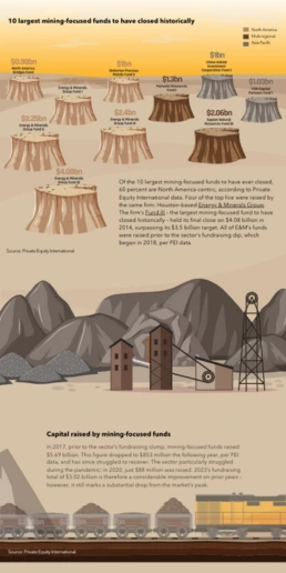
10 Largest Mining-Focused Funds to Have Closed Historically

Health to the plants

Automation & jobs

10 Plus Grands Fonds Axés sur l’Extraction Minière Fermés Historiquement

10 Largest Mining-Focused Funds to Have Closed Historically

Customer Survey Report

The Not Enough Impact Report 2018

The Impact of the Better Care Reconciliation Act on Employment
Customer Reviews
Here is what our customers have to say about us.
2022 Summer & Fall and 2023 Winter leader in Data Visualisation Software 4.7 out of 5 stars
See reviews on G2 ›Empowering 30,000+ Companies Worldwide
From startups to established enterprises, our platform has been embraced by a diverse range of businesses seeking to captivate audiences and simplify complex data. Here are just a few examples of the 30,000+ companies that use Infogram.


Learn More Practical Tips
Business
Best Ways to Visualize and Analyze Polling Data
Design
18 Surprising Data Visualizations in Your Everyday Life
Finance
A Practical Guide to Creating Financial Reports
Business
Comprehensive guide to creating annual business reports
Design
Data visualization trends you should look out for in 2023
Design
Information design: definition, tips & examples
Frequently Asked Questions
How do I register an account?
- Click on the Get started button in the top right corner of the homepage.
- Sign up with Google, Facebook or email. Infogram lets its users sign up with a Google or Facebook account, or register with a work email. If you choose to sign up with Google or Facebook, simply login to your account when asked to do so. If you wish to sign up with your email address, enter the email and your desired password, then hit the Sign up button.
- Provide some basic information about yourself. Enter your first and last name, indicate what kind of organization you belong to and specify your role. You will then be able to continue with the Basic plan or choose from any of the available paid plans.
Where to use interactive dashboards?
Dashboards are useful across most industries, as all companies have specific metrics and key goals they care about. From retail and education to big business and personal goals, dashboards can help anyone. Here’s how dashboards can make your life easier:
- Track the metrics that matter Dashboards help you stay focused on the metrics that matter to your business. They are the best way to analyze company performance and spot problems that need to be addressed.
- Easy to understand at a glance Dashboards effectively take complex data and visualize them in bite-sized charts, tables, or maps. Data visualizations are crucial for understanding and readability.
- Dashboards save time Dashboards put all the information you need in one place. You can view key metrics without wasting time navigating across different systems, tools, and data sources.
- Quickly share data with executives and team members Dashboards give other people access to important data. Team members can share KPIs with others from desktop and mobile devices, and managers can grant public and private access to view different levels of information. Spot problems early The more you know about how your business is performing, the better chance you have to stay on track. Dashboards help spot issues or potential problems early on, giving you the opportunity to take a closer look and adjust your strategy.
How do I create a dashboard with Infogram?
- Log in to Infogram.
- Select "Dashboard templates".
- Start with a blank template or use a ready-made designer template.
- Add charts, tables, images, text, and other elements to your project.
- Share a dashboard with your team.
What are the best practices for creating dashboards?
- Keep the design of your dashboard simple. Make it easy to read so viewers will understand the data quickly. Compare your performance to previous periods. This helps viewers understand what performance metrics are exceeding expectations and what needs to be improved.
- Don't try to show everything on your dashboard. Highlight the most important KPIs for your department or industry. You don’t want to overload people with too much information.
- Display the most important metrics with a larger font size. This draws people’s attention to key performance metrics first.
- Design responsive and easy-to-read dashboards on all devices. Make sure people can view dashboards outside of the office from mobile phones or tablets.
- Choose the right charts for your dashboard. Learn more about how to pick the right chart here.
- Use color wisely: Be consistent, use light or neutral colors for visualizations, and add strong colors to attract attention.
How do I add pages to my project?
Adding pages to your project is possible in all template projects (except the single chart and map projects).To add a page:
- Deselect any charts or objects in your project or click outside the project canvas.
- Click the Add page button in the right sidebar. There you will be able to select a blank canvas or one of the predefined pages.
- Delete a page by selecting it in the editor or in the settings panel on the right and by clicking the backspace key on your keyboard. To reuse a page, make a copy with the Duplicate button.
Change the order by dragging and dropping pages up and down the list.There are other ways you can upgrade pages in your project:
- For more on adding transitions to pages, head over to the article about adding and editing page transitions.
- For more on creating a clickable summary for easier navigation within pages, head over to the article about page linking.
- For more on how to add page numbers, head over to the article about customizing the footer.
How do I use guides and the layout tool?
Structured content is so much easier to navigate. Before starting a project, try to imagine what you want the end result to look like. Ask yourself: What page size do I want to choose for my project? How do I want to structure my page? Answers to these questions will set you up for success and a beautifully structured visualization. Tip: Layout settings are available in infographics, dashboards, reports, and other template projects. Choose a template and repurpose it for a quick start. Once in the editor, use Layout options(Show guides and Show layout) to arrange objects on the canvas. To enable guides:
- Click Layout in the bottom left corner of your editor.
- Enable the Show Guides option.
- Move objects around the page to adjust their position with respect to each other.
Tip: Start adding objects from the top left section of the page. Use the first object to align all other objects. To use the layout tool:
- Click on Layout in the bottom left corner of your editor.
- Switch on the Show Guides option. You’ll see pink columns with lines appear on the canvas. Tip: Use columns and lines to the group and align objects. Remember to always separate groups that are not related.
- Use the Spacing slider to adjust the white space on the sides of the page. Use the Number of Columns slider to choose how many columns you wish to appear on the page.
Tip: A good rule of thumb is to work with twice as many columns as groups you have. For instance, if you plan on dividing the page into two blocks, use at least 4 columns (2 for each block). That way you can be more precise in arranging objects in each block, making sure they are evenly aligned and with equal margins.
Didn't find the answer? Check our FAQs

Try Infogram Now!
Are you ready to unleash the power of data visualization? Get started with Infogram today and create stunning, interactive content that captivates your audience. Elevate your projects and bring data to life.