06.10.2015 by roberts
It’s not an exaggeration to call the bar chart the king of data visualization. Experts suggest to use it instead of a pie chart when showing comparisons, it can substitute a line chart when visualizing time-series data and serve as an ideological base for pictorial charts. Yet there are some things to be aware of.
History
It’s common to think that the bar chart was invented by Scottish engineer and political economist William Playfair (1759 – 1823), however the credit for the first bar chart goes to Nicole Oresme a French physician. In his 14th century publication, “The Latitude of Forms” he uses bars to plot the velocity of a constantly accelerating object against time. The only thing those charts were missing was data.

Later Playfair uses bar charts to compare Scotland’s imports and exports in the year 1780, recording quantities in the length of each bar and this is how we keep using bar charts until today.

When to use bar charts
The classic bar chart is used to compare quantities among categories with either horizontal or vertical bars. 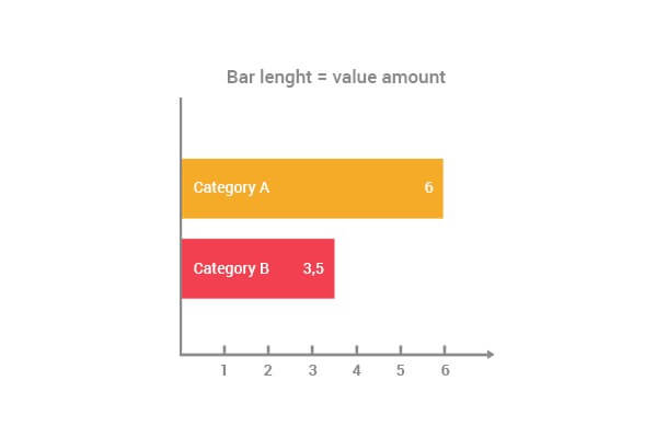 It answers the question of “how many?” in each category. Simply put, longer bars equal larger numbers.
Variations
As simple as a bar chart could be, it has many variations. Each of them serves a different purpose.
Vertical v.s horizontal
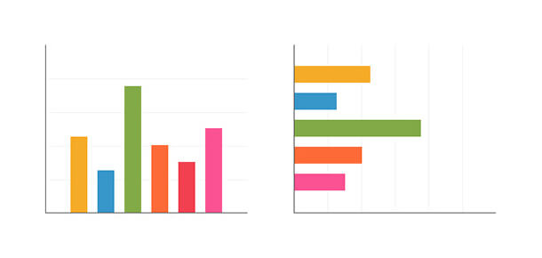 According to the American psychologist and neuroscientist Stephen Kosslyn (born 1948) “the properties of the visual pattern shouldn’t be in contradiction with the real properties of what is being represented”. This means the height of each of your family members is best compared with vertical columns, but the distance that each of your colleagues ran in 1 min at the corporate sports event is better compared with horizontal bars.
Histogram
 It’s a bar chart that works almost as a line chart. It takes points in time or other continuous categories and compares values of each. This way you can compare on which day of the week (category) your colleagues drink coffee the most (value). Some sources suggest to use a line chart instead: “From a cognitive psychology standpoint, a line, even though it could be zigzagging, better illustrates the continuity of its values.” However, if the values (not a trend) is what you are after, feel free to use a histogram.
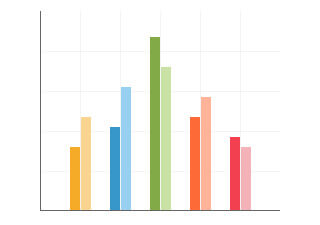
Grouped
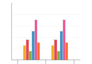 This is another variation of a bar chart that allows you to make better comparison between groups of categories. It’s especially useful when you need to compare something “before and after” – say party polls before and after the scandal with a lead politician from one of the parties. The rule of thumb with grouped bar chart is not to use paired graphs for more than two independent variables. The patterns that appear when you build paired graphs of several data series become complex and difficult to interpret.
Population Pyramid
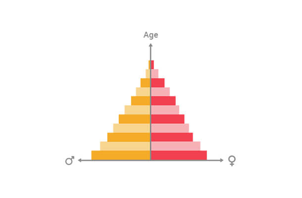 Population Pyramid is a bar chart that goes in both directions from the y axis and usually compares how many men and women are in each age group of society. It is almost like a double histogram that provides better comparison between two variables. Although you can imagine more use cases than just gender comparison across age groups, this is the primary purpose of Population Pyramid and most people will assume that this is what the chart is all about.
Radial
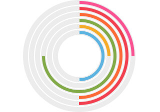 Radial bar chart takes quite an unusual approach to value representation. It uses a polar coordinate system, rather than a cartesian one to represent values. The problem is – every bar on the outside is longer than the previous therefore the only way to decode the values represented is by angle rather than length and we come to the very same problem that pie charts create – we are not very good at judging angle differences. The only reason to use a radial bar chart is aesthetics.
Stacked
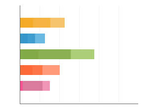 The strength of a stacked bar chart lies in it’s ability to show “a-part-of-the-whole” comparison. Imagine comparing apples, bananas, kiwi and melons and breaking each in nutrition facts. A rule to follow when using stacked bar charts is placing the values that have a lower variation in the lower part of the chart. This way you’ll be able to visually enhance the differences between other values.
Progress bar
 This type of bar chart is probably the one that requires the least explanation. It also takes the “part-of-the-whole” approach to show “how full or empty the glass is”. It is very handy if you need to show how many of the people who signed up for your event actually attended or how much of your budget has been already spent.
Best practices
As you see there are many variations of a simple bar chart, nevertheless there are some rules that apply to all of them:
- Start the Y axis at zero. Sometimes bars will look similar and the only way to show the diffeence will be by changing the y axis. Double think before you do it. If the real difference is not that big, perhaps it’s better to search for differences elsewhere and not mislead your reader.
- Use consistent colors. Avoid making a “rainbow-chart”. Use a single color or shades of that color. This will give you an opportunity to highlight a particular bar. Read more tips on how to better use colors here.
- Label axes. You are the one who knows what the chart is about. Not your audience, not yet. Don’t forget to label your axes, so people know if you are comparing thousands or millions of dollars. Being consistent with labelling axes will build trust in you.
- Display values. It’s easier to compare length, but hard to name the exact value just by reading from the grid. Your charts will be very clear if you display the value each bar represents. It will also give you an opportunity to take the grid off and make the chart more visually clean.
Would you like to experience the full power of data visualization? Try Infogram for Teams or Enterprise for free! With a Team or Enterprise account, you can create up to 10,000+ projects, collaborate with your team in real time, use our engagement analytics feature, and more. Request your free demo here.
Get data visualization tips every week:
New features, special offers, and exciting news about the world of data visualization.