09.01.2024 by Infogram
For businesses and organizations, collecting and storing data has become increasingly important. However, purely collecting and storing data doesn’t provide value – visualizing and analyzing it does. That’s where data analytics and visualization tools come in to help businesses and organizations sort through data, visualize it, and eventually help arrive at well-informed decisions. And dashboards are well-known tools for providing dynamic and interactive visualizations. But what is a dashboard? How is it different from reports? And what are the best practices to create one? In this article, we’ll answer all these questions and provide more tips and insights on dashboards. Additionally, we’ll provide insights into how Infogram’s features can help you create more impactful dashboards that cater to specific informational needs.

What is a dashboard?
At its core, a dashboard is a graphical user interface that provides an overview of key information, metrics, and data points. It serves as a centralized hub for monitoring, analyzing, and interpreting complex data sets in a visually appealing and easily understandable manner. Dashboards are designed to offer real-time insights, allowing users to track performance, identify trends, and make data-driven decisions efficiently.
What is a data dashboard?
A data dashboard is a specialized form of dashboard focused on presenting and visualizing data-related information. It helps to monitor, analyze, and interpret datasets to get meaningful insights. Unlike traditional dashboards that may cover a broad spectrum of information, data dashboards specifically emphasize visual representation and analysis of data points, metrics, and key performance indicators (KPIs). These dashboards are designed to facilitate the understanding of complex datasets by providing a clear, concise, and interactive display of information. Users can explore and interact with the data dynamically, enabling them to make informed decisions based on real-time insights.
Data dashboards often integrate various visualization elements such as charts, graphs, tables, and maps to convey information effectively. They play a crucial role in data-driven decision-making processes across industries, empowering users to spot trends, identify correlations, and respond promptly to changes in the data landscape.
Here’s an example of a data dashboard template available on Infogram:
What is a dashboard in business?
Business dashboards aggregate data from multiple sources into a unified and visually compelling interface, providing a well-defined overview of the company’s key metrics. These dashboards are tailored to address specific business objectives, aligning with strategic goals and operational needs.
A business dashboard typically includes key performance indicators (KPIs) related to various aspects of the organization, such as financial performance, sales, marketing, human resources, and customer satisfaction. It allows decision-makers to track progress, identify areas for improvement, and align the team with underlying business objectives.
In a business context, dashboards serve as a real-time information center, fostering a proactive approach to decision-making. Whether it’s monitoring sales trends, assessing marketing campaign effectiveness, or evaluating employee productivity, business dashboards empower leaders with the insights needed to navigate the complexities of today’s dynamic business landscape. As businesses continue to embrace data-driven strategies, the role of dashboards in providing actionable insights becomes increasingly crucial for achieving long-term success.
Discover a business dashboard template you can recreate on Infogram:
The difference between dashboards and reports
While both dashboards and reports share the common goal of presenting data, they differ in their approach and functionality. Reports are typically static and provide detailed, structured information. Additionally, they provide more context to data in the form of summaries and detailed descriptions. In contrast, dashboards are dynamic and offer a real-time, visual representation of data, enabling users to interact with the information and gain actionable insights as soon as possible.
Why dashboards are important
Dashboards play a crucial role in improving data visibility and accessibility. They help stakeholders to quickly grasp complex information, facilitating faster and more informed decision-making. Dashboards also promote collaboration within teams by providing a shared platform for data analysis, creating a culture of transparency and accountability.
What are dashboards used for?
Dashboards can be used in various industries and for different purposes. Some common use cases include:
- Business performance monitoring:
- Tracking key performance indicators (KPIs) to measure business success.
- Monitoring sales, revenue, and other financial metrics.
- Marketing analytics:
- Analyzing campaign performance.
- Visualizing website traffic and user engagement.
- Human resources:
- Monitoring employee performance and engagement.
- Tracking recruitment and onboarding metrics.
- Project management:
- Visualizing project timelines and milestones.
- Tracking resource allocation and project progress.
Student performance metrics:
- Implementing dashboards to track academic performance across classes.
- Visualizing attendance records, exam scores, and student engagement data.
Best practices for creating dashboards
Creating an effective dashboard involves a thoughtful combination of design, functionality, and clarity. Here are ten essential tips to ensure your dashboards deliver meaningful insights:
Define clear objectives: Clearly outline the purpose of your dashboard. Know what key metrics and insights you want to convey to your audience.
Prioritize essential information: Focus on the most critical data points. Avoid clutter by showcasing only the information that directly aligns with your dashboard’s objectives.
Choose the right visualizations: Select visual elements that effectively communicate your data. Bar graphs, line charts, and pie charts are common choices, but ensure they align with the nature of your data.
Consistent design and branding: Maintain a consistent design and branding throughout your dashboard. This helps in creating a cohesive and professional look.
Optimize for user experience: Ensure a user-friendly experience. Arrange elements logically, use intuitive navigation, and keep interactions simple for users of varying expertise.
Responsive design: Make your dashboard accessible across different devices. A responsive design available on Infogram ensures that users can seamlessly interact with your dashboard on desktops, tablets, or smartphones.
Real-time data updates: Use real-time data update functionality on Infogram. This ensures that your audience always has access to the latest information.
Use appropriate color schemes: Opt for a color scheme that improves readability and emphasizes key information. Avoid overly vibrant colors that may distract from the data.
Provide context and annotations: Include contextual information and annotations to help users interpret the data. Explain any anomalies or trends that might not be immediately apparent.
Regularly review and update: Dashboards should evolve with changing data and user requirements. Regularly review and update your dashboards to ensure their ongoing relevance and effectiveness.
By following these tips, you can create dashboards that showcase data effectively and provide a seamless and insightful experience for your audience.

Infogram: Your tool for creating impactful dashboards quickly
If you’re ready to create a dashboard, you don’t need to go far. Infogram is a user-friendly platform known for visually compelling and interactive dashboards. You can easily create professionally-looking dashboards using Infogram features that cater to diverse user needs and preferences. Explore key features that Infogram has to offer!
1. User-friendly interface
Infogram has a user-friendly interface, characterized by an intuitive drag-and-drop mechanism. This streamlined process ensures that users, regardless of their technical expertise, can effortlessly create interactive dashboards. Our commitment to simplicity eases the dashboard creation process, allowing you to focus on the content and insights rather than grappling with complex design tools.
2. Data visualization options
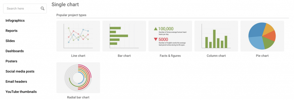
One of Infogram’s standout features is its extensive array of data visualization options. Users can choose from a diverse set of charts, graphs, and maps to creatively represent their data. Whether it’s pie charts for categorical data, line graphs for trends, or interactive maps for geographical insights, Infogram provides the tools to transform raw data into visually compelling narratives. This versatility enables you to convey complex information in a format that resonates most effectively with your audience.
3. Real-time collaboration
We understand the importance of collaborative efforts in data analysis. That’s why we offer a real-time collaboration feature, available for Team and Enterprise plans. This feature promotes efficiency in data analysis, as team members can contribute simultaneously, share insights, and make informed decisions collectively.
4. Customization
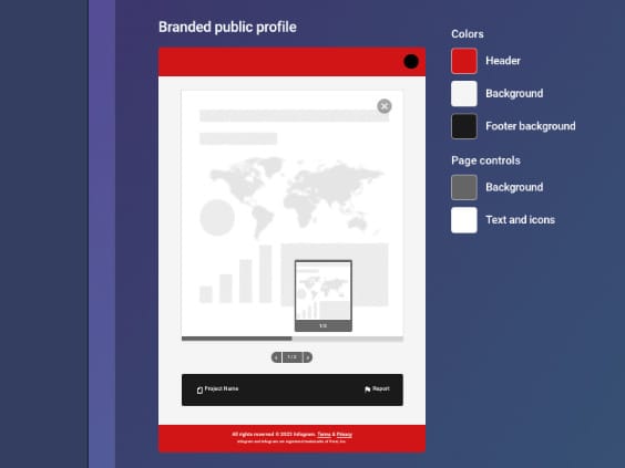
By recognizing the significance of branding and design preferences, Infogram empowers users with extensive customization capabilities. Users can tailor their dashboards to align with their brand identity, ensuring a cohesive and professional representation of data. This customization extends beyond color schemes and includes fonts, logos, and overall aesthetic elements. Infogram’s branding features offer a personalized approach to dashboards and help maintain a consistent brand image.
5. Templates
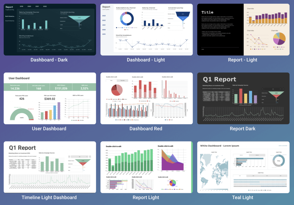
If you’re unsure about your design skills, there’s no need to create a dashboard from scratch. Infogram offers a great range of customizable templates that allow users to simplify the creation process even more. Whether you’re looking for a starting point or seeking inspiration, the template library offers pre-designed layouts that can be easily adapted to specific data sets and objectives.
Ultimately, the combination of Infogram’s user-friendly interface, diverse data visualization options, real-time collaboration, extensive customization options, and a rich template library makes it an easy choice for creating impactful dashboards that elevate data storytelling.
What is a dashboard? It’s a vital tool for decision-making
Dashboards are indispensable tools for anyone seeking to provide actionable value to data for strategic decision-making. They provide a real-time, visual representation of key metrics, fostering a data-driven culture. And with Infogram’s features and templates, you can easily create one that effectively communicates insights in a visually appealing manner. Discover what Infogram can offer to you, and start creating impactful data visualizations today!
Get data visualization tips every week:
New features, special offers, and exciting news about the world of data visualization.