23.04.2020 by Infogram
There’s so much information about the ongoing pandemic and its consequences circling the internet. On the one hand – people are being informed 24/7, and there’s definitely no information vacuum.
On the other hand – there are so many articles, infographics, charts, maps, and other data visualizations related to COVID-19 that it’s easier than ever to get overwhelmed with misinformation.
One of our goals here at Infogram has always been to empower people to create better data stories. In light of this, we’ve compiled a list of some of the most resourceful data visualizations related to COVID-19 we’ve seen out there that will help you stay up to date on the ongoing situation.
This list includes reliable, data-driven visualizations including infographics, dashboards, and live-updating maps from trusted sources, some of them created with the help of Infogram.
Click the images below to see the full project.
1. Coronavirus: the disease Covid-19 explained
Source: South China Morning Post
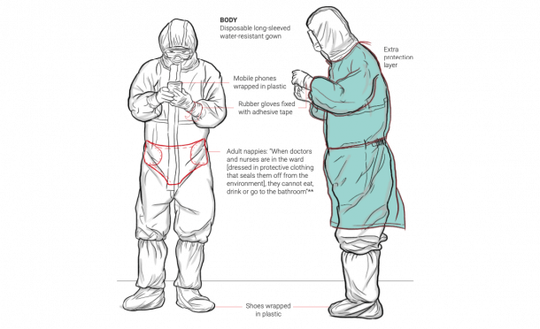
This thorough data visualization project by South China Morning Post explains how the COVID-19 outbreak began and how the then-mysterious disease rapidly spread from Wuhan to other countries around the world.
The dataviz covers all the important basics, including the symptoms and complications of the virus, information about proper hand hygiene, the conditions of the health care workers, as well as information about the animal meat market in Wuhan — which is believed to be the epicenter of the coronavirus outbreak.
2. The ultimate COVID-19 real-time map
Source: Johns Hopkins University
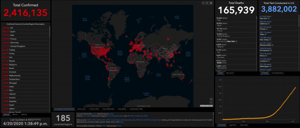
This interactive, web-based dashboard was created by the Center for Systems Science and Engineering at Johns Hopkins University and has become one of the world’s most authoritative sources for the latest coronavirus updates.
The dashboard provides the latest statistics on cumulative confirmed cases, active cases, and incidence rate around the world. You can also view the testing and hospitalization rate for COVID-19 in the US. This dashboard is a great point to start if you want to pull live-updating data into your own data visualization.
3. COVID-19 projections
Source: The Institute for Health Metrics and Evaluation (IHME)
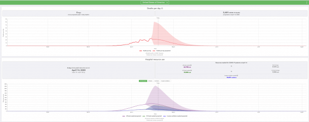
This data visualization provides initial estimates of when coronavirus infections could drop to one per 1 million people, projecting the possible timeframe of when social distancing policies could be relaxed. The dataviz also estimates hospital capacity and “peak resource use” to help hospitals and health systems prepare for the surge of COVID-19 patients.
4. Infection and fatality rates
Source: Information is beautiful
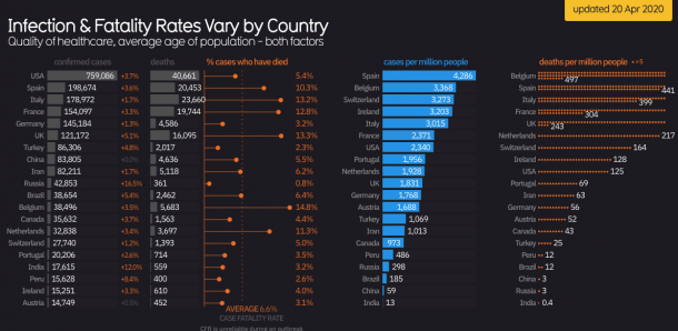
In this dataviz, you can discover the varying infection and fatality rates by country. The dashboard is a part of a larger COVID-19 #Coronavirus data pack that you can explore to investigate visualized data on the contagiousness of the virus, total mentions of the virus in the media, incubation periods, and more.
5. Consumer concern about COVID-19 in the US
Source: NRC health
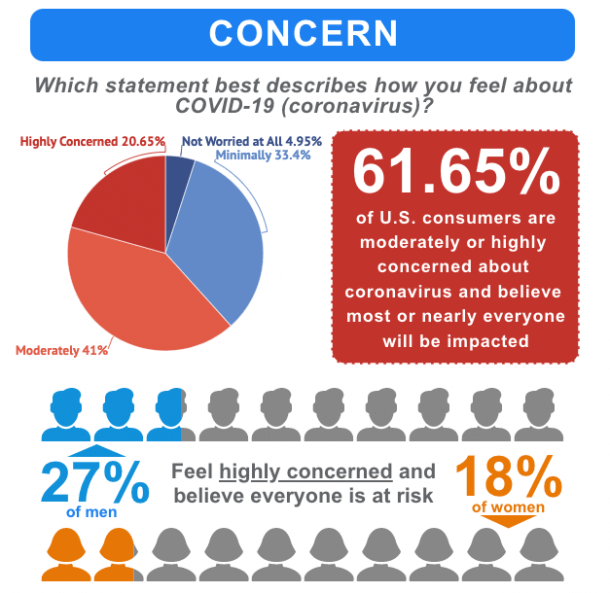
National Research Corporation Health (NRC Health) focuses on collecting vast volumes of healthcare consumer data to help healthcare organizations improve the aspects that matter most to patients and health care professionals.
One of their recent surveys looked into how Americans feel about the ongoing COVID-19 epidemic, how the epidemic has changed their daily routines, whether they feel the healthcare system is equipped to handle the outbreak and more. They recently also published an interactive dashboard on mental health insights in the US.
6. Coronavirus (COVID-19) in Australia
Source: covid19data.com.au
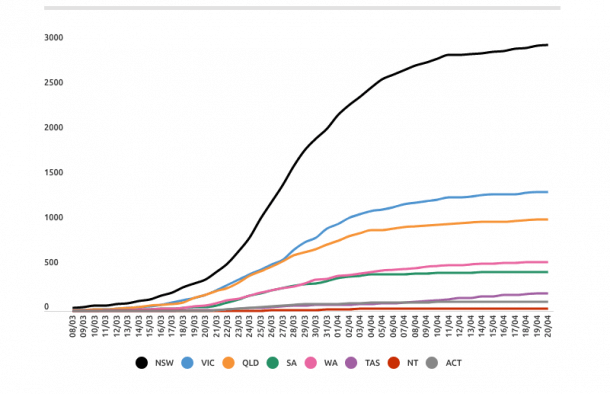
If you’re looking for more details about how COVID-19 has affected Australia, covid19data.com.au is a useful source to keep on the radar. The site and all data is managed by journalist Juliette O’Brien, who first started tracking individual coronavirus cases in Australia at case number 44, when other data was unavailable.
The website brings together fragments of information and data that are technically, but not practically, available to the Australian public, and present them clearly without editorializing or projecting.
All data used in the charts is based on media reports and verified updates from state and federal health departments in Australia. Each chart is time-stamped to show the exact date and time it has last been updated.
7. Track the cases in the UK and London
Source: MSN
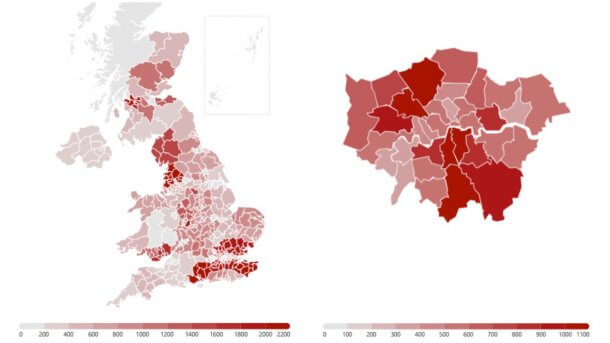
This interactive map published on MSN shows the number of cases of COVID-19 in each county of the UK and the boroughs of London. You can expand the map and hover over for the number of cases in the area of your interest. The data is collected from the local authorities in England, and health boards in Wales and Scotland.
You can also view a live map to see an overview of active, recovered, and fatal cases in each country worldwide.
8. COVID-19 clusters in Singapore
Source: covid19 SG
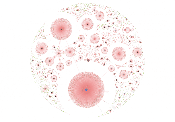
This network map lists all the patients who contracted COVID-19 in Singapore and recreates the clusters where each patient came into contact with the virus. For example, you can see that 47 people were infected at a private dinner function.
Even though the map shows data exclusively on Singapore, the complete transparency of the data is something other governments can learn from. Harvard epidemiologists have even called the city-state the “gold standard” for case detection. The commitment to transparency is at the heart of Singapore’s success in dealing with the outbreak, and as a result, they’ve been able to build social and political trust, prevent conspiracy theories, and avoid panic.
9. Media freedom violations
Source: International Press Institute
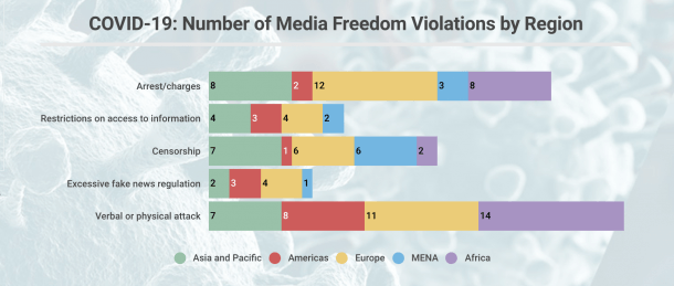
Amid the COVID-19 pandemic, press freedom is more essential than ever. The global health problems caused by the disease require effective measures to protect everyone’s lives, and this includes combating disinformation.
The International Press Institute closely monitors press freedom restrictions in this extraordinary situation and in this chart, you can learn more about the press freedom violations linked to the COVID-19 crisis.
10. Are you at higher risk for COVID-19?
Source: Spectrum News
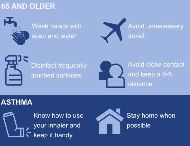
Last, but not least – this infographic by Spectrum News reminds the guidelines of how to keep yourself safe even if you’re in one of the groups of people who are at greater risk for coronavirus than others.
#StaySafe and let us know if there are other data visualizations you’ve found helpful. Or if you want to create your own infographics, charts, and other dataviz projects, learn more about visualizing data in a time of crisis.
Get data visualization tips every week:
New features, special offers, and exciting news about the world of data visualization.
