03.05.2018 by Infogram
There are a lot of great resources available that offer advice on effective data visualization design. But, who has time to search through multiple articles, websites, and research papers for hidden gems and useful tricks? We want to help you build great charts right now, which is why we put together this list of quick tips for you to consider when crafting your next visualization.
15 Quick Data Visualization Tips
1) Before you start designing your chart, stop to think about your story. What are you trying to say? Once you understand your message, the process is much easier.

2) Keep it simple. If it doesn’t support your story, leave it out. You don’t want to clutter your charts with unnecessary text, colors, drop-shadows, or 3D imagery.
3) Give your chart a strong title that clearly frames your message. Great titles make charts more memorable and digestible.
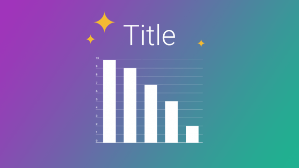
4) Scale your chart appropriately. The scale used on each axis must have equal intervals. This is a quick way to make sure your chart displays correctly.
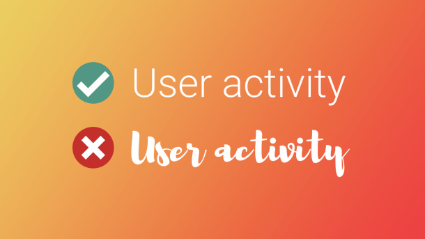
5) Pick a font for your title, axis labels, and legend that is easy to read. You want people to connect with your message quickly.
6) For the sake of transparency, always cite your sources. This gives you credibility, builds trust, and offers your viewers a chance to visit the source for more information.
7) Organize your data logically. Arrange columns and bars in order by value so they are easy to compare at a glance.

8) Use color to attract attention to a specific part of your chart. Bright colors attract eyes quickly, helping to get your message across faster.
9) Avoid rainbow or mixed color palettes. They may be pretty, but they aren’t necessarily effective. We suggest you choose one color for the whole chart or utilize a pop of color.

10) Don’t cherry pick the data you choose to visualize. While you may have impressive numbers to share, you need to give context and tell the whole story.
11) Label your data directly if it makes your chart easier to understand quickly. Place labels next to the appropriate lines or bars if a legend takes too much time to read.

12) Grid lines should be only used if they make it easier to read your data. Play around with vertical and horizontal gridlines until you feel like your chart is clear and concise.
13) Use company colors, fonts, and branding when presenting data internally. This makes your charts look polished and professional.

14) Try to avoid using pie charts to make comparisons. Pie charts are hard to compare at a glance, it’s best to use bar or column charts.
15) It’s easy to get lost in a visualization when you’re trying to get it just right. Give it to a friend or colleague! See if they can understand your message in 30 seconds or less.

We encourage you to share your favorite tip with your friends on social media. Copy and paste the text, add a picture, tag people, and post! We love sharing fun data visualization information with our followers, like the tweet you see below. ????
Pro #dataviz tip: Don’t cherry pick the data you choose to visualize. While you may have impressive numbers to share, you need to give context and tell the whole story. Visualize your data story with Infogram ➡️https://t.co/aohbIzkuZE pic.twitter.com/MiRPVUBt6r
— Infogram (@infogram) April 29, 2018
Interested in discovering how Infogram can enhance your team’s work? Join a brief Zoom session with our Infogram representative to explore key features, get answers to your questions, and understand how we can assist. It’s quick, informative, and just like a coffee break chat. Schedule your call now!
Get data visualization tips every week:
New features, special offers, and exciting news about the world of data visualization.