17.06.2025 by Infogram
Infogram now includes the option to adjust the height of rows in tables. This new setting allows you to control how much vertical space each row takes up – making it easier to format your tables based on the type and density of content you’re working with.
Whether you’re building data-heavy dashboards or creating content-rich reports, having control over row height helps improve layout flexibility and visual clarity. You can create compact tables that save space or increase row height to improve readability for more detailed information.
How This Helps You
By default, table rows have a fixed height that might not suit every project. With the ability to customize row height, you can:
- Make complex data easier to read with more breathing room.
- Tighten layouts by reducing unused space in compact tables.
- Align tables more easily with other elements in your report, slide, or dashboard.
This change gives you more control over how your tables look and function, so your content fits better within your overall design.
What You Can Do With It
- Writers and researchers can present detailed notes or categories more clearly, especially when working with long text entries.
- Designers can fine-tune visual balance and alignment across pages, ensuring tables feel consistent with the rest of the layout.
- Managers and analysts can create cleaner, easier-to-read summaries that make key figures or comparisons stand out, particularly when sharing performance or KPI data.
How It Works
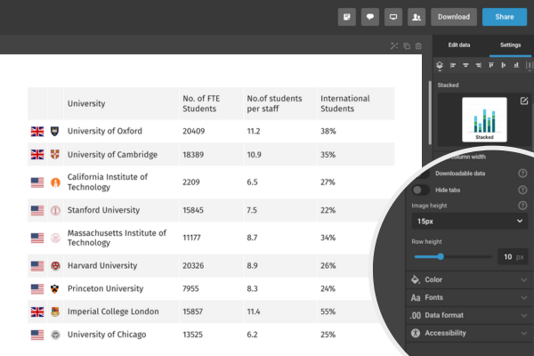
- Open your table in Infogram.
- In the right-hand menu, go to Table properties.
- Find the Row height setting.
- Use the slider to increase or decrease the row height as needed.
- The table will update automatically to reflect your changes.
You can adjust the height anytime, so it’s easy to test what looks best with your content.
The adjustable row height feature is now available in Infogram. Whether you’re preparing a presentation, building a dashboard, or designing a report, this update gives you more flexibility to work the way you want.
Get data visualization tips every week:
New features, special offers, and exciting news about the world of data visualization.