21.12.2017 by Infogram
’Tis the season for holiday cheer, parties, and presents – and while we can’t help with wrapping gifts, we can certainly share a few. With stunning visualizations surfacing every day, 2017 has been a great year for data-driven masterpieces.
Each year, the Kantar Information is Beautiful Awards celebrate excellence and beauty in data visualizations, infographics, interactives, and information art. Last month they announced who got to take home the trophies.
Here are five of our favorite data visualization projects that won gold in a variety of prestigious categories at the 2017 Information is Beautiful Awards:
The Unlikely Odds of Making it Big
by Russell Goldenberg & Dan Kopf – The Pudding
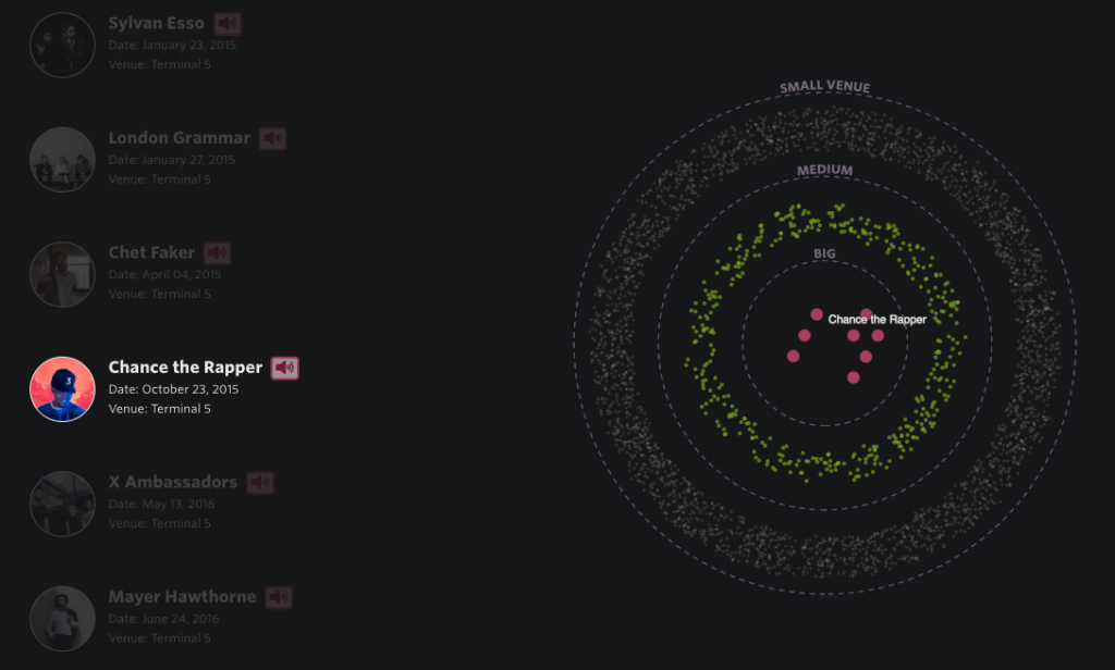
What three years and 75,000 shows in New York tell us about the chance your favorite band will succeed. In 2013, over 7,000 bands played small shows in the NYC area. This amazing interactive visualization walks you through just how many of those made it big by October of 2016.
How Do You Draw a Circle?
by Thu-Huong Ha & Nikhil Sonnad – Quartz
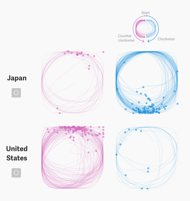
Hundreds of thousands of people around the world have played Google’s game Quick, Draw! prompting us to ask what takeaways it might have for global culture, like whether your location and language affect how you draw. Using circles, the great universal symbol, Nikhil Sonnad and Thu-Huong Ha of Quartz answered that question.
When Napoleon Ventured East
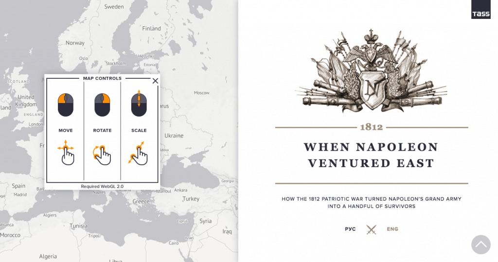
A special historical project by Russian news agency TASS dedicated to one of the most dramatic pages in Russia’s past – the Patriotic War of 1812. This program is based on a map outlined by French engineer Charles Joseph Minard in 1869.
This statistical diagram presents a graphic picture of Napoleon’s Russian campaign and all the stages that eventually led to his army’s defeat.
Rhythm of Food
by Moritz Stefaner, Yuri Vishnevsky, Simon Rogers, Alberto Cairo et al.
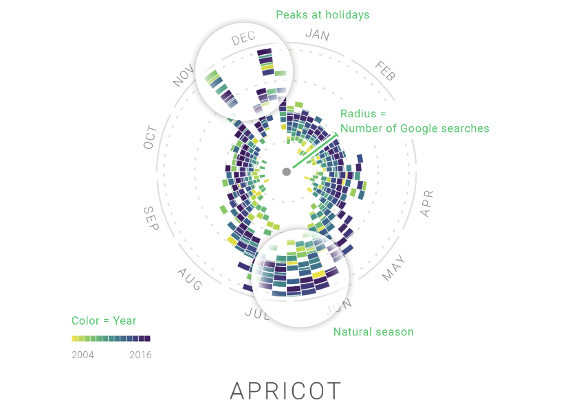
Google News Lab and Truth & Beauty explored Google Trends data to see how we search for food. These mesmerizing, interactive radial charts are both beautiful and educational. Explore the rise and fall of recipes, various diets and drinks, cooking trends and regional cuisines.
Data Sketches
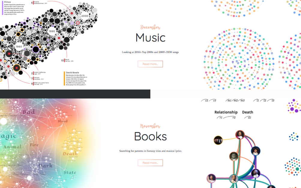
Data sketches is a year-long collaboration in 12 installments. On average taking a month per project, Nadieh and Shirley create an extensive data visualization of a different topic and write about their design, creation processes, and learnings. Their work is creative, colorful, personal, and wildly entertaining.
Build amazing visualizations in 2018 with Infogram. We recently announced a completely redesigned version of our award-winning tool, introducing a new flexible drag-and-drop editor, beautiful designer templates, and more powerful chart capabilities than ever before. Try it out! We know you’re going to love it.
Interested in discovering how Infogram can enhance your team’s work? Join a brief Zoom session with our Infogram representative to explore key features, get answers to your questions, and understand how we can assist. It’s quick, informative, and just like a coffee break chat. Schedule your call now!
Get data visualization tips every week:
New features, special offers, and exciting news about the world of data visualization.