17.10.2018 by Infogram
If you want to get another job, advance your career, do better in school, or grow your business with data, we have a solution for you – free online courses! Browse this list of classes you can take from home to become a data pro without spending a dime.
Free Data Visualization Online Courses
1) Introduction to Data Analysis using Excel
In this course, you will learn how to perform data analysis using Excel’s most popular features. You will learn how to create pivot tables from a range of rows and columns, showing you the power of pivots in action. In 4 weeks you’ll be able to gain valuable insights from pivot tables, calculate margins, filter data, and create aggregate reports.
2) Data Visualization: A Practical Approach for Absolute Beginners
 The ability to create charts that are compelling, accurate, and tell a story is becoming a core skill of any job in the 21st Century. This course provides a practical approach to learning the theories and techniques of data visualization for data analysis. In 4 weeks you’ll be able to build the basic chart types and create basic reports and dashboards.
3) Introduction to Data Science
Learn what it takes to become a data scientist from Microsoft in this introductory course. You’ll learn how Microsoft’s Data Science curriculum works, as well as the basics of exploring data using a variety of visualization, analytical, and statistical techniques. In 6 weeks you’ll be able to plan your next steps in their program, basic visualization techniques in Excel, and foundational statistics used to analyze data.
4) Data Analysis Essentials for MBA Success
If you want to study for an MBA, but you’re not sure what basic data analysis is required, this course is for you. The goal of this course is to teach you fundamental data analysis skills so you are prepared for your MBA study and able to focus your efforts on the core MBA curriculum. In 6 weeks you’ll learn the fundamentals of presenting data and data-based decision-making.
5) Analytics for Decision Making
This statistics and data analysis course will help you understand the fundamental concepts of sound statistical thinking that can be applied to a variety of contexts. In 4 weeks you’ll learn about variability in the real world, data types, appropriate visualizations, effective decision-making, and how to apply these learnings to managerial decisions in start-up environments.
6) Intro to Data Science, Tools, and Methodology
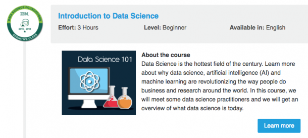
IBM offers three simple courses for aspiring data scientists. This learning path currently consists of one course that introduces you to Data Science from a practitioner’s point of view, to courses that discuss topics such as data compilation, preparation, and modeling throughout the life-cycle of data science from basic concepts and methodologies to advanced algorithms. It also discusses how to get some practical knowledge with open-source tools.
7) Analytics for the Classroom Teacher
This course is an introduction to the emerging field of teaching and learning analytics from the perspective of a teacher. You’ll learn how teachers, curriculum developers, and policymakers are collecting and analyzing data from the classroom to help guide decisions at all levels. In 6 weeks you’ll see how data analytics can improve the classroom while also gaining an understanding of current analytics tools and data-driven lesson planning.
This course focuses specifically on the ethics of data and data science. This course will provide you with the framework to analyze concerns regarding data collection, analysis, privacy, and the consequences of sharing data. In 4 weeks you’ll go over who owns data, the definition of informed consent, and what it means to be fair with data.
9) Data Analysis: Visualization and Dashboard Design
Turn raw data into beautiful charts and dashboards with this course. This course covers the main tasks required from data analysts today, including importing, summarizing, interpreting, analyzing, and visualizing data. It will equip you with the tools that will enable you to be an independent data analyst. In 6 weeks you’ll learn how to build basic charts and dashboards.
10) Data Analytics for Business
This course teaches the scientific process of transforming data into insights for making better business decisions. It covers the methodologies, issues, and challenges related to analyzing business data. It’s a little long at 15 weeks, but when you’re done you will know how to approach business problems analytically with data.
11) Marketing Analytics: Marketing Measurement Strategy
Marketers depend on metrics to determine the success of their campaigns. In this course, you’ll learn how to execute market sizing, identify market trends, and predict future conditions. Analytics-based marketing is increasingly important in determining a company’s spending and ROI. In 4 weeks you’ll know how to understand marketing metrics and successfully measure your success.
12) Data Visualization for All
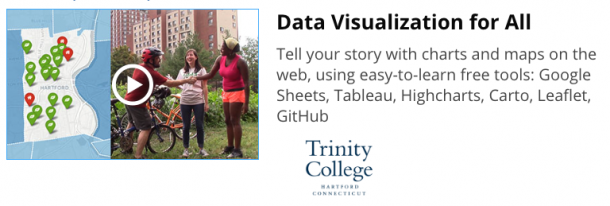
In this data visualization course, you will learn how to design interactive charts and customized maps for your website. It begins by showing you easy-to-use tools, followed by step-by-step tutorials, then offers real-world examples. This 6-week course is perfect for nonprofit organizations, small business owners, local governments, journalists, academics, or anyone who wants to tell their story with data.
13) Practical Learning Analytics
Learning analytics is the measurement, collection, analysis, and reporting of data surrounding learning. This class focuses on using traditional student record data – the kind every campus already has. It will address questions raised by stakeholders, campus leaders, faculty, staff, and students. In 4 weeks you’ll learn how to bring in data or your own for analysis and visualization.
14) Analytics Storytelling for Impact
In this analytics storytelling course, you’ll learn effective strategies and tools to master data communication through well-crafted analytics stories. You’ll learn what a story is, why they matter, and how to craft a great story. Get practical help applying these ideas to your data analytics work. In 6 weeks you’ll be able to apply storytelling principles to your analytics and improve your presentations with stories.
15) ProPublica Data Institute Online
Couldn’t attend the ProPublica Data Institute? Now you can learn some of the lessons from home. This year they recorded five video lessons from the institute and you can watch them online. They cover an intro to coding, how websites work, HTML, basic CSS, and CSS classes. These videos are perfect for journalists trying to learn data journalism and interactive database design.
We’ve spent time creating resources that you can access right now, but we plan to offer a data visualization course in the near future. What would you like to see us teach?
Interested in discovering how Infogram can enhance your team’s work? Join a brief Zoom session with our Infogram representative to explore key features, get answers to your questions, and understand how we can assist. It’s quick, informative, and just like a coffee break chat. Schedule your call now!
Get data visualization tips every week:
New features, special offers, and exciting news about the world of data visualization.


