
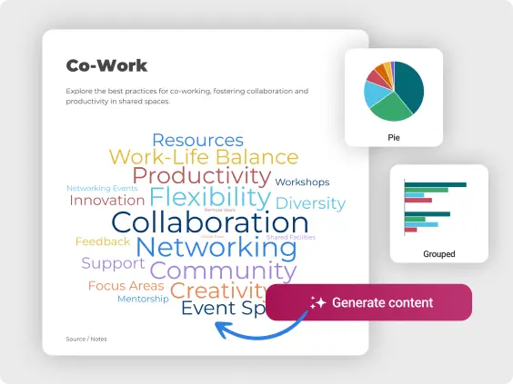
Create Interactive Charts
Explore different chart types to visualize time series data, categories, and numerical values, and discover how interactive features can improve your data storytelling.


4.7 out of 5 stars


Overview
Why
Types
Examples
Reviews
Tips
FAQ
Present Data with Impact
Charts are powerful tools for visualizing data, allowing you to present complex information clearly and engagingly. Whether you're working with time series data, categories, or numerical values, charts can help transform raw data into meaningful insights that are easy to understand and analyze.
In a typical chart, the x and y axes represent different variables, such as time, categories, or quantities. Depending on the type of chart—whether it's a bar chart, line chart, pie chart, or scatter plot—data points are displayed in a way that highlights trends, comparisons, or distributions. For example, line charts are ideal for showing changes over time, while bar charts are great for comparing different categories.
Moreover, charts can be customized with colors, labels, and interactive elements to enhance their storytelling power. Interactive charts, in particular, allow users to explore the data more deeply, offering a dynamic way to engage with the information.
Explore Why Charts Are Useful
Unlock the potential of visual storytelling and see why charts are essential tools for presenting data effectively.
Simplify Complex Data
Transform large, complex datasets into clear visual formats that are easy to interpret. By turning raw numbers into graphs and charts, you quickly highlight key insights without overwhelming your audience with information. This visual approach makes it easier for anyone to grasp important concepts and trends at a glance, leading to better understanding and engagement.
Whether you're analyzing survey results, financial reports, or performance metrics, clear visuals can break down intricate details into digestible pieces, making it easier to communicate essential findings and drive informed discussions.

Improve Data Storytelling
With these charting tools, you can create visuals that effectively tell your story. Whether you want to showcase a trend, illustrate a comparison, or highlight critical data points, your charts will help transform raw data into compelling narratives.
For instance, marketers can visually represent campaign performance over time, making it easier to communicate results to stakeholders. By incorporating storytelling elements into your visuals, you can evoke emotions and facilitate a deeper connection with your audience, ensuring that your message resonates and prompts action based on shared insights.

Advance Decision-Making
Visualizing data through charts allows you to spot trends, patterns, and outliers quickly. This clarity leads to more informed decisions, whether you’re in business, research, or any field where data guides strategy.
Sales teams can use visual data to identify high-performing products and adjust their approaches in real-time, while content creators can analyze audience engagement to refine their strategies. By making it easier to analyze and understand data, visualizations help you respond to new opportunities or problems quickly. This can create a culture of decision-making based on data throughout your organization.
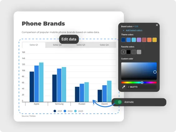
Customize and Improve Interactivity
You have extensive customization options to tailor your charts to your needs. By adjusting colors, labels, and chart types, you can create visuals that align perfectly with your branding and messaging. Interactive charts add another layer of engagement, allowing your audience to explore data in greater depth.
This dynamic experience keeps viewers interested and encourages them to interact with the information you present. Customization also means you can emphasize particular data points or trends, ensuring that your audience focuses on what matters most, improving their understanding and retention of key messages.
Boost Engagement
Well-designed charts not only look appealing but also capture and hold your audience's attention. In presentations, reports, or online content, these visuals make data-driven content more engaging, ensuring your message is not just seen but also remembered.
For example, educators can use engaging charts to present complex topics, making learning more interactive and effective. By turning complicated data into attractive visuals, you can make people more likely to remember the information. This can lead to a deeper understanding and more discussions about the insights, which can ultimately drive better outcomes.
Represent Data Effectively
Choose from a wide variety of chart types, including bar, line, bubble, and heat maps. This versatility ensures you select the best format for your specific data, highlighting the most important insights effectively.
For example, a marketer can use a pie chart to represent market share, while a researcher might prefer a scatter plot to show correlations in their findings. By matching the right chart type to your data, you improve clarity and make your findings more impactful. This adaptability allows you to cater to diverse audiences, ensuring that your visuals resonate and clearly convey the intended message.

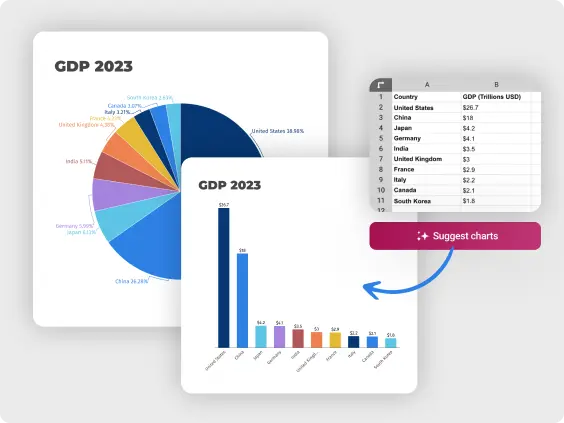
AI-Powered Charts For Saving Time
Now with an AI chart generator, you can create interactive, visually captivating charts in a fraction of the time it would take to do manually. All you need to do is paste your data or type in a topic, and the AI instantly generates a fully customized chart for you.
Unsure which chart type best suits your data? The AI analyzes your information and suggests the most effective options, making sure your visuals communicate your data clearly and impactfully. By saving time on chart design, you can focus on interpreting your data and delivering your message.
Chart Types to Explore
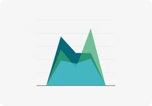
Area Chart
Illustrate cumulative data or multiple series' composition over time by filling the area between the line and x-axis.
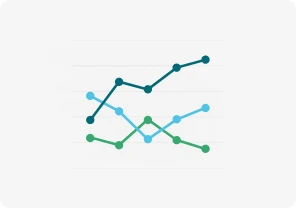
Line Chart
Shows trends over time using an x and y-axis.

Pie Chart
Displays percentages, with all slices totaling 100%, showing parts of a whole.

Pictorial Chart
Uses icons or pictures to visually represent data in an engaging way.
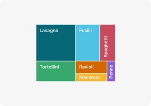
Treemap
Shows hierarchical data as rectangles, with size and color reflecting value.
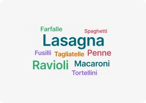
Word Cloud
Visualizes word frequency, showing which terms appear most often.
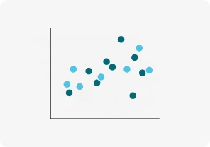
Scatter Chart
Plots data points on x and y-axes, showing relationships between variables.

Bubble Chart
Uses bubble sizes to represent numeric values on an x and y-axis.
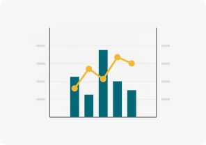
Dual Axis Chart (line and column)
Compares two sets of data with different scales using two axes.

Gantt Chart
Tracks tasks over time with horizontal bars, visualizing project timelines.
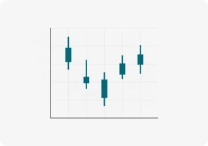
Candlestick Chart
Shows stock price movements, displaying open, close, high, and low prices.
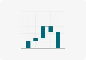
Waterfall Chart
Tracks how positive and negative changes affect a value step by step.

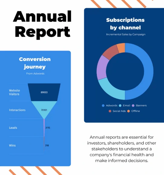
Funnel Chart
Shows data narrowing through stages until the final result at the bottom.
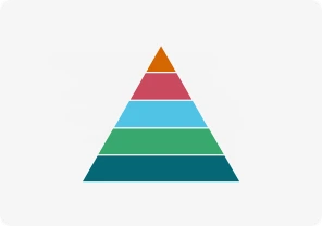
Pyramid Chart
Displays hierarchical data in a triangle-shaped chart with different section sizes.

Radial Chart
Compares categories using circular bars in a polar system.
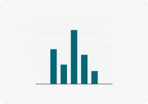
Column Chart
Uses vertical bars to compare data over time or across categories.

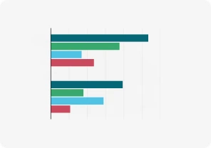
Bar Graphs
Uses rectangular bars to compare values across different groups.
Race Bar Chart
Shows bars moving over time, visualizing rapidly changing data.

Population Pyramid
Shows age and gender distribution using back-to-back bar graphs.

Tornado Diagram
Compares variables' impact on outcomes with horizontal bars.

Sunburst Chart
Displays hierarchical data using concentric rings to represent levels.

Radar/Spider Chart
Compares categories across axes radiating from a central point.

Sankey Diagram
Shows data flow between stages using arrows of varying thickness.

Alluvial Chart
Tracks changes in data categories over time using flowing streams.
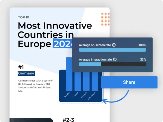
Get Inspired by Infogram User-Created Projects
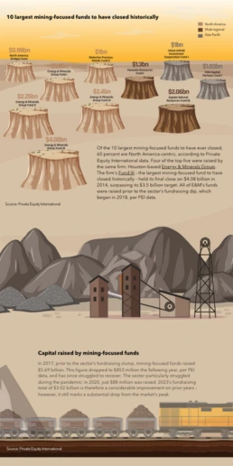
10 Largest Mining-Focused Funds to Have Closed Historically

The Challenges of Remote Work

A snapshot of greater Portland's need for affordable homes

The Working Poor in California

Snapshot of Non-Cash and Cash Trends

TX Operation Lone Star

What Spain Has to Lose from Catalan Independence

Travel Through Space
Customer Reviews
Here is what our customers have to say about us.
2022 Summer & Fall and 2023 Winter leader in Data Visualisation Software 4.7 out of 5 stars
See reviews on G2 ›Empowering 30,000+ Companies Worldwide
From startups to established enterprises, our platform has been embraced by a diverse range of businesses seeking to captivate audiences and simplify complex data. Here are just a few examples of the 30,000+ companies that use Infogram.


Learn More Practical Tips
Business
Best Ways to Visualize and Analyze Polling Data
Data
AI for Data Analysis: Maximizing Value From Your Data
Data
The Complete Guide to Different Types of Charts
Design
20+ Graphic Design Tips for Mastering Your Visuals
Design
Chart Dos and Don’ts: The Ultimate Data Visualization Guide
Design
Good and Bad Data Visualization Examples
Frequently Asked Questions
How to add data to a chart?
Add data manually or by copy-pasting.
- To add a chart to the canvas, click Add chart in the left-side toolbar and select the chart you wish to use. Drag-and-drop the chart onto the canvas.
- Go to the Edit data tab in the Settings panel on the right or double-click the chart to access its data table.
- Click on a cell and start typing or use keyboard controls to copy-paste:
- Right-click a cell to access a menu with styling options:
Note: To access the option to Add/change link, you need to have a Business subscription or higher.
How does Infogram make interactive maps easy to create?
Infogram’s 800+ maps and simple tools let you build dynamic maps quickly. A data journalist can create a clickable election map, while a market researcher can plot customer locations, all without design skills. Import data from spreadsheets or PDFs, and add features like tooltips or animations. It’s fast, intuitive, and needs no coding.
How to pick the right chart for your data?
The first question you should always ask yourself is whether visualizing your data is really necessary. Would it make the story easier to understand? Does it provide context? Is it relevant?
Including a visualization just for the sake of it can be confusing and reduce the impact of your story. Remember that bad data visualization can be worse than none at all.
It’s important to choose the right kind of graph to visualize your data. Here you will find a brief summary of various types of graphs and when it’s best to use what.
Take that into account! Make your visualizations as simple and clean as possible, it makes them much easier to understand and usually more visually appealing. Keep the ‘data to ink ratio’ in mind – if you had to print your visualization try and show as much information as possible using the least ink.
How to edit chart settings?
Customize charts to look just the way you want them to! Chart settings are located in the right sidebar of the editor.After adding a chart to your project, select it once to access chart settings. Use tabs at the top to switch between the data table and settings.Here you can add animation to your chart, as well as edit (click on hyperlink settings to be redirected to tutorial articles):
- Chart properties
- Color
- Axis and grid
- Fonts
- Legend
- Tooltips
- Data format
- Accessibility
Where to use interactive charts?
It’s time to stop thinking about charts as boring, black and white, 2D boxes buried in a sea of text. Anytime you need to grab your audience’s attention (and keep it) Infogram allows you to become a visual storyteller.
Create a chart for any of the following:
1. Business reports and presentations
2. Blog posts
3. News articles
4. Research article
5. Social media profiles
6. Marketing campaigns
7. Landing pages
8. eBooks and long-form content
9. Presentations
10. Any other pivotal marketing or communication channels
How to create a chart?
Infogram has made this easy with five steps:
1. Log in to Infogram
2. Select a chart type from the chart menu.
3. Upload or copy and paste your data.
4. Customize your look/feel with labels, colors, fonts, and graphics.
5. Download your chart as an image, or embed it on your website.
Didn't find the answer? Check our FAQs

Try Infogram Now!
Are you ready to unleash the power of data visualization? Get started with Infogram today and create stunning, interactive content that captivates your audience. Elevate your projects and bring data to life.