27.07.2016 by Infogram
Our team has been working hard this month designing new map labels, redesigning the look and feel of our homepage, and creating brand new charts. Here are Infogram’s major updates for the month of July:
1) Map Labels + Icons
Region + Country Names – You now have the option of adding region or country names to the maps you create. Simply double-click on the map to open your editing options and click the ‘Region names’ button along the top bar – like the map of France below.
Map Icons – Infogram offers over 200,000+ amazing icons, and now you can add them to your maps! Double click on the map you want to edit and select the ‘Markers’ button along the top bar. The size of the icons corresponds to the numerical value of the region or country. Select the icon you want and change the colors accordingly.
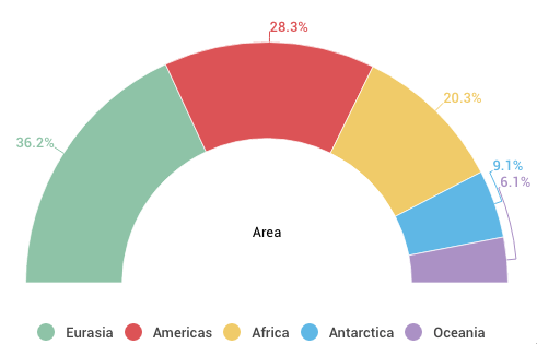
2) New Semi-Circle Chart
New charts are very exciting here at Infogram. We’d like to introduce you to our brand new semi-circle pie chart. This type of chart represents parts of a whole in the shape of a semi-circle, divided into sections. This chart is excellent if you want to save space and add style to your next blog post, email campaign or report.
3) Infogram Redesigns
New Homepage Design – Our homepage has gone under a slick redesign, giving it a more real-world feel. Check it out!
Theme Names – Infogram offers a large selection of beautiful theme templates to help you get started quickly. You will find each theme labeled with its individual theme name. Now it will be even easier to remember which themes you love to work with.
Would you like to experience the full power of data visualization? Try Infogram for Teams or Enterprise for free! With a Team or Enterprise account, you can create up to 10,000+ projects, collaborate with your team in real time, use our engagement analytics feature, and more. Request your free demo here.
Get data visualization tips every week:
New features, special offers, and exciting news about the world of data visualization.


