12.09.2023 by Infogram
In the realm of data visualization, table charts play a fundamental role, weaving together tabular data in a neat and organized format. From financial reports to market analyses and project timelines – table charts are the backbone of data representation. They allow us to turn complex datasets into structured insights, enabling us to make informed decisions and share knowledge effectively. At Infogram, we recognize the importance of tables as a key tool for data communication. That’s why we’re excited to introduce a set of game-changing features for editing table charts to improve the process of creating and presenting tabular data.
Click to explore new features:
Revamped editor toolbar
Cell-level rich-text table editing
Expanded text alignment options
Cell-level coloring

Elevating data visualization with interactive and engaging tables
While the traditional role of table charts has been to provide an organized view of data, their potential goes far beyond mere organization. Today, tables as well as other charts are expected to be interactive, visually captivating, and rich in contextual information. Just look at a few of the best table examples, and you can notice the level of visual appeal and data storytelling experience they offer.
Tip: If you’re wondering when to use chart vs. table, read our article on charts vs. tables.
Whether you’re a business analyst conveying quarterly performance figures or an educator illustrating complex concepts, the power of your message relies on the engagement and clarity of your data tables.
With that in mind, we’re excited to introduce new features for editing table charts that’ll amplify the impact of your tabular data. So without further ado, let’s dive right in!
Revamped editor toolbar
The revamped editor toolbar will elevate your data customization experience. It conveniently situates the commonly used rich-text table editing choices just above your data table, saving you time and improving your workflow. To illustrate the benefits, here are three scenarios where this feature proves exceptionally useful:
Effortless report creation for analysts
Analysts can now seamlessly format their data presentations. With the new toolbar, they can quickly adjust fonts, colors, and styles, ensuring reports are visually engaging and easy to understand.
Simplified content management for content creators
If you’re a content creator, you can benefit by spending less time on design and more on crafting compelling content. By easily formatting text, creating lists, and applying headings through the toolbar, you can save time that can be devoted to improving the quality of your work.
Improved collaboration for teams
Team members can now harmonize the visual elements of their documents effortlessly, as the toolbar simplifies aligning text, tables, and images, maintaining a consistent look throughout.
Ultimately, by incorporating the new editor toolbar into your workflow, you benefit from increased efficiency, collaboration, and creativity.
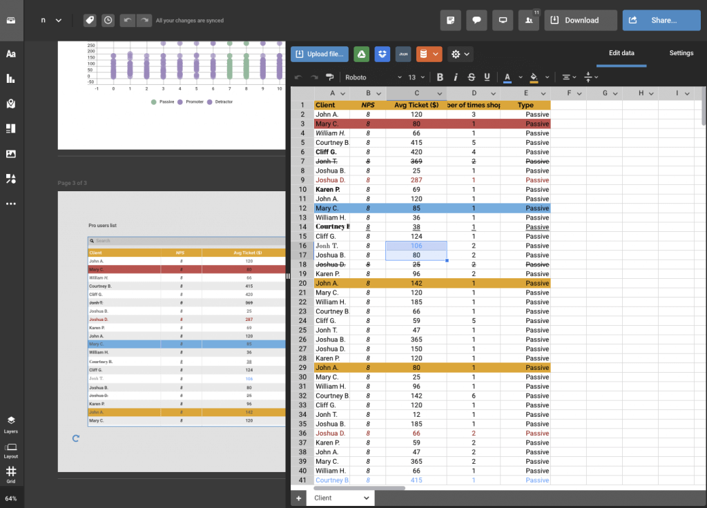
Cell-level rich-text table editing
Prepare to take your data tables to a whole new level of sophistication. With our latest update, not only can you assign distinct fonts, font sizes, and colors to individual rows or columns, but you can even apply these rich-text table editing possibilities to different sections within a single cell. This level of granular customization opens up more possibilities, allowing you to highlight specific data points for maximum impact. Let’s look at three examples showcasing the usefulness of this feature:
Financial analysts crafting comprehensive reports
Financial analysts can now make their reports more comprehensible and visually striking. By assigning different fonts, colors, and sizes to specific rows or columns, analysts can emphasize critical data like revenue growth or expense trends. Additionally, they can apply distinct formatting within a cell to highlight significant figures, helping stakeholders grasp essential insights at a glance.
Marketers creating impactful campaign analysis
Marketing teams can elevate their campaign performance analysis. Using the new customization feature, it’s possible to apply varying styles to sections within a cell to showcase key metrics like click-through rates or conversion percentages. This enables marketing professionals to create visually engaging dashboards that clearly present campaign effectiveness and help with strategic decision-making.
Researchers presenting data in scholarly papers
Academic researchers can enhance the visual appeal of their research findings. By customizing fonts, colors, and styles for different sections within a cell, they can effectively highlight specific data points in complex tables or charts. This feature is particularly valuable when presenting nuanced results or statistical significance in academic papers, making it easier for readers to interpret and engage with the research.
No matter the case, this feature allows you to communicate your data with precision and impact, ensuring that your messages resonate effectively with your target audiences.
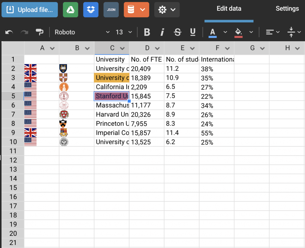
Expanded text alignment options
Along with rich-text editing, we’ve expanded text alignment options. In addition to the familiar left, center, and right alignment choices, you can now precisely position your values vertically – whether at the top, middle, or bottom. This upgrade is especially useful for those dealing with intricate datasets that demand utmost precision.
Cell-level coloring
Your data isn’t just about numbers; it tells a story. So with the creative freedom that cell-level table editing feature enables, you can also take control of cell-level table coloring options. Now you can easily assign colors to individual cells, allowing for a more immersive and engaging data presentation. Cell-level coloring provides your audience with an instant visual cue about data significance, trends, or categories. This level of customization transforms data points into compelling visuals that resonate with your viewers.
Bringing data storytelling to the table
Our commitment to innovation, usability, and data-driven communication remains steadfast. And we’re excited to bring more functionalities that elevate data storytelling to the table (pun intended). Explore the possibilities, embrace the new editing features, and empower your data visualizations with Infogram. Your data has a story – and with Infogram, your story can be told more dynamically. Learn more about the table chart functionalities here.
Interested in discovering how Infogram can enhance your team’s work? Join a brief Zoom session with our Customer Success Manager to explore key features, get answers to your questions, and understand how we can assist. It’s quick, informative, and just like a coffee-break chat. Schedule your call now!
Get data visualization tips every week:
New features, special offers, and exciting news about the world of data visualization.