02.12.2015 by Infogram
“Of all the graphic forms used today, the scatter plot is arguably the most versatile, polymorphic, and generally useful invention in the history of statistical graphics.” – Michael Friendly and Daniel Denis, Journal of the History of the Behavioral Sciences
While it’s generally accepted that scatter plots are incredibly useful, historians don’t know quite where they came from. Unlike the pie chart, line graph, and bar graph, scatter plots were not invented by Scottish engineer and political economist William Playfair. In fact, nobody is widely credited for having invented the scatter plot.
 Scatter plots, a lot like line graphs, use horizontal and vertical axes to plot data points. But, scatter plots have a very unique purpose – they show how one variable affects another, meaning you can visualize relationships and trends in the data.
How to Read a Scatter Plot
Scatter plots were the first truly two-dimensional (2D) graphs. They consist of two axes and plotted data points, with each point on the scatter plot corresponding to one value of the data set. Each point is plotted based on the values of each axis. Therefore, they show two dimensions at once!
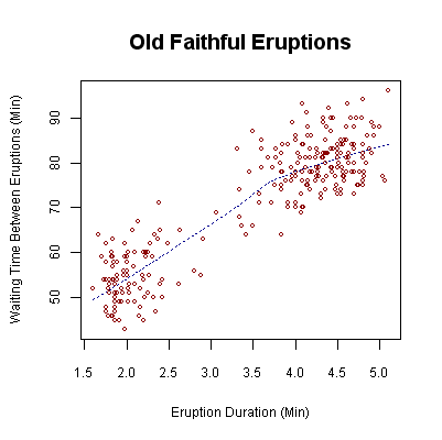
The relationship between two variables is referred to as their correlation. The closer the data points come to making a straight line means the correlation between the two variables is higher, or the relationship is stronger. When reading a scatter plot you need to look at the direction, slope, and strength of the data points. It doesn’t matter if you are plotting education vs salary, or hours spent studying vs final grades on a test, these graphs show a few common trends. Let’s go over the different ways to read a scatter plot.
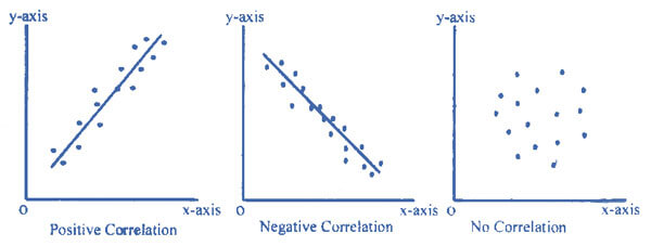
- Positive Correlation – If the slope starts from the bottom left and ends on the upper right the correlation is positive. Both values are increasing together. A perfect positive correlation is given the value of 1. In perfect correlations, the data points lie directly on the best fit line.
- Negative Correlation – The correlation is considered negative if the slope begins on the upper left and falls towards the bottom right of the scatter plot. This means one value is increasing while the other is decreasing. A perfect negative correlation is given the value of -1.
- Null – This scatter plot trend shows no correlation between the data points. If there is no correlation present the value is 0.
- Correlation Strength – Here is where the number value corresponding to the correlation comes into play. The closer the number is to 1 or -1, the stronger the correlation, or the stronger the relationship between the variables. The closer the number is to 0, the weaker the correlation, which means the data is further away from the regression line (best fit line).
What are Regression Lines?
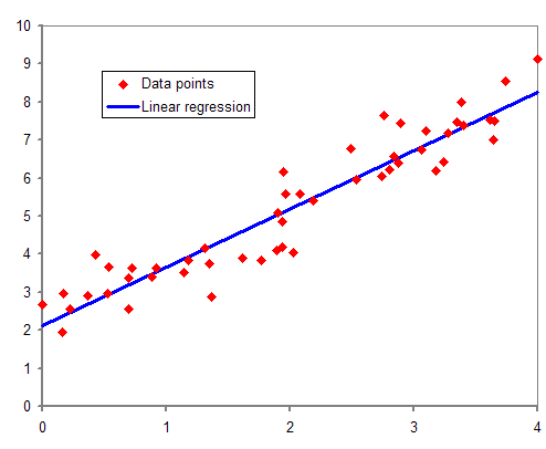
Linear regression is a method for modeling the relationship between two variables. It consists of finding the best-fitting straight line through points on a scatter plot, showing the correlation and overall trend. The line that fits best is known as a regression line. This is also useful for guessing the value of Y when you know X.
How to Use Scatter Plots
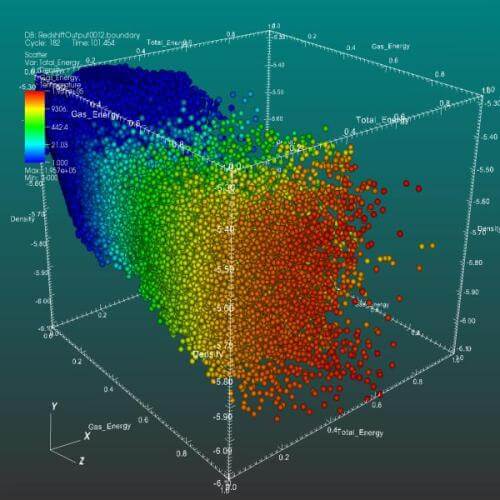
A 3D scatter plot allows the visualization of multivariate data.
– Scatter plots are a wonderful way to show how one variable impacts another. You can use a scatter plot to effectively show how the amount of caffeine consumed affects the time people go to sleep.
– Unlike other graphs, scatter plots lend themselves to large sets of data. If you want to graph the stars in the sky by color and luminosity, for example, you can plot the data without it looking cluttered and confusing. It may even unlock specific trends you couldn’t see while looking at the raw data.
– If you want to compare regression lines, don’t use more than two. Again, the scatter plot can get messy if you try to compare too many relationships/trends.
– That being said, feel free to add other variables. Your scatter plot may be more detailed or more colorful if you have another variable to graph. Just make sure the variable(s) you add are relevant to the story you are trying to tell.
– It may sound obvious, but start the Y-axis at 0. If you set the Y-axis above 0 it skews the way your graph looks, and your data won’t be presented accurately.
Remember: Correlation does not always equal causation – other factors may have influenced the data and gone unnoticed.
Get data visualization tips every week:
New features, special offers, and exciting news about the world of data visualization.