18.02.2025 by Infogram
Are you looking for creative infographic design ideas? In this article, you’ll find plenty of inspiration for your infographic designs. From timeline infographics to interactive designs, explore 25+ infographic design ideas that’ll help you spark inspiration for your next project.
Infographics are an essential tool in visual storytelling that can help you transform complex information into easily digestible content. By exploring and trying out different designs, you can enrich your infographics and make them truly stand out. Each design is tailored for communicating different types of information, making it a perfect choice to either break down a process or compare datasets.
Furthermore, by using Infogram to create your infographic designs, you can streamline the creation process. Infogram features like the AI infographic maker, AI chart suggester, interactive elements, or easy data imports will elevate and improve the experience and end result.
Now, without further ado, discover and get inspired for your next project with these creative infographic design ideas!
Infographic design ideas
From simple infographic design ideas to creative design ideas, discover how you can elevate your projects and tailor them to showcase different information.
Timeline infographic
A timeline infographic is an effective way to present a chronological narrative that highlights progress or significant milestones over time. It can illustrate a company’s growth, a product’s development journey, or key historical events leading to a momentous achievement. To improve engagement and readability, use markers or icons for specific events and apply distinct colors, textures, or layouts (such as horizontal, vertical, or circular) to denote time periods. Incorporating interactivity, like clickable dates for additional details in digital formats, can further enrich the viewer’s experience while maintaining a clear focus on the timeline’s flow.
Comparison infographic
Comparison infographics visually juxtapose two or more elements to emphasize similarities and differences in a straightforward, engaging way. They are perfect for highlighting the evolution of products, comparing pros and cons of decisions, or contrasting statistics like costs or features. These infographics often use bold visual divides, such as contrasting colors, icons, or side-by-side layouts, to clarify distinctions. By combining clear visuals with contextual data points or qualitative summaries, this design effectively communicates the core message while keeping the information accessible and easy to compare at a glance.
Statistical infographic
Statistical infographics transform raw data into meaningful and visually compelling stories, making them an excellent tool for simplifying complex information. They often leverage visuals like bar charts, pie graphs, and dashboards to summarize survey results, performance metrics, or demographic trends. Designers typically spotlight the most critical figures, using bold typography and contrasting colors to draw attention. Careful organization and minimal clutter ensure that audiences grasp the message quickly, while incorporating animations or interactive features can make such data even more dynamic and memorable, especially for digital formats.
Process infographic
Process infographics break down complicated workflows or procedures into easy-to-follow, step-by-step visuals, making them ideal for technical documentation or educational purposes. Clear sequencing with labeled steps, directional cues like arrows, and visual aids such as diagrams or flowcharts can simplify even the most complex processes. Steps are often grouped into distinct phases to help audiences better organize the information, ensuring clarity and preventing overwhelm.
Map-based infographic
Map-based infographics combine geographic visuals with data to tell a location-driven story, making them useful for conveying trends like population distribution, transportation routes, or economic activity. By overlaying maps with pins, heatmaps, or interactive elements like moving trade routes, these infographics make spatial data more engaging. Tailored designs—such as highlighting specific regions or layering data types like climate information or resource distribution—add depth to the narrative. This format is particularly impactful for illustrating geopolitical events, tourism data, or the spread of trends or phenomena over geographic areas.
Hierarchical infographic
Hierarchical infographics visually represent relationships of power, importance, or dependencies within a structure, making them ideal for organizational charts, workflow diagrams, or tiered systems. Often using pyramid shapes or flow diagrams, this format conveys information in a descending order of priority or influence. The design naturally guides the viewer from the topmost tier down to subordinate layers, making it easy to understand how elements interact or depend on each other. With clear divisions, consistent colors, and readable labels, hierarchical infographics ensure complex systems are communicated effectively.
Circular infographic
Circular infographics are ideal for illustrating cycles, systems, or processes that operate continuously or in repeating patterns. This format is commonly used for topics like financial quarters, environmental cycles, or strategic planning processes, where the connection between stages is essential. Circular charts, often enhanced with seamless shapes or directional arrows, help emphasize the idea of flow and interconnectivity. By visually reinforcing the cyclical nature of the subject, these infographics simplify complex systems and make them easy to understand at a glance.
Flowchart infographic
Flowchart infographics simplify the navigation of complicated processes, decision trees, or workflows by organizing them into a logical sequence of steps. By using distinct markers, such as rectangles to indicate actions, the structure becomes immediately intuitive to follow. Whether interactive or static, flowcharts are an excellent tool for illustrating decision-making processes, troubleshooting guides, or procedural workflows, as they make even the most intricate paths approachable and user-friendly.
Interactive infographic
Interactive infographics bring data to life by using dynamic elements like scrolling, hover effects, or tooltips to provide additional layers of information. This interactive format engages users by letting them explore content at their own pace, revealing insights such as detailed statistics, explanations, or animations. Often used in e-learning, data journalism, or marketing campaigns, interactive infographics are particularly effective at making complex topics approachable while keeping viewers engaged and involved.
Mind map infographic
A mind map infographic visually organizes relationships between a central topic and its subtopics, making it ideal for brainstorming or showing how interconnected ideas relate. Major ideas are positioned as central nodes, with color-coded branches extending outward to smaller, related concepts. This layout emphasizes both the hierarchy and complexity of the subject, enabling viewers to quickly grasp the structure of information while encouraging exploration of each layer. Mind maps are invaluable for teaching, strategic planning, or illustrating problem-solving pathways.
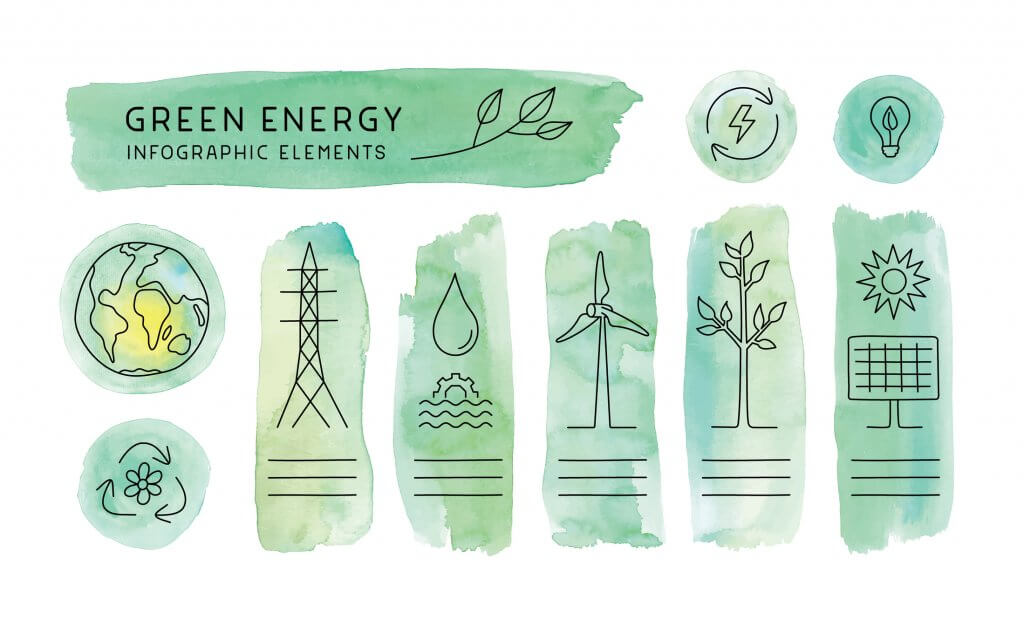
Watercolor infographic
Watercolor infographics introduce an artistic, fluid aesthetic by using natural and textured visual elements. Often applied in creative or organic storytelling, this style evokes a sense of warmth and emotion, making the data feel personal and evocative. Perfect for artistic industries or environmental topics, watercolor designs draw viewers in with their gentle, flowing transitions between colors, emphasizing the human or environmental impact in a soft yet engaging manner.
Minimalist infographic
Minimalist infographics strip down design to its essentials, using clean typography, ample white space, and a limited color palette to focus on key metrics or information. This approach eliminates distractions, ensuring the content is easily digestible while maintaining a sleek, professional aesthetic. Perfect for executive summaries or reports, minimalist infographics convey critical insights quickly and effectively, appealing to audiences who value clarity and efficiency in data presentation.
Illustrated storyboard
An illustrated storyboard infographic combines custom artwork with structured narratives to guide users through sequences or explain concepts. These infographics are highly adaptable, making complex topics like scientific research, product demonstrations, or academic lessons more accessible and engaging. By pairing detailed visuals with accompanying text, illustrated storyboards can enliven content and ensure viewers remember key points. The added artistry not only clarifies information but also brings a creative and personalized touch to the message.
Photography infographic
Photography-based infographics use images as the central element, overlaying data points or text for maximum impact. By blending the emotional appeal of imagery with the precision of statistics, this format creates a compelling narrative that resonates with viewers. Ideal for topics like environmental awareness, product marketing, or humanitarian efforts, the combination of visuals and concise text ensures the message is both memorable and visually appealing.
Monochromatic infographic
Monochromatic infographics use a single-color palette to create a cohesive, modern, and elegant design. Variations in shade, tint, and saturation add depth and visual interest, while negative space and thoughtful composition ensure clarity. This approach is ideal for audiences seeking sleek and contemporary visuals, particularly in corporate reports, portfolio pieces, or branding materials, as it blends simplicity with sophistication.
Comic-style infographic
Comic-style infographics bring a fun, dynamic energy to data presentation by using cartoon visuals, speech bubbles, and sequential panels. This approach is ideal for simplifying complex topics, breaking down information into digestible chunks while maintaining high engagement. With relatable characters and storytelling elements, these infographics appeal to broad demographics, making them perfect for educational campaigns, product promotions, or communicating concepts to younger audiences.

Typography-focused infographic
Typography-focused infographics make the design itself a feature by creatively manipulating text elements to tell a story. Oversized numbers, bold keywords, and dynamic fonts bring attention to critical points, while animated or motion text can add flair for digital formats. By using typography as both content and design, these infographics effectively combine style and clarity, making them ideal for presentations that emphasize storytelling, quotes, or key statistics.
Data art
Data art transforms traditional data visualizations into visually captivating narratives, bridging aesthetics and information. This format is ideal for showcasing complex relationships, such as global impacts or intricate datasets, in a way that feels creative and thought-provoking rather than purely numerical. By abstracting raw data into unique shapes, patterns, or compositions, data art allows for an artistic yet informative representation, appealing to both analytical and visual audiences.
Collage infographic
Collage infographics blend multiple visual elements—like photographs, sketches, and patterns—to create a scrapbook-like aesthetic that’s ideal for lifestyle, travel, or creative storytelling. This layered approach brings a tactile feel to digital designs, making the content more relatable and engaging. The diverse textures evoke emotion and individuality, perfect for showcasing personal journeys, cultural themes, or brand narratives that prioritize authenticity and visual depth.
Retro design
Retro-infographic designs channel nostalgia with vintage-inspired elements such as bold typefaces, muted neon color schemes, and patterns like polka dots or stripes. Whether referencing the 1950s, 1980s, or another iconic period, this style captures attention by evoking a sense of history or familiarity. It’s especially effective for campaigns focused on branding, history, or cultural nostalgia, where the retro aesthetic aligns with the subject’s thematic essence.

Animated infographic
Animated infographics take traditional static designs and add motion to engage audiences more dynamically. Short animations, loops, or transitions can highlight data points, connect visual elements, or narrate a story. Ideal for use on social media, advertising, or digital campaigns, these infographics hold attention longer and can simplify complex topics by visually demonstrating changes or processes over time.
Infographic poster
Infographic posters are visually striking standalone designs that combine compelling graphics with succinct messaging. Designed to grab attention from afar, they balance minimal text with bold visuals to make an immediate impact. These posters are well-suited for advertising events, summarizing research findings, or delivering messages in a public space where quick comprehension is critical. Their dual role as both artwork and informational medium makes them versatile and memorable.
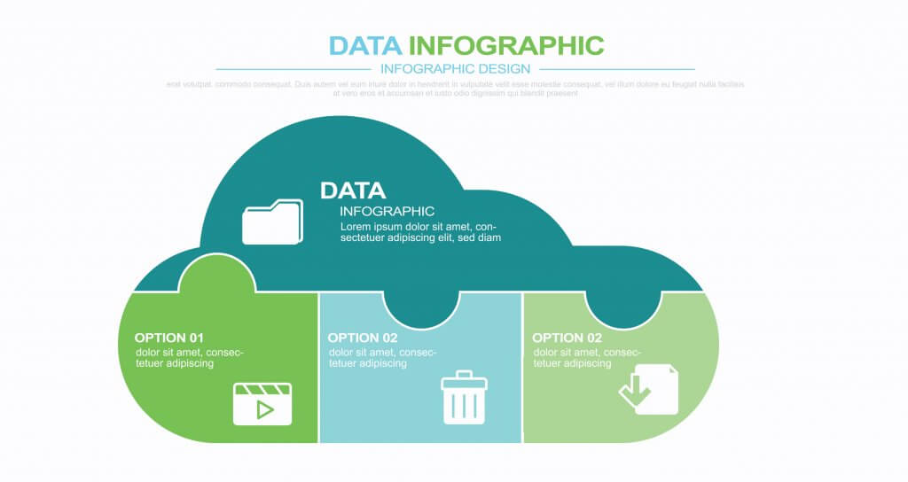
Puzzle layout
Puzzle layout infographics represent interconnected steps or components as pieces fitting into one unified whole. This format is ideal for depicting collaborative processes, workflows, or integrated systems, where each part depends on the others to create a complete picture. The puzzle approach highlights both individual contributions and the importance of collaboration, offering a compelling visual representation of teamwork or sequential tasks that come together to achieve an overarching goal.
Infographic resume
Infographic resumes blend visual hierarchy with straightforward layouts to transform the traditional CV into a modern, engaging format. By including dynamic elements like interactive skill ratings, timeline-based work experiences, and creative icons, these resumes help candidates stand out with a memorable, eye-catching representation of their career journey. They offer a way to present qualifications more creatively while keeping the focus on key professional attributes, making it easier for employers to quickly grasp a candidate’s strengths and background.
Ecosystem infographic
An ecosystem infographic depicts interdependent systems—such as biological cycles, economic circuits, or workflow integrations—through visual elements that flow seamlessly together. Whether explaining environmental systems, business operations, or even social networks, this format emphasizes the connection and balance between various components. Flowing lines, interconnected nodes, or natural motifs help illustrate how each part supports and sustains the whole, making it clear that disruption to one element impacts the others.

Branded infographic
Branded infographics extend a company’s identity into its storytelling assets by using consistent brand colors, logos, and custom icons. By incorporating these elements, the infographic reinforces brand recognition and ensures the visual style aligns with the company’s identity. This design type is perfect for presenting corporate data, product information, or marketing insights, as it seamlessly integrates branding with content, keeping the focus on both clarity and a consistent brand experience.
More infographic design ideas
By experimenting with different formats, colors, and visual techniques, you can turn any data or story into a compelling infographic. Whether you’re explaining a process, showcasing trends, or summarizing complex ideas, these creative infographic design ideas can help you communicate your message effectively and memorably.
If you want to browse more creative infographic design ideas, make sure to check out Infogram’s Example page where we have listed a wide range of infographic examples created by our users. Try one of the approaches in your next project and watch your audience engage like never before!
Get data visualization tips every week:
New features, special offers, and exciting news about the world of data visualization.