
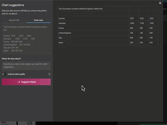
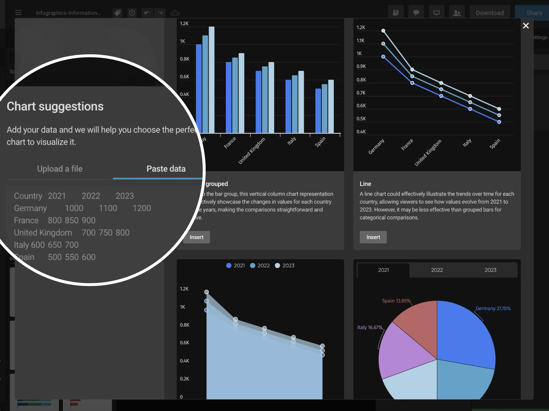
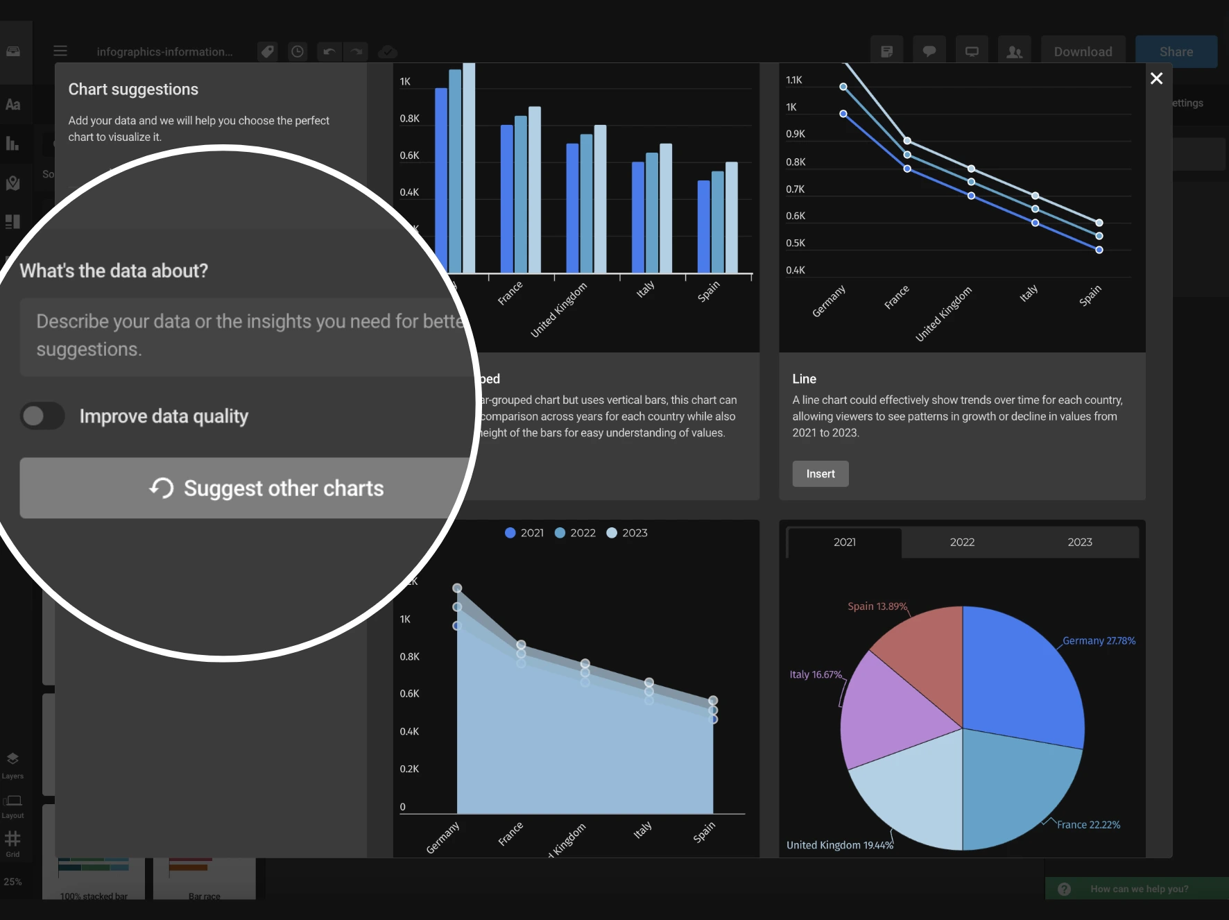
Get Personalized Chart Suggestions with AI
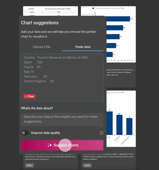
Simply upload or paste your data, and get immediate AI recommendations for the best charts to use.


4.7 out of 5 stars


Overview
Why
Types
Examples
Reviews
Tips
FAQ
Tailored Suggestions That Fit Your Specific
Creating compelling reports, presentations, and dashboards can often feel overwhelming. Choosing the right chart to display your data, managing time constraints, and handling design details can be challenging. That’s where Infogram’s personalized AI chart suggestions come to the rescue.
This feature simplifies the process by analyzing your data and recommending the best chart types with just a few clicks. Simply copy and paste or upload your data spreadsheet, and the AI will suggest the most effective charts to present your information.
Whether you’re a content writer, journalist, analyst, marketer, salesperson, consultant, teacher, or student, this feature helps you create professional-quality data visualizations quickly and easily. It stands out by providing tailored suggestions that fit your specific data and uncover patterns and insights you might have missed.
With the AI handling chart selection, you can focus on crafting your message and presenting it effectively. Don’t let choosing the right chart slow you down - discover how personalized AI chart suggestions can streamline your visualization process and make your data presentations more impactful.
Dive in today and see how this feature can make your reporting tasks smoother and more efficient!
Here's Why You Should Try Out AI Chart Suggestions
Learn about the benefits of using personalized AI chart suggestions.
Save Time
Streamline your workflow by automating the chart selection process. Instead of spending time designing charts yourself, you’ll receive quick suggestions for the most suitable chart options.
This allows you to focus more on analyzing data and making strategic decisions. For example, if you’re a financial analyst, this feature speeds up report creation, giving you more time for in-depth analysis and strategic planning.
Get the Best Chart Options
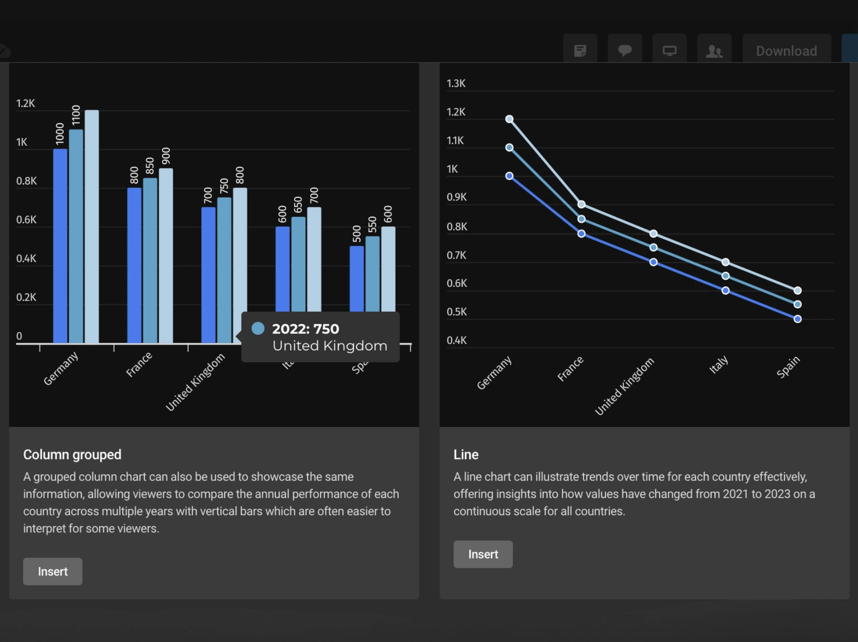
Receive tailored recommendations for chart types based on a thorough analysis of your data. This ensures your charts are based on accurate insights rather than assumptions, resulting in precise and relevant visualizations.
By selecting the most appropriate chart, you can effectively highlight key information, making it easier to interpret your data and make informed decisions. For instance, if you’re part of a sales team, you’ll quickly identify quarterly performance trends, simplifying the process of making data-driven decisions.
Discover Hidden Insights
Choose the best chart types to uncover hidden patterns and trends in your data. This feature not only ensures your visualizations are visually appealing but also brings to light insights that might otherwise be overlooked.
For example, as an academic researcher, you can transform complex study results into clear, impactful charts that effectively communicate key findings and trends.
Choose From a Variety of Chart Types
Access a broad range of chart options, from basic bar and pie charts to more advanced types like spider charts.
This variety allows you to select the most suitable chart for any data scenario you encounter, ensuring your visualizations are both versatile and effective.
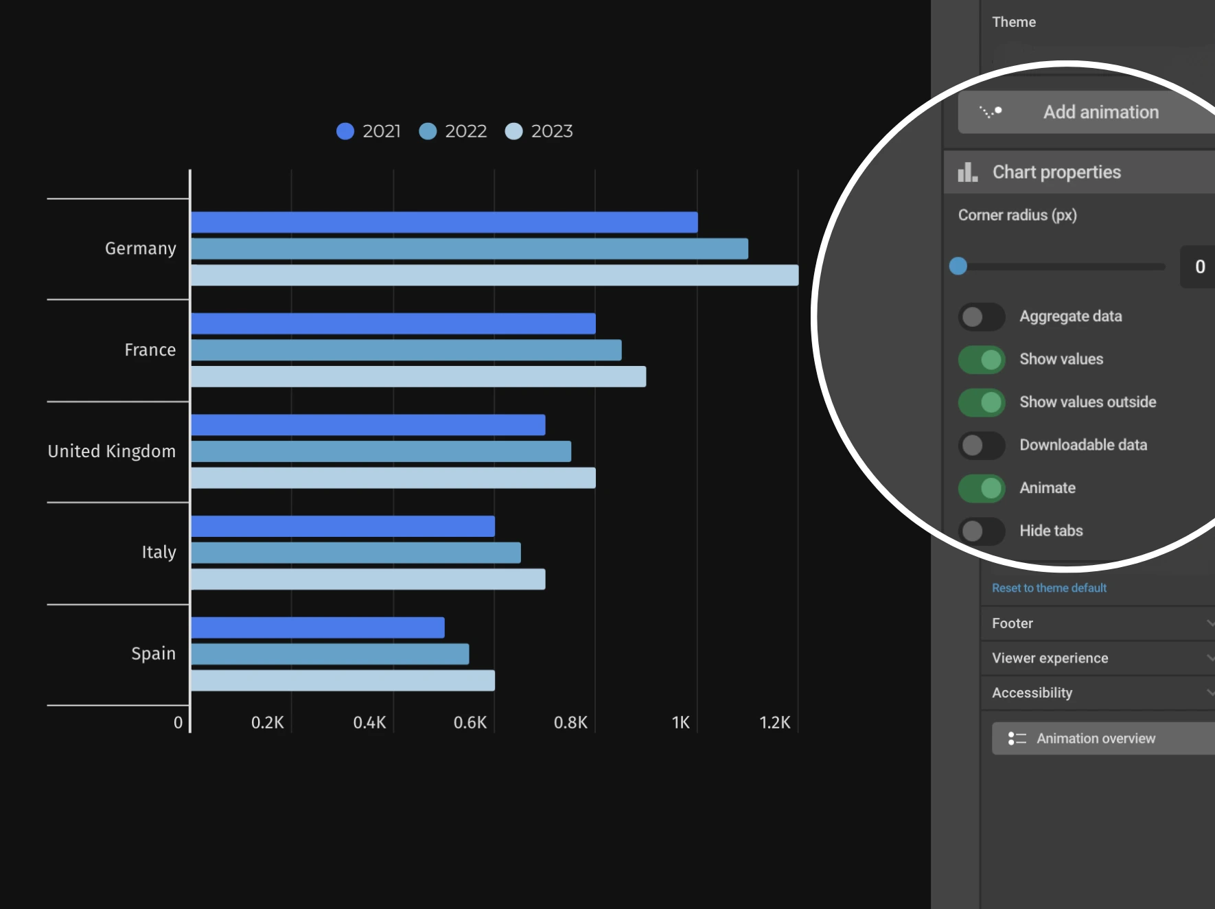
Customize with Ease
Eliminate the trial-and-error of manual design with our tailored chart suggestions. Infogram's user-friendly interface simplifies the creation of charts for your needs, regardless of your design experience. Whether you’re a beginner or an expert, you can effortlessly produce high-quality visualizations.
For example, if you’re a marketing manager, you can quickly generate professional reports with charts that highlight key metrics, saving time and reducing errors.
AI Chart Types to Explore
Area Chart
Illustrate cumulative data or multiple series' composition over time by filling the area between the line and x-axis.
Line Chart
Shows trends over time using an x and y-axis.

Pie Chart
Displays percentages, with all slices totaling 100%, showing parts of a whole.

Pictorial Chart
Uses icons or pictures to visually represent data in an engaging way.
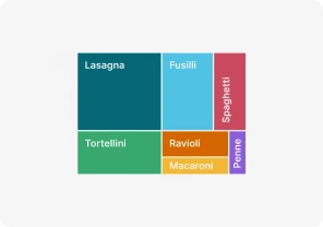
Treemap
Shows hierarchical data as rectangles, with size and color reflecting value.
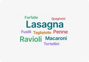
Word Cloud
Visualizes word frequency, showing which terms appear most often.
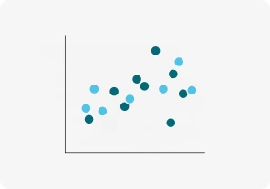
Scatter Chart
Plots data points on x and y-axes, showing relationships between variables.

Bubble Chart
Uses bubble sizes to represent numeric values on an x and y-axis.
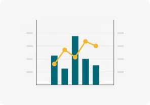
Dual Axis Chart (line and column)
Compares two sets of data with different scales using two axes.

Gantt Chart
Tracks tasks over time with horizontal bars, visualizing project timelines.
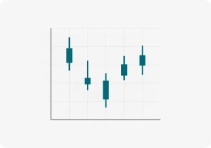
Candlestick Chart
Shows stock price movements, displaying open, close, high, and low prices.
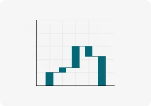
Waterfall Chart
Tracks how positive and negative changes affect a value step by step.

Funnel Chart
Shows data narrowing through stages until the final result at the bottom.
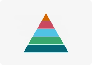
Pyramid Chart
Displays hierarchical data in a triangle-shaped chart with different section sizes.
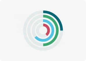
Radial Chart
Compares categories using circular bars in a polar system.
Column Chart
Uses vertical bars to compare data over time or across categories.

Bar Graphs
Uses rectangular bars to compare values across different groups.
Race Bar Chart
Shows bars moving over time, visualizing rapidly changing data.

Population Pyramid
Shows age and gender distribution using back-to-back bar graphs.

Tornado Diagram
Compares variables' impact on outcomes with horizontal bars.

Sunburst Chart
Displays hierarchical data using concentric rings to represent levels.

Radar/Spider Chart
Compares categories across axes radiating from a central point.

Sankey Diagram
Shows data flow between stages using arrows of varying thickness.

Alluvial Chart
Tracks changes in data categories over time using flowing streams.
Get Inspired by Infogram User-Created Projects

10 Largest Mining-Focused Funds to Have Closed Historically
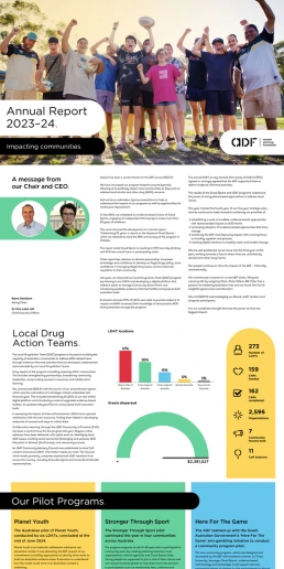
2024 ADF Annual Report
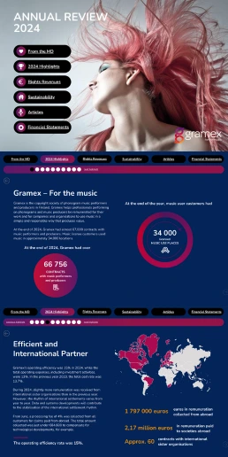
Annual Reviews
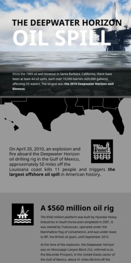
Deepwater Horizon Oil Spill
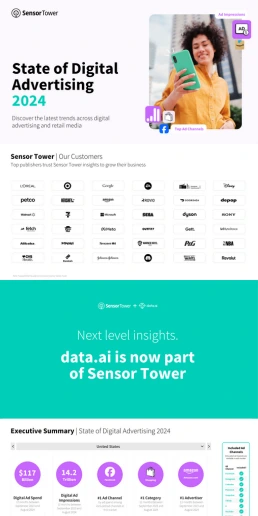
State of Digital Advertising

The Not Enough Impact Report 2018

The Scope and Impact of Free-Roaming Dogs and Cats

Florida Seaports
Customer Reviews
Here is what our customers have to say about us.
2022 Summer & Fall and 2023 Winter leader in Data Visualisation Software 4.7 out of 5 stars
See reviews on G2 ›Empowering 30,000+ Companies Worldwide
From startups to established enterprises, our platform has been embraced by a diverse range of businesses seeking to captivate audiences and simplify complex data. Here are just a few examples of the 30,000+ companies that use Infogram.


Learn More Practical Tips
Business
Best Ways to Visualize and Analyze Polling Data
Data
AI for Data Analysis: Maximizing Value From Your Data
Data
The Complete Guide to Different Types of Charts
Design
20+ Graphic Design Tips for Mastering Your Visuals
Design
Chart Dos and Don’ts: The Ultimate Data Visualization Guide
Design
Good and Bad Data Visualization Examples
Frequently Asked Questions
What are personalized AI chart suggestions?
Personalized AI chart suggestions is a feature in Infogram that helps you pick the best type of chart for your data. Just upload your data, and AI will analyze it and recommend the most suitable chart types. This way, you can create clear and impactful visualizations without having to guess which chart to use.
How do I use personalized AI chart suggestions?
To use this feature, open the editor and go to the "Add data" section (https://support.infogram.com/hc/en-us/articles/14213115798684--Creating-charts-with-AI#creating-ai-suggested-charts ). You can either copy and paste or upload your spreadsheet. The AI will review your data and suggest various chart options. You can then choose the one that best represents your information and customize it to fit your needs.
How does the AI speed up my report creation process?
The AI speeds up your report creation by instantly recommending the best chart types for your data. This saves you time because you don’t have to decide on your own. It quickly analyzes your data and provides suggestions, allowing you to create charts more efficiently and focus on other parts of your project.
Can the AI help me be more accurate in my visualizations?
Yes, the AI helps ensure that your data is presented accurately and effectively. By suggesting the best chart type, it helps you avoid common mistakes and ensures that your data is displayed clearly, making it easier for your audience to understand.
What kind of insights can the AI provide?
The AI can reveal patterns or insights in your data that you might not notice on your own. For example, it might suggest using a spider chart instead of a bar chart to highlight specific trends or relationships, offering a deeper understanding of your information.
How can personalized AI chart suggestions be useful for content writers and journalists?
For content writers and journalists, this feature simplifies creating visual content. It helps you choose the right chart to illustrate your points clearly, making your articles more engaging and your data more compelling.
In what ways can this feature benefit analysts and consultants?
Analysts and consultants can use this feature to quickly generate the most effective visualizations for their data. It saves time, improves accuracy, and helps present complex data in an easy-to-understand way to clients or stakeholders.
How can government employees and educators use this tool?
Government employees and educators can use this tool to create clear and professional charts for reports, presentations, and educational materials. The AI ensures that their data is presented in a way that is both informative and accessible.
Is this feature useful for marketing and sales professionals?
Absolutely! Marketing and sales professionals can benefit from this feature by creating impactful charts that highlight key metrics and trends. This helps in making data-driven decisions and communicating insights more effectively to their teams and clients.
How does the AI help students with their school projects?
For students, personalized AI chart suggestions make it easier to create accurate and visually appealing charts for their projects and presentations. It helps them choose the right chart types to clearly convey their findings and improve their overall project quality.
Can I still customize the charts suggested by the AI?
Yes, once the AI suggests a chart type, you have full control to customize it. You can adjust colors, labels, and other elements to match your style and the message you want to convey.
What if I have a unique dataset? Will the AI still be helpful?
Yes, the AI is designed to handle a wide range of data types. It will analyze your unique dataset and provide tailored chart suggestions that best fit your specific data, helping you visualize even the most unusual information effectively.
How does the AI handle large datasets?
The AI can efficiently analyze large datasets. It will still provide accurate and relevant chart suggestions, making it easier to manage and present extensive amounts of data.
Are there any limitations to the AI's suggestions?
While the AI provides valuable suggestions based on your data, it’s always a good idea to review the recommendations and ensure they meet your needs. The AI may not be able to capture every detail of your data, so your input is important for finalizing the visualization.
Can I use the AI suggestions for both public and private projects?
Yes, the AI’s suggestions can be used for any type of project, whether public or private. It helps create professional and effective visualizations for various purposes. If you have any more questions or need further assistance, feel free to visit the support page (https://support.infogram.com/hc/en-us/articles/14213115798684--Creating-charts-with-AI ).
Didn't find the answer? Check our FAQs

Try Infogram Now
Are you ready to unleash the power of data visualization? Get started with Infogram today and create stunning, interactive content that captivates your audience. Elevate your projects and bring data to life.