05.09.2018 by Infogram
Maps have the power to tell incredible stories across fault lines, oceans, continents, and city blocks. They may vary in aesthetic and intention, but one thing is clear – maps help people understand where they are and where they’re going. With an amazing ability to display information on a global, national, or local scale, maps are versatile visual assets that are both compelling and memorable.
But, not all maps are created equal. Here’s what to do, and what not to do, when making a basic map.
Pick the Right Map
You have location-based data you want to visualize, but which map is right for you? The first step is to stop and think. Don’t start plugging your data into any map without evaluating your overall message and the type of data you have to share. People often begin designing without thinking about the different types of maps available to them, and which ones to use in different situations.
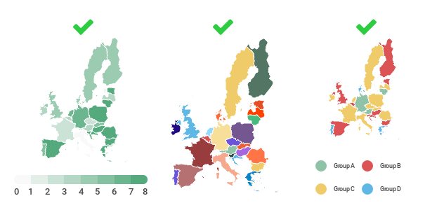
Do this: Once you know what your map is about, you need to pick the right type of map. Heat maps (choropleth maps) display values on a scale from low (cool color) to high (hot color) represented by a color gradient within geographic boundaries. They can be used to visualize election results, population density, changes in temperature, and more. Individual area or grouped area maps are designed to shed light on specific regions, which is good for highlighting trends and making comparisons.
Simple, Organized Design
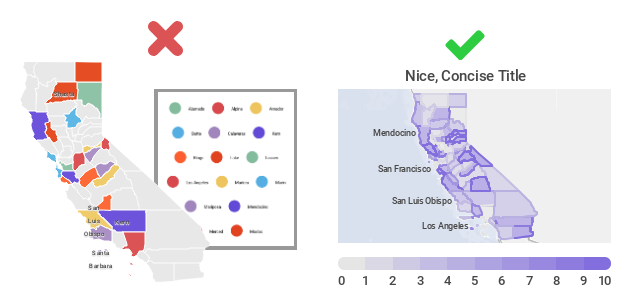
Nothing is worse than a cluttered, hard to read map. Don’t make your design so elaborate that people can’t understand your message quickly. Resist the urge to add all of the information you have in the form of legends, text, labels, and images. That being said, you don’t want to leave out crucial information that your viewer needs for context and deeper understanding.
Do this: Craft a map that is clean, simple, and organized. Keep in mind the size of your final map, and where it will be viewed, as this will determine how detailed or general you should be. Give your map a clear title, legend or scale, and source for your data. Try different layouts to avoid overcrowding or large blank areas. Everything on your map should have a purpose. Ask yourself – Does this element play an essential function? Can it be simplified? Does it require explanation? And is it critical for reading comprehension? Always remember that less is more.
If you have additional information you want to add to your map, but don’t want to make your original design too busy, experiment with an interactive map building tool. That way you can add hover over tooltips with facts and stats, links to web pages, multiple tabs featuring different datasets, and clickable chart legends.
Purposeful Color Selection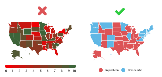
Color can grab people’s attention, set the mood, and influence perception. The color palette you choose for your map can change the way people respond to your data. Don’t pick colors that are too similar when you’re making comparisons. If you’re building a heat map or grouped area map, and the colors are too hard to distinguish, comparisons can’t be made easily.
If you are picking a palette with multiple colors, avoid a rainbow palette with bold hues. These designs distract from your data and run the risk of putting off your audience. You should also be mindful of people who may be color blind. In this case, you should be careful when using the combination of green and red, green and brown, and blue and purple.
Do this: When building a heat map based on one variable, we suggest you pick one color, with the highest saturating being your ‘hot color’ and the lowest being your ‘cold color.’ If you want to have more contrast, pick two complimentary colors that are pleasing to the eye. Gradients don’t generally make sense for individual and grouped area charts, so pick a palette that shows stark contrast without overpowering the viewer. If you aren’t sure where to start, you can use a free online color picker like Adobe’s Color Wheel.
Don’t be afraid to be literal with your color choices. If you’re talking about rainforests or the environment, experiment with green or earth tones. If you’re building an election or government based map, experiment with colors relating directly to specific political parties.
Map Alternatives
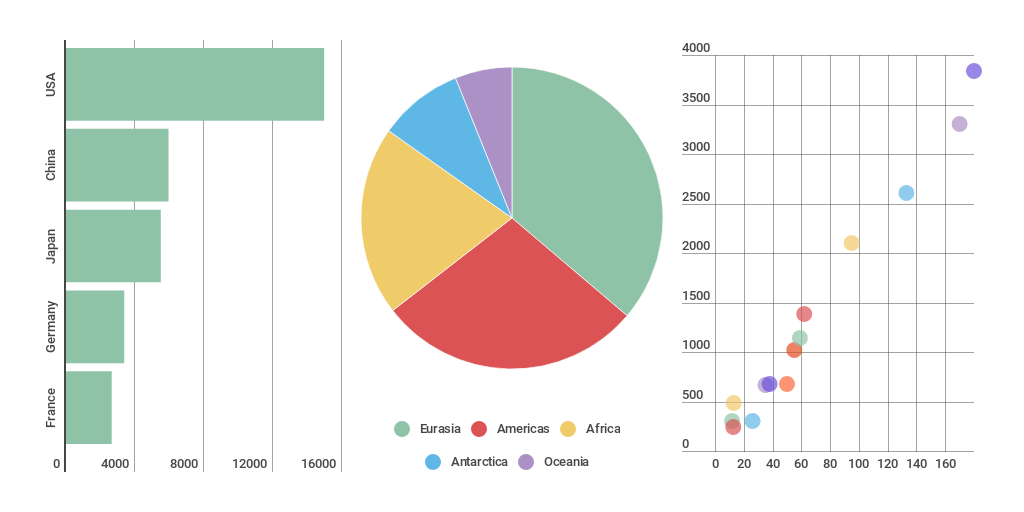
Is a map too complicated for your data? There are a handful of alternative charts you can try.
Most location-based data works with the classic chart types. If you’re comparing one or more values, you can’t go wrong with a bar or line chart. If you want to show composition, or how individual parts make up a whole, pie or area charts are well suited for this. If you need to visualize distribution, or a range of information, scatter plots are a nice alternative.
Would you like to experience the full power of data visualization? Try Infogram for Teams or Enterprise for free! With a Team or Enterprise account, you can create up to 10,000+ projects, collaborate with your team in real time, use our engagement analytics feature, and more. Request your free demo here.
This post is a part of Infogram’s ‘Do This, Not That’ series – offering insight and best practices for the world’s most common chart types. If you found this useful, you may want to check out more posts in this series:
Interested in discovering how Infogram can enhance your team’s work? Join a brief Zoom session with our Infogram representative to explore key features, get answers to your questions, and understand how we can assist. It’s quick, informative, and just like a coffee break chat. Schedule your call now!
Get data visualization tips every week:
New features, special offers, and exciting news about the world of data visualization.