22.08.2018 by Infogram
There is no chart in existence as misunderstood, detested, defended, and talked about than the pie chart. How can a chart that resembles a much-loved dessert be so polarizing? Pie charts get a bad rep because they are often used to visualize data that could be much better served with a different chart type. Plus, people don’t know how to use them effectively, and the internet is home to thousands of cringe-worthy examples.
If you’ve chosen to build a pie chart, there are a lot of ways it can go wrong. Here’s what to do, and what not to do, when designing one.
Simplicity is Key

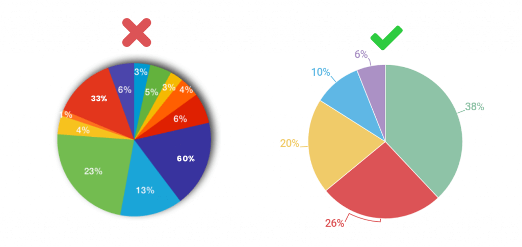
There is nothing worse than a pie chart with too many slices (or categories) that make it impossible to compare. When it comes to a great pie chart, simplicity is key. Don’t include more than 5-6 categories and, most importantly, make sure your numbers add up to 100%! Not doing the math correctly is a common mistake that makes your pie chart useless. Pie charts are designed to show parts of a whole, so any sum below or above 100% doesn’t represent the entire picture. Finally, when it comes to legends, pie charts don’t generally need one. It’s cleaner to label your data directly.
Do This: Pie charts are great if one or two of the categories have a much higher value than the others. This means, at a glance, it’s easy to see which categories have the largest share of the pie. If all pie slices are roughly the same size, it doesn’t tell a good story. Pick a topic to visualize that is broken down into no more than 5-6 categories, make sure the pie has a clear message, and your slices need to add up to an even 100%. To avoid clutter, label your pie slices directly and skip the legend.
Variety of Colors

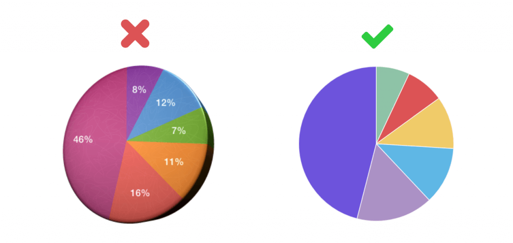
Pie charts break down the composition of a certain subject. Your viewer’s eyes are naturally looking for differences in the values. The easiest way to do this is with color. Make sure the colors you choose for your pie chart are different enough and easy to distinguish. Don’t pick colors that are the same or too similar. They are much too difficult to compare.
Do This: If you’re trying to highlight one category or slice of your pie, make all of the other slices the same color. Make the one you want people to focus on a complimentary shade. If you are hoping to have people evaluate all categories of your pie, use a pleasing, contrasting palette for easy comparison.
Don’t Pit Pie Against Pie

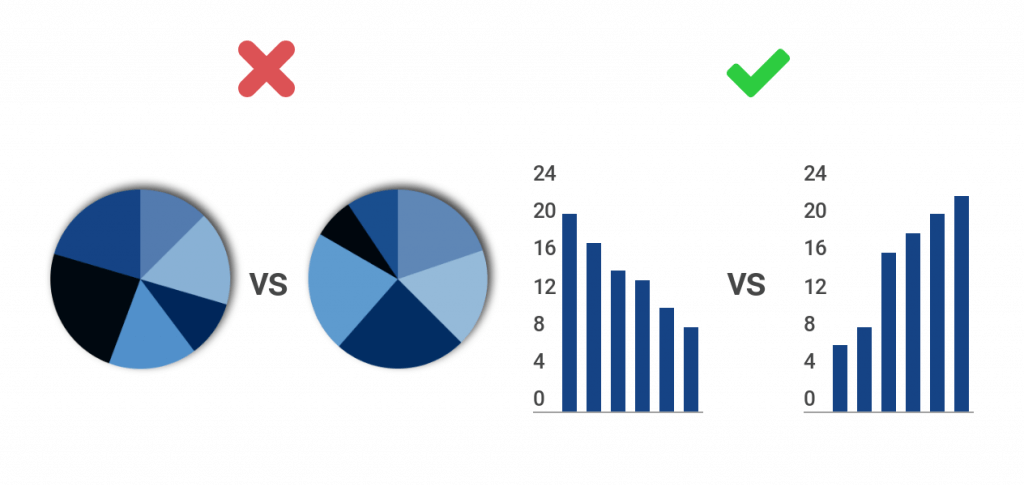
The human brain is very good at distinguishing differences in length and volume, which is why bar and column charts are so popular. What the brain isn’t good at, though, is comparing angles. Never ask your viewer to compare one pie chart with another pie chart. This practice is confusing and time-consuming.
Do This: If you’re looking to compare two datasets side by side that represent parts of a whole, use bar and column charts instead of pie charts. It’s much easier for people to compare the length of bars and columns than it is for them to compare the angles found in a pie chart. When comparing two datasets, try a grouped bar or column chart. This means you don’t have two separate charts to compare. Instead, you have one organized chart that saves space and your viewer’s time.
Pie Chart Alternatives

Hate pie charts? There are a few alternative charts you can try.
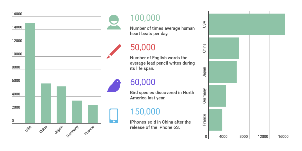
If you want to display parts of a whole, there are non-pie charts that work, too. As mentioned above, you can always rely on the classic bar or column chart to display this data. You can also experiment with a facts and figures chart.
These charts are nice if you want to focus on 1-2 important stats. They often feature an accompanying icon for added visual engagement. Too often, we feel the need to include all of the data, instead of relying on the power of simplicity by showing just a couple of numbers. You can also plug your data into a 100% stacked bar chart. These charts show what percentage each value contributes to a total on one bar divided into sections vs. a circular pie.
Would you like to experience the full power of data visualization? Try Infogram for Teams or Enterprise for free! With a Team or Enterprise account, you can create up to 10,000+ projects, collaborate with your team in real time, use our engagement analytics feature, and more. Request your free demo here.
This post is a part of Infogram’s ‘Do This, Not That’ series – offering insight and best practices for the world’s most common chart types. If you found this useful, you may want to check out more posts in this series:
Interested in discovering how Infogram can enhance your team’s work? Join a brief Zoom session with our Infogram representative to explore key features, get answers to your questions, and understand how we can assist. It’s quick, informative, and just like a coffee break chat. Schedule your call now!
Get data visualization tips every week:
New features, special offers, and exciting news about the world of data visualization.