06.01.2026 by Infogram Team
In 2025, Infogram was home to numerous amazing projects spanning various data visualization themes and needs. These projects encompass a portion of all the amazing Infogram features and showcase how data can be shown in an interactive, engaging, and visually appealing manner.
Take a look at some of these projects we highlighted throughout the year.
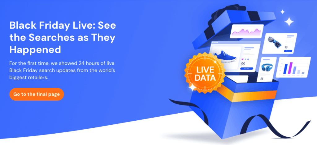
Similarweb
Similarweb leveraged Infogram’s API to power a high-impact Black Friday campaign – driving trial sign-ups, engagement, and brand visibility with live-updating data visualizations. Read the full case study here.
USA Today
USA Today is one of the leading news organizations in the United States. USA Today wanted to augment their daily and weekly visual stories with additional responsive and interactive graphics.
Read the full case study here.
BNP Paribas Real Estate Germany
BNP Paribas Real Estate Germany is a trusted source for insights into the German commercial real estate market. With Infogram, they recognized an opportunity to modernize their reporting.
Read the full case study here.
WKMG News 6
WKMG News 6 is renowned for its in-depth reporting. Recognizing that data visualization is key to understanding complex stories in today’s world, WKMG leverages Infogram to bring news to life.
Read the full case study here.
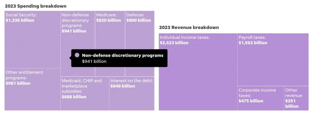
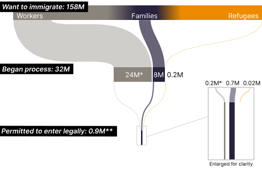
The Cato Institute
See how the Cato Institute used Infogram to turn complex policy research into compelling visual narratives, boosting engagement, consistency, and influence across publications, media, and social campaigns.
Read the full case study here.
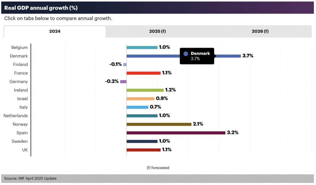
Linesight
With Infogram-powered charts, Linesight transformed complex energy and macroeconomic data into an interactive report built for clarity and confident decision-making.
Read the full project here.
Alcohol and Drug Foundation
The Alcohol and Drug Foundation leveraged Infogram to create an interactive Annual Report that makes complex policy and impact data accessible, transparent, and engaging.
Read the full report here.

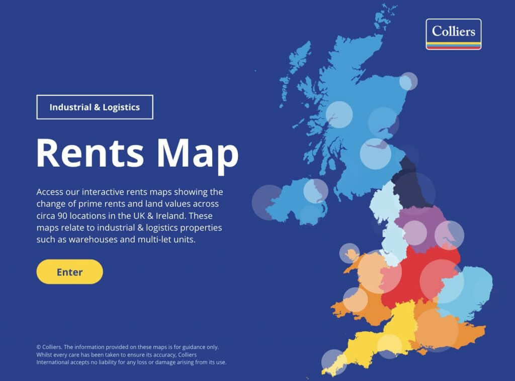
Colliers
Colliers used Infogram to create an interactive Industrial & Logistics Rents Map, bringing powerful insights to life through clear design and location-based data.
Read the full report here.
B Lab Global
B Lab Global, a nonprofit transforming economies for people and the planet, uses Infogram to simplify data and drive systemic change through interactive, engaging, and accessible storytelling tools.
Read the full case study here.
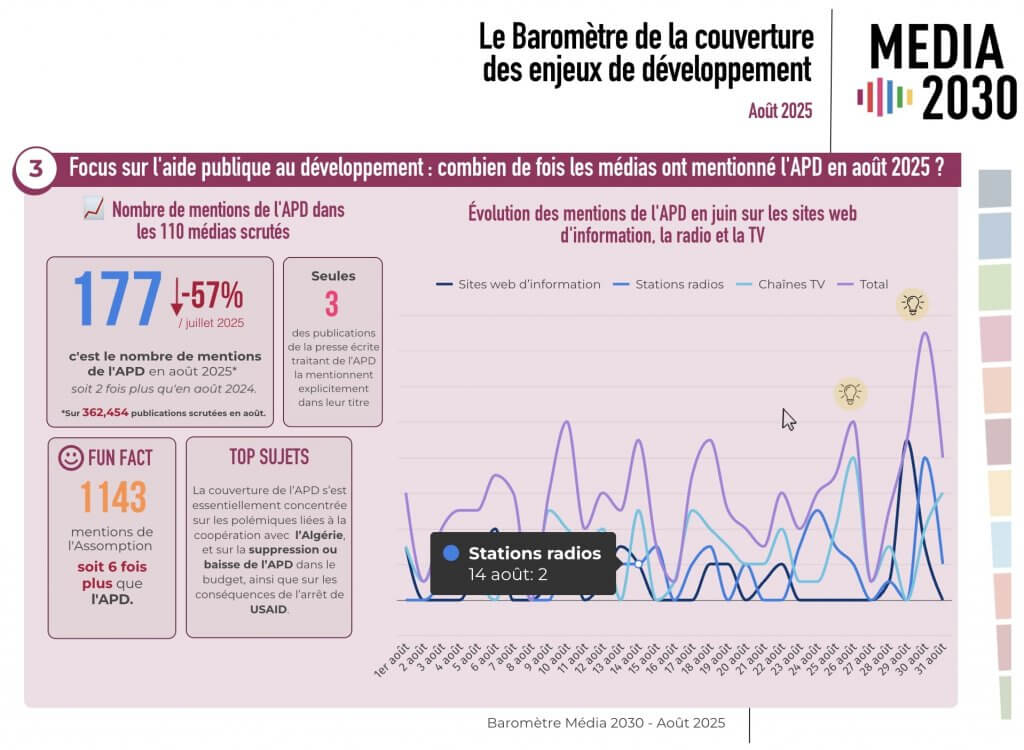
Focus2030
Focus 2030 used Infogram to turn complex media analysis into a clear, interactive report—making key insights easy to explore and understand.
See the full report here.
Private Equity International
PEI Group earned a shortlist spot at the #IIBAwards for Business Analytics, with their Number Crunch series demonstrating how Infogram-supported data visualization can turn complex private equity insights into compelling stories.
REDF
With Infogram, REDF turned their 2024 Impact Report into an engaging, interactive story highlighting how employment social enterprises drive real impact across the U.S.
See the full report here.

Der Pragmaticus
Der Pragmaticus uses Infogram to elevate serious journalism, embedding interactive dashboards and data-rich visuals to turn complex topics into accessible, explorable stories.
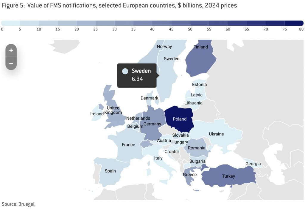
Bruegel
Bruegel uses Infogram to turn complex global economic data into clear, interactive insights—making it easier to explore, compare, and understand.
Read the full report here.
Ville de Grenoble
This project is a great example of how Infogram helps bring data journalism to life through clear, interactive visual storytelling.
Prezenter Team
The Prezenter leveraged Infogram to create an interactive Tour de France report, making complex cycling data easy to explore and understand.
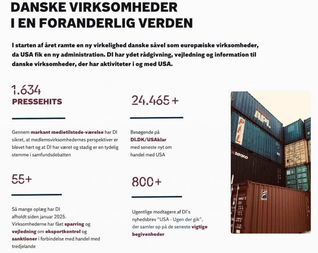
Dansk Industri
Dansk Industri used Infogram to transform complex industrial data into an interactive Annual Report with clear visuals, mapped insights, and compelling storytelling.
In 2025, these Data Visualization Projects were highlighted by Infogram across social media and in full case studies, showcasing how interactive visuals turn complex information into clear, engaging stories. From real-time dashboards to in-depth reports, teams across industries demonstrated the power of thoughtful data storytelling. As data continues to shape how we understand the world, strong visualization remains essential to turning insights into impact.
Get data visualization tips every week:
New features, special offers, and exciting news about the world of data visualization.