
 Back to customer stories


The Cato Institute, a globally respected public policy think tank, needed a better way to translate complex policy data into engaging, accessible content. With dozens of publications, reports, and social media campaigns each year, consistency, scalability, and visual impact were becoming increasingly important. By adopting Infogram, the Cato Institute revolutionized how it communicates the principles of liberty, free markets, and limited government with standout visualizations now reaching policymakers, media, and the public more effectively than ever.
About Cato Institute
Founded in 1977, the Cato Institute is a nonpartisan, independent think tank focused on advancing individual liberty, free markets, limited government, and peace. Its mission is to create a free and open society where individuals can pursue prosperity and meaning.
With over 50 research papers annually, 5+ books, hundreds of blog posts, social campaigns, and ongoing web features, Cato Institute’s work spans every major public policy issue: from immigration to education to economic freedom.
The Challenge
Before adopting Infogram, the Cato Institute struggled with some design and production hurdles that made visual storytelling difficult and inconsistent. One major obstacle was the lack of a cohesive visual identity across platforms. “Fonts, colors, shapes were all over the place,” shared Onur Yoruk, Data Visualization Manager at the Cato Institute. “Our charts, maps, or tables lacked [...] interactivity.”
These inconsistencies diluted the impact of the Cato Institute’s research and complicated both collaboration and publication. Visual assets were created manually, shared across teams, and often revised multiple times, slowing down workflows and making it hard to scale.
As Cato’s Institute publication volume grew, so did the need for a faster, more centralized way to produce polished, high-impact visual content across digital and print media.

Why Infogram?
Infogram provided a centralized, easy-to-use platform for the Cato Institute to produce high-quality, interactive visualizations at scale. The customizable templates, collaborative tools, and export options (including print-quality vectors) made it a perfect fit for the Cato Institute’s evolving needs.
"Infogram constantly helps us translate complex policy research into accessible, compelling visual narratives,” shared Onur.
Infogram in Action
The Cato Institute now uses Infogram across multiple publication types: from academic reports to blog posts and social media campaigns. A few standout examples:
1. Policy Analysis on Immigration

Visuals from this report went viral on social media and were even cited in congressional hearings using large-format posters. Infogram enabled the Cato Institute to simplify and amplify one of the most complex policy debates of our time.
Click here to view the report.
2. Blog Post on Tariffs
Using interactive flowcharts, the Cato Institute mapped out tariff impacts, enabling better reader comprehension and stakeholder engagement. Infogram’s ease-of-use and interactivity helped boost engagement significantly.
Click here to view the report.
3. Survey Report on Private School Enrollment
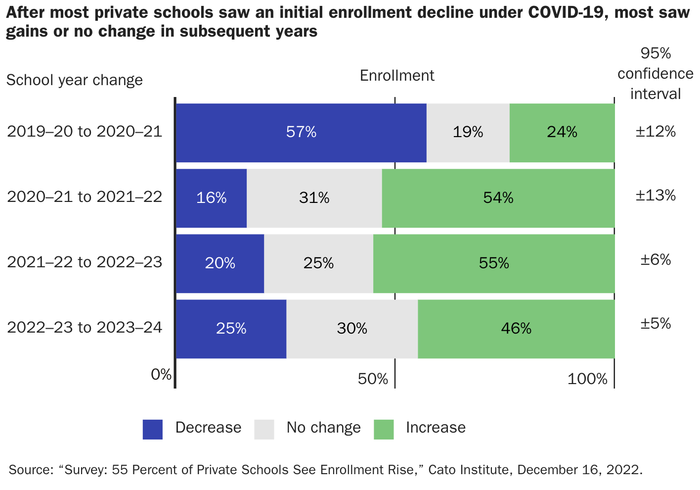
By using Infogram’s diverse visualization tools and annotation features, the Cato Institute team built a compelling digital report, later repurposed for social media, extending its reach and resonance.
Click here to view the report.
How Infogram Transformed Cato Institute's Workflow
Infogram has become a core part of Cato Institute’s publication and content design process:
- Decentralized production: Researchers and communicators alike now create data visualizations, not just designers.
- Scalable content: Increased volume of charts, maps, and tables across web, print, and social media
- Faster collaboration: Real-time co-creation and feedback reduced turnaround time and eliminated messy file exchanges.
High-quality print outputs: Infogram’s export options enabled polished graphics for books, flyers, and internal publications. One unexpected benefit? Infogram’s vector export feature made it easy to include publication-ready graphics in print books with little or no need for post-production edits.
Results and Impact
Since adopting Infogram, Cato Institute has seen:
- A significant increase in data visualization content across channels.
- Faster turnaround times for reports and media content;
- Greater social media reach and engagement via interactive visuals;
- Improved internal collaboration and a more streamlined design system.
Visual storytelling is now at the heart of Cato Institute’s advocacy, helping the organization clarify policy issues, persuade stakeholders, and spread the ideas of liberty further and faster. “Being able to create high-quality data visualizations in a decentralized way increased our productivity as an organization several-fold since Infogram’s adoption”, added Onur.
Final Thoughts
Infogram has improved how the Cato Institute communicates. From simplifying complex data to fueling social engagement and publication design, the platform has become an essential tool in Cato Institute’s mission to defend liberty and inspire meaningful change.
Looking ahead, Cato Institute plans to leverage Infogram in new ways, including developing interactive educational content for students that explores fundamental ideas in economics, law, and philosophy. A new generation of visual thinkers may be just one chart away from a deeper understanding of freedom. In Onur’s words: “Specifically, we want to dive into educational content for students. We are tinkering with mini explainer units with data visualizations that will teach fundamental topics in economics, law, and philosophy. It will be an exciting new avenue for us!”.


