26.04.2017 by Infogram
I think we can all agree that data-heavy presentations are terrible. They are not only hard to sit through from the viewer’s perspective, they are also unfortunate for the presenter who took the time to collect the data and build the presentation.
Why are bad data presentations the worst? They often result in a lack of interest, zero information retention, and a waste of time for both the viewer and the presenter. The presenter also loses the opportunity to share quality insights with their audience.
We value your time and effort, which is why we put together 5 rules for presenting data. Follow these tips and you’ll be creating more engaging data presentations in no time:
1) Highlight your best data
When you present data in charts and maps it becomes easier to read, easier to understand, and much more memorable. This is why data visualizations are such great presentations tools. They make it easy to spot key findings and trends in a compelling way. Make it a point to share stats that are truly significant and impressive.
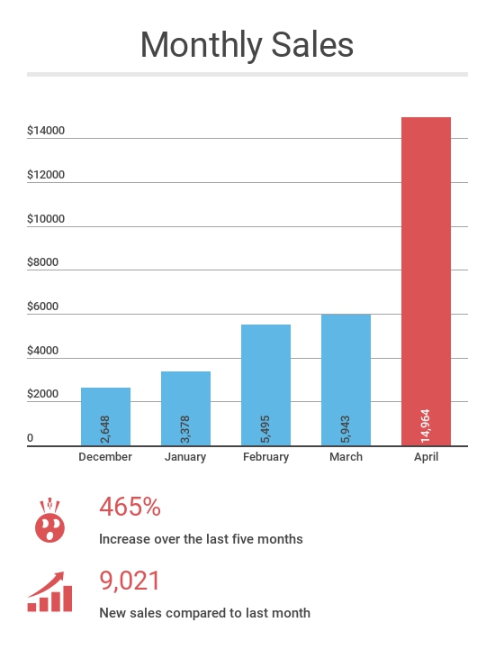
You can do this with a few tweaks to the design of your visualization. The easiest way to do this is with clear labeling and effective color use. Let’s look at the three examples below. Each stat is sharing the same information.
The story is about how amazing sales were in April. That significant jump can be displayed as an impressive column chart, a shocking percentage, or a whole number. The accompanying visuals add an extra level of engagement. It’s up to you which method you find to be the most persuasive.
That being said, you should never go out of your way to delete information to skew your story one way or the other. You can’t cherry-pick your data or manipulate your message. It’s dishonest and counterproductive.
If you haven’t hit your numbers, or your marketing campaign isn’t getting you any leads, you need to share that information so you can form a solution and improve your tactics.
Would you like to experience the full power of data visualization? Try Infogram for Teams or Enterprise for free! With a Team or Enterprise account, you can create up to 10,000+ projects, collaborate with your team in real-time, use our engagement analytics feature, and more.
2) Color is your friend – use it wisely
Color is really important when designing both presentations and data visualizations. Color can grab people’s attention, set the mood, and influence perception.
Using color effectively can enhance the way your charts and graphs communicate data. Try to use a few simple contrasting colors that are both pleasing and easy to differentiate from each other at a glance. Use the same colors throughout your presentation and use branded colors when applicable.
3) Provide context
When you’re presenting data you want to make sure you are telling a story and providing context. It’s not just about sharing data, it’s about sharing what the data means. You must resist the urge to simply throw facts on a screen and hope for the best. Giving context helps you explain your strategy or pitch more powerfully.
4) Show one chart at a time
Presenting data is a balancing act. The amount of data you share, and the way you present it, can lead to genuine conversation, fresh ideas, and a memorable presentation. Or it can lead to a presentation that is hard to follow and sit through.
Try to avoid sharing back-to-back charts. You should switch up the variety of your visuals to keep people engaged and curious. You wouldn’t have multiple slides with bullet points back to back, so you shouldn’t do it with charts. You risk losing the audience’s attention. Feel free to break up your data-heavy slides with icons and pictures. It forces your audience to pause and refocus.
You should also try to only show one chart at a time. You don’t want your audience spending time in their head trying to decipher your charts. The more data you put up at once, the harder your audience has to work to comprehend your message.
5) You are presenting, not reporting
When you are creating visuals for a report you are essentially just sharing the numbers. You need to offer context in print, provide extra information, and be more detailed. It is a much more data-specific approach.
Presenting data is different. Data presentations are as much about you, the presenter, as they are about the data. Your audience is counting on you to share insights into the data, explaining why it matters and what it means.
Pro tip: Leave a physical or virtual copy of your presentation so people can revisit and analyze the data you presented on their own.
This may seem like a lot to think about, but it only takes a little bit of time to look at your data and plan what you’d like to say. Just make sure you aren’t overwhelming your audience and are presenting your data as simply as possible using the best visual for the job in order to convey your message.
You took time collecting and analyzing your data, now you can use it to make an awesome presentation. You can also read our 4 tips for telling an effective data story.
Get data visualization tips every week:
New features, special offers, and exciting news about the world of data visualization.