15.08.2018 by Infogram
A series of data points, connected by a line, can hold surprising stories along its peaks and valleys. Line charts have the power to display trends, highlight successes, and warn about potential dangers – all in seconds. That’s part of their appeal, and part of the reason they’re one of the most common ways to visualize data that changes over time.
Creating a clear, effective line chart, though? That takes practice. Here’s what to do, and what not to do, when designing one.
Even, Clean Axes

The data points of your line chart sit strategically along your x-axis and y-axis. It’s important that your axes’ intervals are spaced evenly and appropriately. Don’t start the y-axis above zero. In most cases, when you start the y-axis above zero it skews the overall message of your chart and makes small changes look more extreme than they really are.
PRO TIP – If you’re building a multiple-line chart, don’t try and compare too many datasets. Multiple-line charts with more than 5 lines can become cluttered and very difficult to read.
Do This: After you’ve set your y-axis to start at zero, evaluate your axes. Your tick marks should be the same distance apart, representing the same even intervals. You don’t need to label every value on your x-axis. Instead, label the tick marks at specific increments that make sense for your dataset. You don’t want to overcrowd your chart with too many numbers.
Deliberate Text Placement

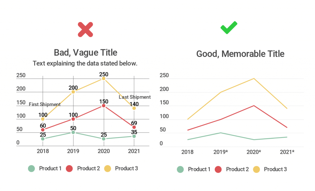
Don’t feel pressured to include all the information you have about your chart in the form of text. You don’t want to overwhelm your viewer with paragraphs of copy, bulky legends, axis labels, and additional words. Legends aren’t a requirement for single-line charts but can be very useful when comparing multiple lines on the same chart.
Do This: Be very selective with the text you choose to add to your chart. Give it a good, memorable title. Label the axes if the information provided by the tick marks needs further explanation. If you are visualizing data you didn’t collect yourself, list a source somewhere small that doesn’t distract from your line chart. If one of your data points stands out and needs to be highlighted, feel free to add a pop of color or a few words of text to focus your viewer’s attention there.
Contrasting Colors for Multiple Lines

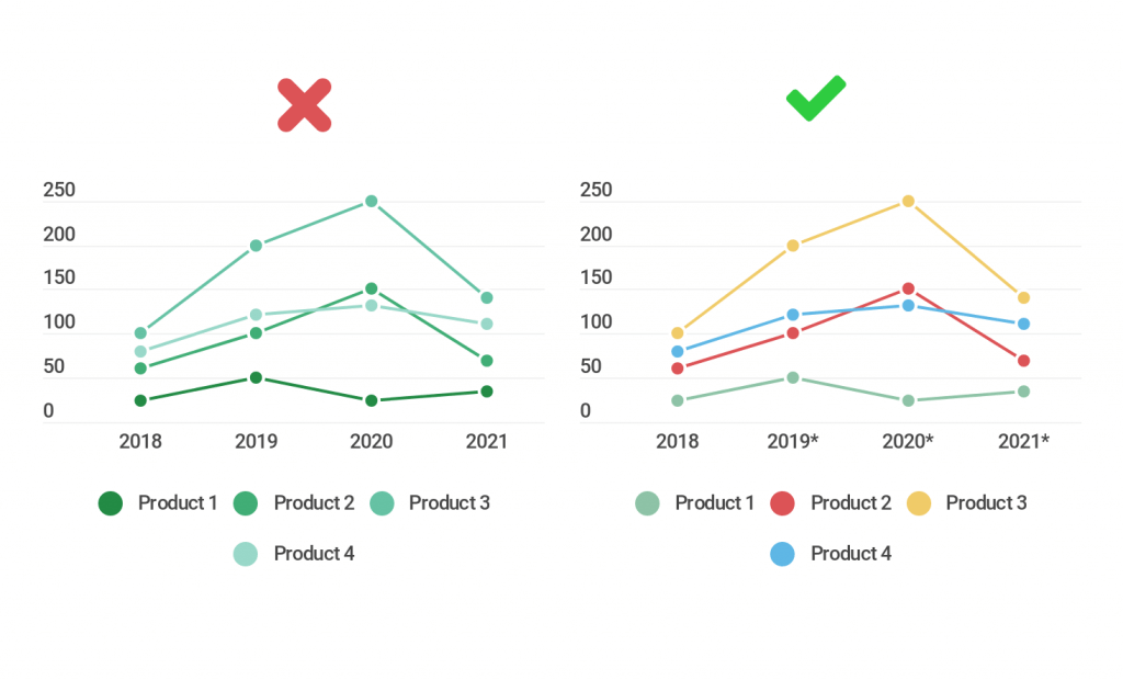
When you place multiple datasets on one chart, in the form of multiple lines, you need to make it obvious which line is which. Don’t make your lines all the same color, or variations of the same shade. You don’t want your viewer spending extra time trying to make out differences in your chart. You want them to get to the ‘ah ha’ moment quickly.
Do This: If you are comparing multiple lines, give them clear contrasting colors. The palette you choose should still be pleasing to the eye, nothing too bright or jarring. If you’re building charts for business reports or dashboards, try to pick a few branded company colors that stand out and work well together for a more polished feel.
Line Chart Alternatives

Hoping for a different chart? Here are a few alternatives you can try.
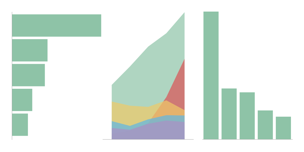
If you’re looking for a way to display change over time that isn’t a line chart, experiment with an area chart. Line and area charts are very closely related, the only difference is that the area plotted below the line is filled in with color. They’re good for showing time series data, clearly displaying continuity across a dataset. They both make it easy to spot trends rather than individual values. You can also try plugging your data into standard bar and column charts.
Remember, if you try these alternatives, and it doesn’t feel right, go back to the classic line chart. They are easily one of the best ways to clearly show change over time.
Would you like to experience the full power of data visualization? Try Infogram for Teams or Enterprise for free! With a Team or Enterprise account, you can create up to 10,000+ projects, collaborate with your team in real-time, use our engagement analytics feature, and more. Request your free demo here.
This post is a part of Infogram’s ‘Do This, Not That’ series – offering insight and best practices for the world’s most common chart types. If you found this useful, you may want to check out more posts in this series:
Interested in discovering how Infogram can enhance your team’s work? Join a brief Zoom session with our Infogram representative to explore key features, get answers to your questions, and understand how we can assist. It’s quick, informative, and just like a coffee break chat. Schedule your call now!
Get data visualization tips every week:
New features, special offers, and exciting news about the world of data visualization.