19.09.2018 by Infogram
Imagine driving down an unfamiliar road, and every single sign you see is near identical with dense paragraphs of text explaining what it’s for. You’d feel completely lost, or even worse, totally distracted. That’s why road signs don’t use a lot of text. Instead, they utilize color and recognizable symbols or icons to transmit information.
Icons are the most common form of visual communication around the world. We follow them down highways, use them to navigate computer files, and choose them to represent emotions via text message. They’re universal because they convey messages instantly — often despite the limitations of language, location, and other variables. That’s why pictorial charts are the perfect way to effectively display different values and share specific stats.
Pictorial charts use relative sizes or repetition of icons to represent data. But, crafting an effective pictorial chart doesn’t come naturally. Here’s what to do, and what not to do, when designing one.
Relevant, Easy-to-Read Icons
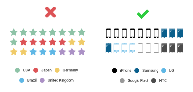
The right icon is key to the perfect pictorial chart. Don’t pick a generic icon that doesn’t relate directly to your story. You want to grab people’s attention and understanding quickly, not leave them wondering what they’re looking at. You also need to think about where people will be viewing your chart. If it’s relatively small, say on a mobile device or a sheet of paper, you don’t want to pick an icon with a lot of detail that’s tough to see.
Do this: Once you’ve honed your overall message, pick an icon that makes your topic pop. There are a lot of great icon options available these days, so it’s easy to find one that is specific to your dataset. Pick an icon that is easy to read, clear, and to the point. If you’re talking about fruit sales, pick an icon that corresponds with the specific fruit you’re selling. If you’re talking about iPhone sales, grab an icon of a smartphone, or a stack of money.
Simple, Concise Comparisons
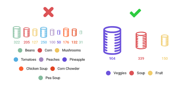
When you’re creating a pictorial chart, you’re asking people to make visual comparisons quickly, which can get tricky. You don’t want to visualize too many categories or items. The point is to simplify your message, not confuse the viewer. For both pictorial charts, which use repeating icons to compare different values, and size comparison charts, which use icon size to compare different values, you want to try to avoid comparing more than 5 different items.
Do this: Pictorial charts are great visual communication tools when made simply. Our brains can easily understand 5 items or less. If you have a lot of items in your dataset to compare, we suggest you pull the items that are most important to your message. Let’s pretend you collected 25 cans at your charity can drive. That is far too many items to visualize individually. You may want to show the top 5, or the brands people recognize most, or group the cans by type. This type of data curation is fine, as long as it doesn’t skew the numbers.
Deliberate, Defined Colors
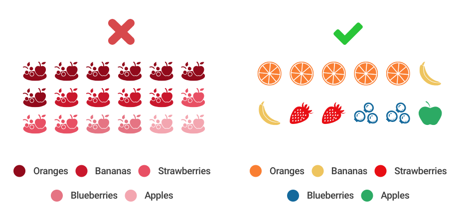
When building a proper pictorial chart, with repeating icons, don’t pick colors that are too similar to tell apart. If you use the same color or shades of the same hue, comparisons become almost impossible to make at a glance. You don’t necessarily need a wide variety of colors for a size comparison chart, because people are looking at the size of the icons, not the color, to make comparisons. But, you still want a pleasing color selection that helps your icons stand out.
Do this: Be thoughtful when picking colors for your pictorial charts. If you’re asking people to compare repeating icons, pick contrasting colors that are easy for our brains to separate. If you’re making a size comparison chart, experiment with colors that correspond directly with the topic you’re visualizing. Let’s go back to the fruit sales example: try making oranges orange, bananas yellow, strawberries red, blueberries blue, and apples green.
Not sure where to start? There are many wonderful websites designed to help you pick awesome color palettes, like Adobe Color Wheel.
Pictorial Chart Alternatives
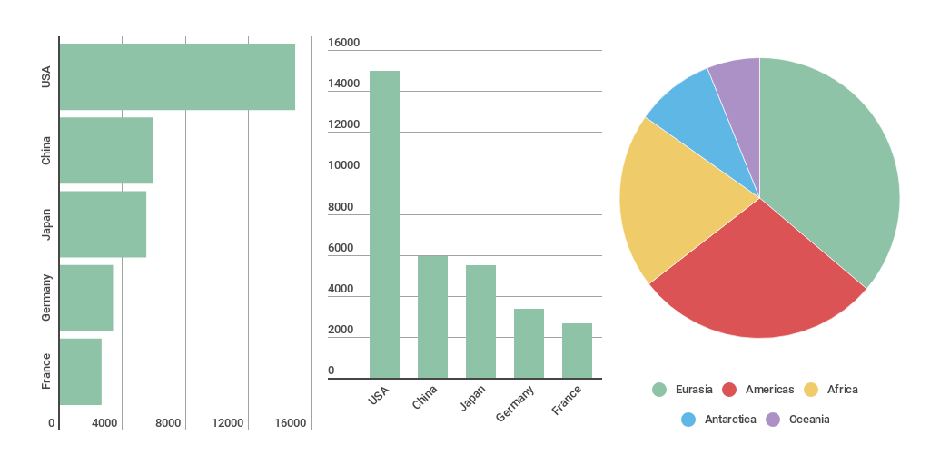
Icons aren’t always the way to go. If pictorial charts aren’t quite right for your data, there are a couple of alternative charts you can test out.
If you want to show distribution or compare values, bar charts are a classic pick. They’re common, easy to understand, and highly effective. If you want to show parts of a whole, and how those values relate to one another, a pie chart might be your best bet. Just make sure your values are in the form of percentages that add up to 100%.
Would you like to experience the full power of data visualization? Try Infogram for Teams or Enterprise for free! With a Team or Enterprise account, you can create up to 10,000+ projects, collaborate with your team in real time, use our engagement analytics feature, and more. Request your free demo here.
This post is a part of Infogram’s ‘Do This, Not That’ series – offering insight and best practices for the world’s most common chart types. If you found this useful, you may want to check out our previous posts:
Interested in discovering how Infogram can enhance your team’s work? Join a brief Zoom session with our Infogram representative to explore key features, get answers to your questions, and understand how we can assist. It’s quick, informative, and just like a coffee break chat. Schedule your call now!
Get data visualization tips every week:
New features, special offers, and exciting news about the world of data visualization.