31.05.2018 by Infogram
If you aren’t including charts or maps on your landing pages, you’re missing out on a huge opportunity. One surefire way to grab your viewers’ attention and pique their curiosity is by using data visualization to present compelling stats. Data-centric landing pages are still fairly new – see why it’s worth stepping into uncharted territory.
1) Why visualizations are a win for engagement
Large parts of our brain are devoted to visual processing; it’s how we navigate our lives. According to data-design expert Dr. Stephanie Evergreen, “We are in a pictures-first world. That is how people operate – with pictures – through our eyes. Our bodies are built with 5 senses, but vision is dominant by far.”
Visuals built around data can help you distill complex ideas into digestible information while establishing brand credibility and trust. Data visualizations are a fantastic way to educate people and uncover trends, but they can also be highly persuasive. A convincing fact, presented at the right time, can help you generate leads, nurture existing leads, and engage current customers. Visuals are powerful and so is data, but together they’re unstoppable.
2) Types of content to visualize, with examples
The options for data-driven landing pages are endless. You can tease out downloadable content, share survey results, highlight success rates, and feature exciting company stats. Let’s go over three fictional examples of pages that benefit from charts or maps.
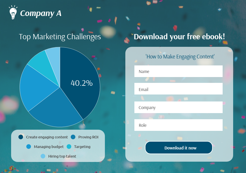
Download Marketing Ebook
Marketers struggle to create engaging content that brings value, raises brand awareness, and establishes themselves as a leader in their industry. In this case, Company A wants to increase ebook downloads. They included a pie chart showing the results of a recent marketing survey, where most marketers pick ‘creating engaging content’ as their biggest pain point. The idea is that whoever visits your landing page will be able to relate to these issues, know they aren’t alone, and feel compelled to download your ebook to find the answer to their problems.
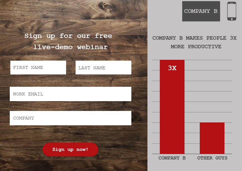
Webinar Sign-up
Webinars are a powerful tool for enticing prospects and filling the sales funnel, and their increasing popularity amongst marketing and sales teams is a testament to this. In this example, Company B wants people to sign up for their upcoming webinar that features a live demo of their productivity tool. They have stats to prove that people who use their tool achieve more in a shorter amount of time. The bar chart clearly shows how effective their tool is, which makes people want to learn more about what they care most about – their time.
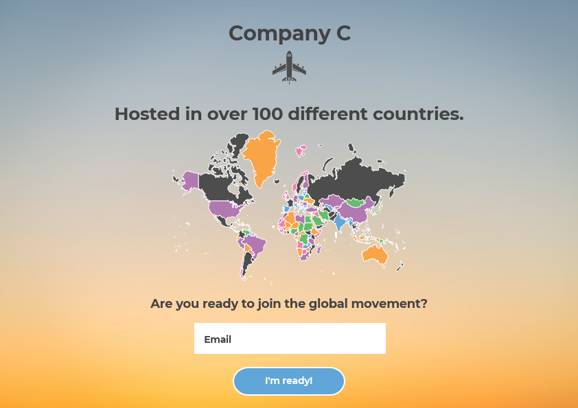
Workshop Sign-up
Free classes and workshops are a good way to connect with customers and potential buyers. They can be educational, entertaining, and useful for putting your brand on the map. In this case, Company C wants to prove they are an authority on their subject with years of experience. This world map shows how many countries this class has been taught in, giving the course credibility and its attendees confidence.
3) Best practices for chart readability and aesthetic
Before you race off to make a chart, it’s important to go over best practices for expert graph design. Remember to pick the right chart, add colors for clarity, and simplify.
Pick the right chart for your data – While your data might technically work with multiple chart types, you need to pick the one that ensures your message is clear and accurate. For example, you could:
- Use line, bar, and column charts to represent change over time.
- Use pyramids and pie charts to show parts of a whole.
- Use scatter plots and treemaps as an alternate way to showcase a lot of data.
Be selective with color – Using color effectively can enhance the way your charts and maps communicate data. That being said, color used incorrectly can muddle or confuse the viewer. Some general tips include:
- Avoid the rainbow effect – while a variety of colors might be pretty, it generally isn’t very effective. We suggest you pick one hue or use a muted neutral tone featuring a pop of color to draw attention to the most important aspect of your data.
- If you’re comparing multiple datasets, like a multiple-line chart, pick contrasting colors that are easy to compare at a glance.
- Use company-branded colors when applicable. When people visit your landing page you want them to know your charts belong to your business.
Keep it simple. Less is more! – A busy visual isn’t fun to look at. You want your chart to be clear, concise, and powerful. This is true of both landing pages and data visualization:
- Only include what needs to be seen to support your message.
- Don’t include too much text or too many numbers.
- Avoid grid lines or legends that distract from the data.
The best part? You can do all of this and more without any professional design experience, just by using Infogram and your favorite marketing tool. Simple editing, easy data imports, interactive graphs, seamless publishing options — all of this and more is yours with Infogram.
This post was previously published on the Prezi blog.
Get data visualization tips every week:
New features, special offers, and exciting news about the world of data visualization.