21.10.2022 by Infogram
Do you know what are the infographic dos and don’ts? Let’s explore key infographic tips in this article.
Infographics are great visual storytellers. They can tell a story about practically anything, and share meaningful data in a highly engaging, interactive format. In fact, infographics get 3x more likes and shares on social media than any other type of content. But there’s so much more to infographics than beautiful-looking data visualizations. These are helpful business tools that let you tell a story and communicate information more effectively.
Infographic design plays a vital role in how your story is received. When you keep design best practices in mind, you can create a really powerful infographic. However, if an infographic is too cluttered or difficult to read, the story gets lost, misunderstood, or simply ignored. That’s why in this article, we’ll list the top infographic dos and don’ts you should follow to design an infographic that successfully communicates your story.
Infographic tips for design
It’s no secret – infographic design is important. A well-designed infographic helps convey complex information more quickly, making it easier for people to understand and remember key points. The visual format allows audiences to absorb data at a glance, which is especially crucial in our information-heavy world.
When done right, infographic design improves storytelling. It can educate, inspire, and motivate your audience. It brings structure to information, guides the viewer through a narrative, and emphasizes the most important insights.
In business, marketing, education, and more, infographics are a powerful tool to capture attention and communicate information effectively. So let’s explore the best design practices to ensure that your infographics have a lasting impact and successfully engage your audience.
Don’t clutter your infographic with too many visuals
One of the most common mistakes we make when creating infographics is saturating them with too much information. You need to leave some breathing room between text and visuals to make an infographic easy on the eyes.
If you clutter the space with too many visual and textual elements, viewers won’t be able to digest the information properly. Instead, only include the most essential information, and make sure to leave plenty of blank space between data visualizations, texts, and other visual components. Don’t overwhelm the infographic or the reader. Remember, sometimes less is more.
Do double-check your sources
There are many sides to a story, but whatever side you tell, tell it as it is. Don’t cherry-pick your data to match your plotline – you’ll sabotage the whole story.
In today’s information-rich digital environment, it’s easy to get confused by all the news and data you come across. However, if you’re creating an infographic to share with others, double-check your data sources and make sure you’re telling the true version of your story. Don’t make the mistake of misrepresenting your data.
Don’t distract readers with color
Color plays a huge role in infographic design. Colors can entice different emotions and help people digest information better. Also, 62-90% of a first impression is due to colors, so it’s crucial to incorporate a suitable and well-matched color scheme in your infographic.
A disorganized color scheme can negatively impact your infographic design. Have you ever felt overwhelmed by color? That’s because it’s difficult for our brains to process a multitude of colors and color combinations. It can even make us feel dizzy when looking at them for a long time.
In your infographic, you want to avoid making bad color choices and use color to your advantage instead. For example, to make the infographic appear well-organized and easy on the eyes, only use 1-2 dominant colors and a maximum of 3 accent colors. If you’re comparing two data points side-by-side, use contrasting colors like red and green instead of red and orange to emphasize the difference between the data.
Do create a series of infographics to display more information
There’s a lot of data and insights you can share in an infographic, but it doesn’t mean you should overload it with information. If you feel that there’s more you want to display but can’t fit into one infographic, create a series of them. Think about every piece of information you want to include and ask yourself, does it add meaning or value? Is it necessary? If the answer is no, don’t include it. It’s better to have less than too much.
Don’t use difficult-to-read fonts
The text in your infographic should be informative and easy to understand. To emphasize a point, use bold or italic text. You can even use two different fonts to create an aesthetic balance.
What’s important is to use fonts carefully and with intention. Too much bold and italic text and the reader won’t know where to focus their attention. A variety of fonts can confuse and overwhelm the reader. And difficult-to-read fonts are just impractical. Try picking a font that’s easy on the eyes. Choose a clean and simple font, and don’t use many variations. Two fonts are usually enough for an infographic.
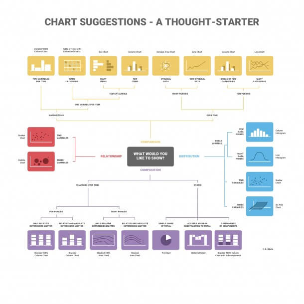
Do research the best chart for your dataset
Infographics are great for data visualizations like interactive maps, bar graphs, line graphs, radar charts, and more. Data visualizations help us understand complicated data, find patterns, identify trends, and tell a story.
Choosing the right type of chart is more important than you may think. If you select the wrong type of chart, it’s going to be difficult to understand and analyze the data you’re trying to illustrate. Also, you’ll have trouble emphasizing certain data points.
There are four types of data visualizations to showcase with charts: Comparison, relationship, composition, and distribution. Here are the main characteristics that distinguish them:
- Comparison
Comparison charts like a line or bar charts are used to compare one or more data sets. You can compare items and show differences over time.
- Relationship
With relationship charts like scatter and bubble charts, you can show connections and correlations between two or more variables.
- Composition
Composition charts are great for showcasing parts of a whole and changes over time. An example of a composition chart is a pie chart.
- Distribution
Distribution charts, such as 3D area charts illustrate how variables are distributed over time, which helps to identify outliers and trends.
Find out more about how to choose the right chart for your data set.
Don’t have too much text
While infographics are great storytellers, they’re not books or articles. Infographics are about visual storytelling, which means that the text isn’t the main character.
Data visualizations require additional context, so a sentence or two is sometimes vital to add next to your charts and graphs. Do your best not to overexplain. In an infographic, the text serves as a guide that leads the viewer from one point to another, but it doesn’t take center stage.
When reviewing your infographic, make sure you only leave in what’s necessary and lose any redundant or unnecessary copy.
Do add context with visual cues
Some data can be difficult to understand. Visual metaphors can add value and meaning to data without cluttering your data visualization with text.
When choosing visual metaphors like icons, images, stickers, or any other visual component, be intentional. You want your visual metaphor to add context and visual cues to your data visualizations, so it’s important to make sure the icon you’re using isn’t misleading or unrelated. Take time to browse through Infogram’s content library to find the perfect visual component that matches your data visualization.
Don’t confuse readers with irrelevant design elements
It’s great to get creative and explore interesting design themes, but always make sure that your theme has a clear and undeniable connection to your topic.
When we’re in our creative mind space, it’s easy to get lost in different ideas, and you might come up with something quirky and relevant to your topic. However, there’s a line between what’s creative and what’s distracting that you don’t want to cross. You want your infographic to be relatable and easily understandable to others, so stick with a design theme that’s a more obvious choice for the topic.
Infogram has a great range of pre-designed templates you can choose from to get started with your infographic. Explore different infographic templates and create your first infographic now.
Do have a design hierarchy
Infographics are like stories – you have a beginning, a middle, and an end. The way you read infographics is top to bottom, so there’s an inherent hierarchy of the story that leads you from the start until the end. Use this hierarchy in your infographic design, allowing information to feel like it flows naturally from top to bottom.
If you place information randomly throughout your infographic, it’ll be difficult to understand where to look first and how to read it. Instead, work out a logical information sequence. Start with a sentence that introduces the topic, explore each aspect of that topic, and end the infographic with a closing argument, summary, or takeaway.
Do optimize your infographic for different platforms
It’s essential to consider where your infographic will be displayed. Infographics can be shared on various platforms, from websites to social media, and each may have different size or format requirements. For instance, an infographic that looks great on a desktop website might be too small or difficult to read on a mobile device. Ensure your infographic is optimized for different formats and responsive to different screen sizes. This will make sure your design is accessible to all viewers, regardless of how they engage with it.
Don’t neglect data visualization clarity
The purpose of an infographic is to communicate data in a way that is easy to understand, so clarity is key. Avoid using overly complex visualizations that require too much interpretation. Instead, opt for straightforward charts, graphs, and icons that clearly illustrate the data. If your audience has to spend time figuring out what the visual means, the infographic has lost its impact. Prioritize clarity and simplicity to ensure that your audience can quickly grasp the information you’re presenting.
Infographic dos and don’ts
Infographics are great for telling a story, sharing insightful data, and educating on a great variety of topics. In fact, infographics are easy to recall for days after viewing. A study found that 65% of people remember new information three days later when it’s paired with an image. Therefore, infographics are powerful information-dense tools for many businesses and organizations.
If you want to reap the full benefits of infographics, make sure to follow the infographic tips we covered in this blog post to create meaningful and powerful visualizations. If you want to see what a great infographic looks like, explore stunning infographic examples.
Interested in discovering how Infogram can enhance your team’s work? Join a brief Zoom session with our Infogram representative to explore key features, get answers to your questions, and understand how we can assist. It’s quick, informative, and just like a coffee break chat. Schedule your call now!
Get data visualization tips every week:
New features, special offers, and exciting news about the world of data visualization.