26.09.2018 by Infogram
Funnel charts are extremely powerful in business settings, highlighting successful strategies and identifying potential problem areas at a glance. They’re used by sales, marketing, and product teams to show the progression of data as it passes through sequential stages, like when you’re after conversion rates and customer flows. You’ve most likely seen them in reports, presentations, dashboards, and marketing content.
The categories you choose to visualize are up to you, of course, but we can help you design a beautiful, effective funnel chart. Here’s what to do, and what not to do, when customizing your own.
Appropriate Format
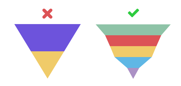
Funnel charts look like upside-down pyramids, with the number of items in the first stage being larger than the last. If your funnel chart doesn’t look like this, you’ve used the wrong chart. Don’t use a funnel chart if you have fewer than three stages to visualize or all stages are roughly the same size. You should also avoid designing a funnel chart that looks exactly like an upside down pyramid – with equal sides. This makes your funnel tough to understand quickly.
Do This: When you have more than 3 stages of a process to visualize, and there is a clear difference in the values associated with these stages, a funnel chart is a good choice. We suggest you make each stage proportional to the value represented, avoiding the equal triangle effect. This makes your funnel a much more accurate and successful visual tool.
Clean, Clear Labels
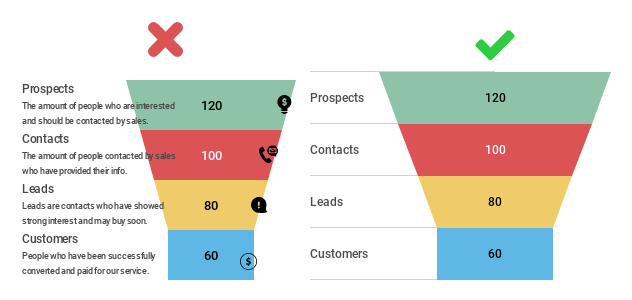
Your funnel chart needs proper labeling when it comes to numbers and text, but you don’t want to include too much or too little. Don’t include a long title, paragraphs of text explaining each stage, or more than one number to represent each section. This leads to a funnel chart that is cluttered and way too hard to decipher. On the flip side, you don’t want to exclude crucial information people need in order to get your message.
Do This: Once you’ve designed a funnel chart that is formatted correctly, you need to label the various stages and include a numeric value. We suggest you add one phrase or term associated with the proper stage to the left or right of your funnel, in line with the relative section, along with the number value. Add a simple, concise title and you’re almost there.
Representative Color Scheme
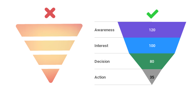
Color can make or break the appearance of your funnel chart. Don’t pick one color for your entire funnel or a gradient that moves seamlessly from the first stage to the last. This will make your chart almost impossible to read. You also don’t want to pick colors that are so dark your viewer can’t clearly read the labels you’ve added.
Do This: Pick colors that make it easy for your viewer to tell the different stages apart. Use clearly different shades of the same color in blocks, from dark to light, to give the impression of flow and connectivity. If you want your stages to reflect different colors that truly stand out, pick an easy to decipher yet pleasing color scheme, like blue, purple, and green.
Funnel Chart Alternatives
Still not sure the funnel chart is right for you? There are alternative charts you can try.
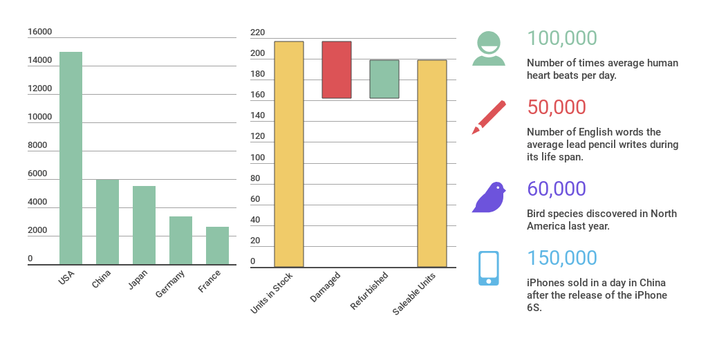
Another great way to visualize the stages of a business process are bar and column charts. While they might look very different from funnels, they are fundamentally similar. Just place your bars in the same order you’d place your funnel stages for fast viewing.
Waterfalls are also a nice alternative. Use waterfall charts if you want to show how you arrived at a net value by breaking down the cumulative effect of positive and negative contributing factors. And remember, if you just want to share some individual stats, like the number of leads or deals closed, use a basic facts and figures chart with fun, related icons.
Would you like to experience the full power of data visualization? Try Infogram for Teams or Enterprise for free! With a Team or Enterprise account, you can create up to 10,000+ projects, collaborate with your team in real time, use our engagement analytics feature, and more. Request your free demo here.
This post is a part of Infogram’s ‘Do This, Not That’ series – offering insight and best practices for the world’s most common chart types. If you found this useful, you may want to check out other posts in this series:
Interested in discovering how Infogram can enhance your team’s work? Join a brief Zoom session with our Infogram representative to explore key features, get answers to your questions, and understand how we can assist. It’s quick, informative, and just like a coffee break chat. Schedule your call now!
Get data visualization tips every week:
New features, special offers, and exciting news about the world of data visualization.