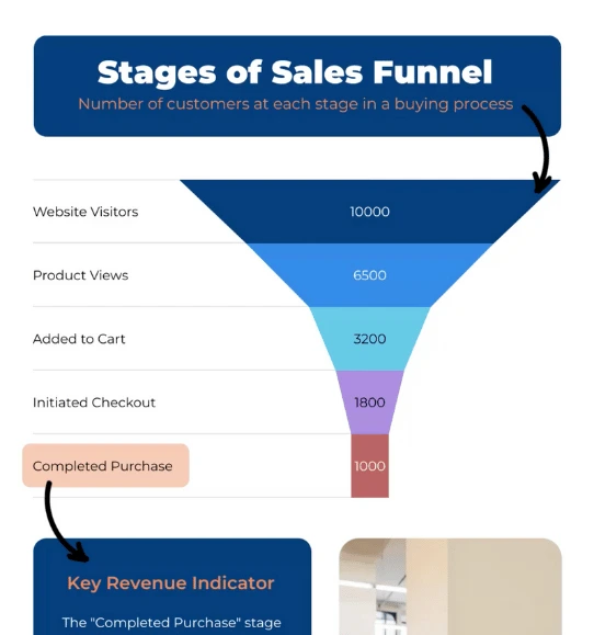
Create an Interactive Funnel Charts

Easily create funnel charts to show how data moves through each stage of a process or project.


4.7 out of 5 stars


Overview
Why
Examples
Reviews
Tips
FAQ
Visualize Data Progression
Creating insightful reports, dashboards, or infographics can be challenging, especially when trying to visually depict the narrowing journey of data through various stages. Traditional charts often fail to capture the true essence of a process where numbers diminish over time, such as a sales pipeline or a customer conversion funnel. This is where Infogram’s interactive funnel charts come in, offering an intuitive solution to visualize data in an engaging way.
Funnel charts are an essential tool for anyone needing to illustrate the movement and drop-off of data across multiple phases. They are particularly powerful for displaying conversion rates, tracking the flow of prospects in sales, analyzing website user behavior, or showing retention through various stages of engagement. For marketers, sales teams, analysts, or even educators, funnel charts help make complex data stories more digestible, clearly showing where drops are happening and where improvements can be made.
Infogram’s interactive funnel charts take these visualizations to the next level. They allow users, from content creators to teachers, to design visual stories that engage audiences, making data not just accessible but also visually appealing. Journalists can depict trends, marketers can pinpoint campaign success, sales teams can evaluate pipelines, and even students can present project data effectively. Infogram makes it easy for all these users to customize and interact with funnel data, ensuring the charts are as informative as they are visually striking.
What sets Infogram apart is the simplicity and interactivity. Unlike many other tools that require extensive customization or steep learning curves, Infogram provides ready-to-use, dynamic templates that anyone can adapt to fit their needs. The interactivity encourages viewers to explore the data for themselves, deepening engagement and understanding.
Ready to simplify your reporting and transform your data into engaging stories? Learn more about how Infogram’s funnel charts can make your next project truly stand out.
Explore Why Funnel Charts Are Useful
Discover why funnel charts are beneficial for your data visualization process.

Visualize a Sequential Process
Funnel charts are excellent tools for representing sequential processes, where data moves step-by-step through different stages. They are particularly effective for transforming complex processes into simple, visually intuitive graphics. By using funnel charts, you can easily convey how information flows from one stage to the next, providing clear insights into each part of the journey.
For those looking to simplify the creation process, Infogram offers an easy-to-use platform for designing and customizing funnel charts online. Whether tracking a sales cycle, a marketing campaign, or an onboarding flow, funnel charts make complex processes understandable, highlighting key points of progress and transition.

Highlight Conversion Rates
Funnel charts are particularly effective at highlighting conversion rates between different stages of a process. For example, in a sales funnel, they clearly show the percentage of leads that move from initial contact to qualified opportunities, and ultimately to closed deals.
This type of visualization helps teams quickly assess how efficiently each stage converts to the next, allowing for a fast understanding of overall performance. Identifying stages with lower conversion rates can help businesses take targeted action, optimizing specific parts of their process to improve overall outcomes. Infogram makes it simple to create detailed funnel charts that spotlight these key conversion metrics.

Identify Bottlenecks
Funnel charts are also powerful tools for identifying bottlenecks - those stages where data drops sharply, indicating a significant loss or inefficiency. These bottlenecks are often the main culprits behind process slowdowns or revenue loss. By visualizing data in a funnel chart, you can immediately spot where the largest drop-offs occur, helping you focus your efforts where they are needed most.
Identifying bottlenecks allows you to take corrective actions, such as redesigning workflows, improving user experiences, or implementing additional support strategies. By addressing these critical areas, you can streamline processes and ultimately improve your overall efficiency and effectiveness.

Analyze User Engagement
Funnel charts are highly useful for analyzing user engagement across websites, apps, or other digital platforms. By mapping out the user journey - from initial visits to specific actions like signing up, making a purchase, or completing another desired action - funnel charts help visualize how users interact with your product or service.
You can easily spot stages where user engagement declines, which may point to usability issues or other obstacles. Understanding these drop-off points allows you to optimize the user experience, enhance retention, and increase conversion rates, ultimately leading to greater overall success.

Track Sales Pipelines
Sales teams can greatly benefit from using funnel charts to track each stage of the sales process. From lead generation and qualification to proposal submissions and closing deals, funnel charts help visualize the entire pipeline, making it easier to manage prospects at every stage.
By illustrating where potential customers are in the sales journey, sales representatives can identify which areas need more focus, better manage their time, and make more accurate sales forecasts. By utilizing these charts, sales teams can not only improve tracking and management but also refine their sales strategies, leading to increased efficiency and higher close rates.
Get Inspired By Infogram User Created Projects

World Blood Donor Day

Top 100 Most Valuable Us Brands

Deep Look at National Parks in the U.S.

Healthcare Consumer Insights

The Most Popular Ice Hockey Leagues

Market Report - Portland

Buying Coffee Vs Making It

The Scope and Impact of Free-Roaming Dogs and Cats
Customer Reviews
Here is what our customers have to say about us.


2022 Summer & Fall and 2023 Winter leader in Data Visualisation Software 4.7 out of 5 stars
See reviews on G2 ›Empowering 30,000+ Companies Worldwide
From startups to established enterprises, our platform has been embraced by a diverse range of businesses seeking to captivate audiences and simplify complex data. Here are just a few examples of the 30,000+ companies that use Infogram.


Learn More Practical Tips
Marketing
3 Unique Ways to Optimize Your Landing Pages with Charts
Business
Best Ways to Visualize and Analyze Polling Data
Data
The complete guide to different types of charts
Design
Do This, Not That: Funnel Charts
Media
From data to story: Data journalism definition & examples
Marketing
3 Unique Ways to Optimize Your Landing Pages with Charts
Frequently Asked Questions
What kind of integration is Infogram providing to create live-updating charts and maps?
With Infogram, you can create dynamic charts and maps that update live and in real time. We support two integrations for live updates:
- Google Sheets
- JSON feeds
As soon as the data changes in the Google Sheet or JSON file, the chart or map it is linked to will automatically update, even when embedded.
Note: Infogram doesn't support formulas, only raw data. If you use formulas or other scripts in your Google sheet, the calculations may not show on Infogram after the import.
How do I create a live-updating chart or map via a JSON feed?
- Add a chart or map to your project canvas by clicking the Add chart or Add map buttons in the left side panel.
- Double-click the chart to open its editor. Above the data table, you will see data import buttons. Choose the Add JSON feed option.
- Now, when you edit the information in your JSON feed, it will automatically update in your Infogram chart. The chart refreshes data every 30 seconds to a minute. These changes will automatically apply to your embeds and shared URL link.
When to use a funnel chart?
Funnel charts are commonly used in sales, marketing, human resources, and project management to:
- Show relationships among multiple groups
- Show the number of prospects at each stage of a sales process
- Show the amount of potential revenue for each stage
- Track the progress of marketing campaigns (like website visitor trends)
- Illustrate shortlisted candidates for recruitment
- Identify potential problem areas (bottlenecks) in a process
How do I create a funnel chart?
Infogram's chart creator allows you to easily create professional funnel charts in just 5 steps:
- Log in to Infogram.
- Select the funnel chart type.
- Upload or paste your data.
- Customize the labels and adjust the design by changing the background, colors, and fonts.
- Download your funnel chart, add it to your project, embed it on your website, or share it on social media.
Infogram is super easy to use and made with non-designers in mind. Even if you don't have any programming, coding, or design experience, you'll be able to make funnel charts in just a couple of steps.
We did all the technical work for you. Now all that's left to do is start creating.
What are some best practices for creating funnel charts?
Here are some general tips to keep in mind to create funnel charts like a superstar:
- Highlight each stage with different colors: That way, it’ll be easier for the reader to compare each stage.
- Label each stage: This will improve the readability of your funnel chart. Don't make the labels too long, otherwise it will just confuse the reader.
- Don't pick colors that are too dark: If the color of your funnel chart is too dark, the viewer won't be able to clearly read the labels you’ve added.
- Scale the size of each stage so the differences are clear.
Learn more about creating the best funnel charts in our “Do This, Not That” series.
Should I use a funnel chart if I have fewer than 3 stages to visualize?
We don't recommend it. If your funnel chart looks exactly like an upside-down pyramid – with equal sides – it makes your funnel tough to understand quickly. Go for a funnel chart when you have at least 3 stages (but preferably more than 3) of a process to visualize and there's a clear difference in the values associated with the stages.
What other chart types can I use instead of a funnel chart?
Another great way to visualize the stages of a business process is to use bar and column charts. They might look different from funnel charts, but they're actually very similar. Waterfall charts are also a nice alternative – use this chart type to show how you arrived at a net value by breaking down the cumulative effect of positive and negative contributing factors.
Didn't find the answer? Check our FAQs

Try Infogram Now
Are you ready to unleash the power of data visualization? Get started with Infogram today and create stunning, interactive content that captivates your audience. Elevate your projects and bring data to life.
