22.11.2023 by Infogram
If you have data you want to visualize, it’s important to choose the right chart. While your data might work with multiple chart types, it’s crucial to determine the best possible chart to use in each case. Ultimately, it’s up to you to select the chart that ensures your message is clear and accurate. Remember, data is only useful and valuable if you know how to properly visualize it and give it context.
We’ll give you an overview of the different chart types and explain how to choose the right chart for your data.
What story does your data tell?
Before making a chart it’s important to understand why you need one. Charts, maps, and infographics help people understand complicated data, find patterns, identify trends, and tell a story. First, think about the message you want to share with your audience. Ask yourself what specific insights or information you want to highlight and what key takeaways you want your audience to grasp.
After defining your central message, follow the best charting practices. Ensure that your data is accurate, with all figures correctly calculated, and scale your charts appropriately to maintain precision. Consider specific insights you aim to convey and decide what would you like to show.
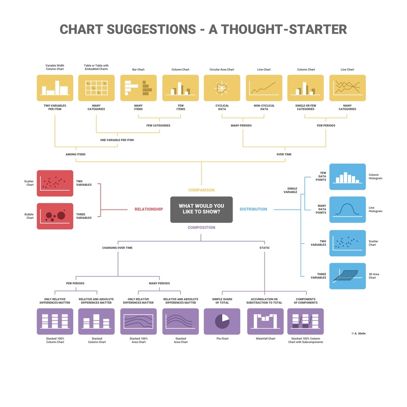
To help you choose the right chart for your data, let’s distinguish four main chart types:
Learn how to use data storytelling best practices to create stunning images and powerful presentations that drive audience engagement.
Comparison
Comparison charts are used to compare one or more datasets. They can compare items or show differences over time. These visual aids are valuable tools for gaining insights into patterns, trends, and variations within the data sets, facilitating a comprehensive understanding of the information at hand.
Relationship
Relationship charts are used to show a connection or correlation between two or more variables. By visually representing the interdependencies and associations, relationship charts provide a clear and concise way to comprehend the intricate dynamics between the variables being examined.
Composition
Composition charts are used to display parts of a whole and change over time. These charts provide a visual representation of how different components contribute to the overall composition and how their proportions evolve over a specified period.
Distribution
Distribution charts are used to show how variables are distributed over time, helping identify outliers and trends. By illustrating the spread and pattern of data points, distribution charts enable analysts to discern patterns, anomalies, and the overall shape of the data distribution.
Selecting the right chart type
Ask yourself how many variables you want to show, how many data points you want to display, and how you want to scale your axis.
Line, bar, and column charts represent change over time. Pyramids and pie charts display parts of a whole. While scatter plots and treemaps are helpful if you have a lot of data to visualize.
Interested in discovering how Infogram can enhance your team’s work? Join a brief Zoom session with our Customer Success Manager to explore key features, get answers to your questions, and understand how we can assist. It’s quick, informative, and just like a coffee-break chat. Schedule your call now!
Types of Charts
Line charts
A line chart reveals trends or changes over time. Line charts can be used to show relationships within a continuous data set, and can be applied to a wide variety of categories, including daily number of visitors to a site or variations in stock prices.
Best practices for creating line charts:
- Clearly label your axes: Make sure the viewer knows what they’re evaluating.
- Remove distracting chart elements: Grids, varying colors, and bulky legends can distract the viewer from quickly seeing the overall trend.
- Zoom in on the y-axis if your data set starts above zero: In certain cases, changing the scale of the y-axis makes it easier to read the data.
- Avoid comparing more than 5-7 lines: You don’t want your chart to become cluttered or hard to read. Visualize the data you need to tell your story, nothing more.
Pie charts
The pie chart is one of the most popular chart types of all time. Pie charts are used to show parts of a whole. A pie chart represents numbers in percentages, and the total sum of all the divided segments equals 100 percent.
Best practices for creating pie charts:
- Make sure your segments add up to 100%: Sounds obvious, but this is a common mistake.
- Keep it clean and consistent: Compare just a few categories to get your point across. If the pie slices are roughly the same size, consider using a bar or column chart instead.
- Avoid using 3-D imagery or tilt your pie chart: This often makes your data impossible to read, because your viewer is trying to compare angles.
Bar charts and column charts
Bar and column charts are used to compare different items. Bars on a column chart are vertical while bars on a bar chart are horizontal. Bar charts are generally used to help avoid clutter when one data label is long or if you have more than 10 items to compare. They’re easy to create and read.
Best practices for creating bar and column charts:
- Start the y-axis at zero: Our eyes are sensitive to the area of bars on a chart. If those bars are truncated, the viewer might draw the wrong conclusions.
- Label the axes: Labelling the axes gives your viewer context.
- Put value labels on bars: This helps to preserve the clean lines of the bar lengths.
- Avoid using too many colors, creating the “rainbow effect”: Using a single color, or varying shades of the same color, is a much better practice. You can highlight one bar in particular if that’s the message you want to get across.
Treemap
Treemaps show parts of a whole. They display hierarchical information as a cluster of rectangles varying in size and color, depending on their data value. The size of each rectangle represents a quantity, while the color can represent a number value or a category.
Treemaps allow you to view trends and make comparisons quickly – especially if one color is particularly prominent. While spreadsheets can show multiple rows of data, treemaps can accommodate hundreds of thousands of items in one organized display, making it easy to spot patterns in seconds. Plus, if made correctly, they make very efficient use of space.
Best practices for creating a treemap
- Start with clean data and a clear message: Treemaps can often involve a lot of data, so it’s important to know exactly what you want to highlight.
- Use bright, contrasting colors so each region is easily read: Remember to avoid the ‘rainbow effect’ and choose your colors wisely.
- Label each region appropriately with text or numbers: This makes it easier for the viewer to evaluate your treemap quickly, without error.
- Avoid cluttering your treemap with too many boxes: Treemaps can contain any number of boxes, but space is limited. You don’t want your treemap to be hard to read.
Dual-axis chart
With a dual-axis chart, you’re essentially combining multiple charts and adding a second y-axis for comparison. Some members of the data visualization community are skeptical about the use of dual-axis charts because they can often be confusing, poorly designed, and misleading to the viewer.
Let’s go over the different types of dual-axis charts and the best ways to use them:
Column and line chart: This dual-axis chart combines a column chart with a line chart.
Dual line chart: This dual-axis chart compares two line charts. There can be more than two lines if need be.
Dual column chart: This dual-axis column chart shows two sets of data displayed side by side.
Multiple-axes chart: This displays the most complex version of the dual-axis chart. Here you see three sets of data with three y-axes.
Area chart
Area charts are a lot like line charts, with a few subtle differences. They can both show change over time, overall trends, and continuity across a dataset. But, while area charts may function the same way as line charts, the space between the line and axis is filled in, indicating volume.
Best practices for creating area charts:
- Make it easy to read: Avoid occlusion. This happens when one or more layers cover important information on the chart.
- Use a stacked area chart: If you have multiple data sets and want to emphasize part-to-whole relationships.
- Use area charts to look at the bigger picture: For example, line charts are good for showing the net change in population over time, while area charts are good for showing the total population over time.
- Avoid comparing too many datasets: Use instead a line chart, it’s cleaner.
- Give the proper context with appropriate labels and legends.
Pyramid chart
Pyramid charts (triangle charts or triangle diagrams) are a fun way to visualize foundation-based relationships. They appear in the form of a triangle that has been divided into horizontal sections with categories labeled according to their hierarchy. They can be oriented up or down depending on the relationships they represent. The stacked layers can also show the order of steps in a particular process.
Best practices for creating pyramid charts:
- Pick a topic and clearly label your subcategories: Decide what information you want to convey with your pyramid and clearly label your layers.
- Organize your subcategories: Decide the order and value of each section on your pyramid.
- Organize the subcategories based on their hierarchy.
- Be consistent: Keep the spacing of your sections even and pick a pleasing color palette.
- Keep subcategories to a minimum: Adding many layers and colors can make your pyramid hard to read.
Word cloud
Word clouds (also known as tag clouds) are a type of weighted list. Word clouds display text in varying font sizes, weights, or colors to show frequencies or categories. They can be arranged alphabetically or at random. They help people identify trends and patterns that might have been difficult to see otherwise.
Best practices for creating a word cloud:
- Provide context: Word clouds are visually eye-catching and provide information about frequency but they often don’t give the viewer any context.
- Use word clouds to show frequency: Avoid using them to display complex topics like the budget or healthcare crisis.
- Watch your word length: Longer words take up more space and can be misleading.
- Analyze data: Word clouds are great for filtering and analyzing data.
- Consider color and font choice: Avoid making your words too similar in size or color.
Tables
Tables display data in rows and columns. Tables make it easy to compare pairs of related values or to display qualitative information (e.g. quarterly sales over several years).
There are multiple reasons you might select a table over a graph, as the right way to visualize your data.
Best practices for creating reporting tables:
- Identify goals: Ask yourself how your table will be used and define your audience.
- Make it easy to read: Consider removing grid lines to increase readability.
- Ensure data accuracy: Always include the source(s) of your data.
- Consider readability: Numbers should be aligned to the right because it makes them easier to compare. Text can be aligned left, but you might prefer to center it for readability.
- Think about your color and font choice: Use color or formatting to draw the viewer to specific values (cells) in your table.
Use Infogram and create interactive charts and graphs
Effective data visualization is a key element in conveying meaningful insights to your audience. The choice of the right chart type plays a pivotal role in ensuring that your message is clear, accurate, and easily comprehensible. By adhering to best charting practices, ensuring data accuracy, and considering the readability of your visualizations, you can craft compelling narratives that engage your audience and facilitate a deeper understanding of complex information.
You can easily create these and many other charts with Infogram. By using Infogram, you can unlock the power of data visualization and create visually appealing and interactive charts, graphs, and maps in minutes. Try Infogram today!
Get data visualization tips every week:
New features, special offers, and exciting news about the world of data visualization.