Create an Interactive Dual-Axis Chart

Easily create dual-axis charts to visualize complex comparisons.


4.7 out of 5 stars


Overview
Why
Types
Examples
Reviews
Tips
FAQ
A Powerful Tool for Comparing Datasets with Different Scales
Dual-axis charts, also known as dual-scale or combination charts, are graphical representations that display two different sets of data on the same chart using two separate y-axes. This allows you to compare two different data series that may have different scales or units of measurement, making it easier to identify patterns, trends, or relationships between the two datasets.
The main advantage of dual-axis charts is that they enable you to visualize data that would not be effectively represented on a single y-axis due to significant differences in magnitude or units. By using dual axes, you can plot these datasets side by side, making it easier to understand their trends and any correlations that might exist between them.
When creating dual-axis charts, it's essential to ensure that the data being compared is relevant and that the scaling of the axes is appropriately adjusted to avoid misleading interpretations. Proper labeling and a clear legend are also crucial to help readers understand which data series corresponds to each axis.
Explore Why Dual-Axis Charts Are Useful
Discover the benefits of dual-axis charts for your data visualizations.

Comparing Different Data Ranges
When dealing with datasets that have significantly different ranges, a single y-axis can cause one dataset to dominate the chart, making it hard to see the other dataset's trends. This is where dual-axis charts become highly valuable. By providing two y-axes, each with its own scale, dual-axis charts allow both datasets to be represented accurately and clearly.
This means you can compare data sets with vastly different values, such as revenue in millions and website traffic in thousands, on the same chart without one overshadowing the other. With dual-axis charts, it becomes easier to spot patterns and analyze trends from both datasets in a single, unified view, making your data comparisons more insightful and meaningful.

Understanding Relationships and Correlations
Dual-axis charts are excellent for uncovering potential relationships and correlations between two variables. By plotting them together on the same chart, you can easily visualize how one variable affects or corresponds with the other. For instance, you might use a dual-axis chart to compare advertising spend and sales revenue to see if an increase in spending leads to higher sales.
This type of chart not only helps you observe trends but also enables you to assess potential cause-and-effect relationships between different datasets. By understanding how to create a dual-axis chart, you can leverage this technique to compare and contrast two distinct data sets with different scales, offering a more comprehensive view of their interactions.

Highlighting Infrequent Events
Dual-axis charts are also useful for highlighting rare or infrequent events that may not follow the same trend as your primary data. For example, if you are tracking daily website traffic alongside occasional server downtimes, a dual-axis chart allows you to present both sets of data without skewing the visualization. The secondary axis enables these infrequent events to be clearly highlighted while maintaining the accuracy of the main dataset.
This makes it easier to compare these events with the overall trend, helping you see their impact in context. Mastering how to make a dual-axis chart ensures that your data remains clear and undistorted, while still showcasing important outliers or irregular occurrences.

Comparing Data Over Time
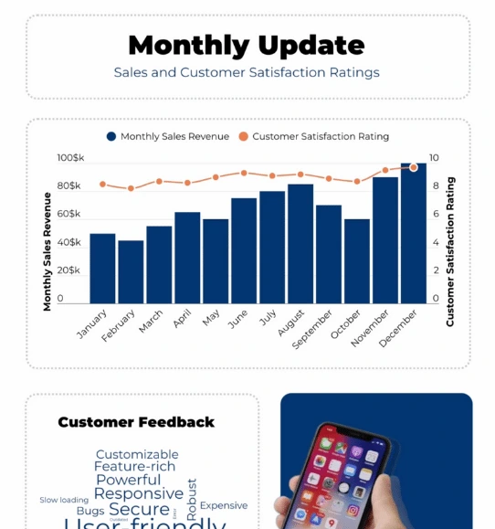
Dual-axis charts are particularly helpful when you need to compare two datasets measured in different units but over the same time period. For instance, if you're analyzing monthly sales figures in dollars and customer satisfaction ratings in percentage, a dual-axis chart allows you to plot both on a single timeline. This makes it easier to see how the two datasets behave in relation to each other over time.
Using dual-axis charts for time-based data comparisons provides a clearer picture of how different metrics perform simultaneously, allowing you to identify trends, spikes, or declines in both datasets over the same timeframe. This type of visualization is crucial for making informed decisions when tracking progress across multiple metrics.

Identifying Turning Points
Dual-axis charts are particularly effective at identifying turning points or key shifts in your data. When visualizing two datasets on separate axes, you can easily spot where the lines intersect, diverge, or experience significant changes. These intersections can signal important moments that warrant further investigation, such as a shift in market behavior, a sudden change in customer engagement, or a pivotal event in a business process.
By using dual-axis charts, you can track these critical points more easily and gain a deeper understanding of how different datasets interact. Learning how to make a dual-axis chart gives you the ability to uncover these key insights and make better data-driven decisions based on the clear visualization of turning points.
Dual Axis Chart Types to Explore

Dual-Line Chart
Compares two data sets as lines on the same graph, each with its own y-axis, to show trends over time.

Dual-Bar Chart
Displays two sets of bars with separate y-axes, allowing easy comparison of data across categories.

Dual-Area Chart
Shows two data sets as filled areas with separate y-axes to compare trends and visualize their combined impact.

Dual-Column Chart
Uses vertical columns with separate y-axes to compare two data sets side by side.

Dual-Combination Chart
Combines different chart types on the same graph to display multiple data sets in one view.

Dual-Scatter Plot
Plots two sets of data points with separate axes to identify relationships between the data sets.

Dual-Axis Bubble Chart
Represents data points as bubbles with separate axes and bubble sizes to show three dimensions of data.

Dual-Pie Chart
Place two pie charts side by side to compare different data sets.
Get Inspired by Infogram User-Created Projects

World Blood Donor Day

Top 100 Most Valuable Us Brands

Deep Look at National Parks in the U.S.

Healthcare Consumer Insights

The Most Popular Ice Hockey Leagues

Market Report - Portland

Buying Coffee Vs Making It

The Scope and Impact of Free-Roaming Dogs and Cats
Customer Reviews
Here is what our customers have to say about us.


2022 Summer & Fall and 2023 Winter leader in Data Visualisation Software 4.7 out of 5 stars
See reviews on G2 ›Empowering 30,000+ Companies Worldwide
From startups to established enterprises, our platform has been embraced by a diverse range of businesses seeking to captivate audiences and simplify complex data. Here are just a few examples of the 30,000+ companies that use Infogram.


Learn More Practical Tips
Marketing
3 Unique Ways to Optimize Your Landing Pages with Charts
Business
Best Ways to Visualize and Analyze Polling Data
Data
How to choose the right chart for your data?
Media
From data to story: Data journalism definition & examples
Design
Introducing Quarterly X-Axis Labels
Design
Dataviz 101: Dual Axis Charts, a Killer Combo
Frequently Asked Questions
How does Infogram make interactive maps easy to create?
Infogram’s 800+ maps and simple tools let you build dynamic maps quickly. A data journalist can create a clickable election map, while a market researcher can plot customer locations, all without design skills. Import data from spreadsheets or PDFs, and add features like tooltips or animations. It’s fast, intuitive, and needs no coding.
What kind of integration is Infogram providing to create live-updating charts and maps?
With Infogram, you can create dynamic charts and maps that update live and in real time. We support two integrations for live updates:
- Google Sheets
- JSON feeds
As soon as the data changes in the Google Sheet or JSON file, the chart or map it is linked to will automatically update, even when embedded.
Note: Infogram doesn't support formulas, only raw data. If you use formulas or other scripts in your Google sheet, the calculations may not show on Infogram after the import.
How do I create a live-updating chart or map via a JSON feed?
- Add a chart or map to your project canvas by clicking the Add chart or Add map buttons in the left side panel.
- Double-click the chart to open its editor. Above the data table, you will see data import buttons. Choose the Add JSON feed option.
- Now, when you edit the information in your JSON feed, it will automatically update in your Infogram chart. The chart refreshes data every 30 seconds to a minute. These changes will automatically apply to your embeds and shared URL link.
When do I use a dual-axis chart?
With a dual-axis chart, you’re essentially combining multiple charts and adding a second Y-axis for comparison. Some members of the data visualization community are skeptical about the use of dual-axis charts because they can often be confusing, poorly designed, and potentially misleading for the viewer.
However, if you have limited space and want to quickly establish the relationship between two variables, the dual-axis chart might be the right fit for you.
How to make a dual-axis chart?
Infogram's dual-axis chart creator allows you to quickly make a radial chart in just 5 steps:
- Log in to Infogram.
- Select a dual-axis chart type (column and line chart, dual line chart, grouped column and line chart, or stacked column and line chart).
- Upload or paste your data.
- Customize colors, labels, and fonts.
- Download your dual-axis chart or embed it on your website.
Infogram is super easy to use and made with non-designers in mind. Even if you don't have any programming, coding, or design experience, you'll be able to make a dual-axis chart in just a couple of steps.
What are some best practices for creating dual-axis charts?
Here are some general tips to keep in mind to make an effective dual-axis chart:
- Make sure your Y-axes are related. Dual-axis charts can be useful when comparing values that have different units of measurement because the things they measure are somehow related in a meaningful way. So make sure both axes are helping you tell your story effectively.
- Place the primary Y-axis on the left. We are hardwired to look at the Y-axis on the left first. Make sure your more important variable is placed there.
- Use contrasting colors. Color-code your dual-axis chart to make it easier for people to understand the data sets you have plotted. Try using contrasting colors so they’re easy to distinguish from one another.
- Give diversity to your data. For example, you can use a dual-axis chart to compare revenue and units sold, price and volume, or rainfall and temperature. If you use similar units of measurement (for example, monetary values), make sure both Y-axes are scaled differently.
- Avoid clutter. Don’t compare more than four variables when creating a dual-axis chart.
- Correlation does not always equal causation. Other factors may have influenced the data and gone unnoticed.
How can I style my dual-axis chart?
You can customize any dual-axis chart to your liking. Pick the right color palette and font, adjust the labels and icons, and even add animations. To edit your chart, click on it, then go to Settings and make the necessary changes.
Didn't find the answer? Check our FAQs

Try Infogram Now
Are you ready to unleash the power of data visualization? Get started with Infogram today and create stunning, interactive content that captivates your audience. Elevate your projects and bring data to life.
