15.11.2018 by Infogram
In our ‘Do This, Not That’ series, we offer insight and best practices for the world’s most common chart types. For each chart, we explain when to use it and offer before and after examples for you to compare. Check out our abbreviated versions of each of the posts below, or click the buttons below each section to dive into the details.
Bar Charts
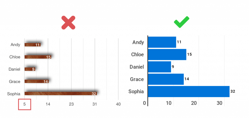
The x-axis and y-axis are the backbone of your bar chart. Don’t start the axis at a value above zero. When you start your axis above zero, you shrink the bars and skew the way your data looks, often confusing the viewer and robbing them of context. You also want to avoid gaps in between your bars that are uneven or too large. This can be a result of poor design or an axis that isn’t scaled evenly.
Do This: Once you’ve set your origin to start at zero, make sure your axes are scaled evenly. The spaces in between your bars should be uniform and consistent. If the data isn’t in chronological order, place the bars in order by size.
Line Charts
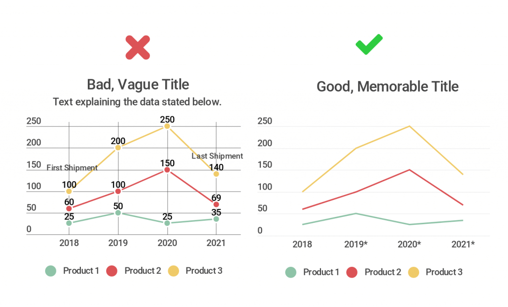
Don’t feel pressure to include all the information you have about your chart in the form of text. You don’t want to overwhelm your viewer with paragraphs of copy, bulky legends, axes labels, and additional words. Legends aren’t a requirement for single-line charts but can be very useful when comparing multiple lines on the same chart.
Do This: Be very selective with the text you choose to add to your chart. Give it a good, memorable title. Label the axes if the information provided by the tick marks needs further explanation. If you are visualizing data you didn’t collect yourself, list a source somewhere small that doesn’t distract from your line chart. If one of your data points stands out and needs to be highlighted, feel free to add a pop of color or a few words of text to focus your viewer’s attention there.
Pie Charts
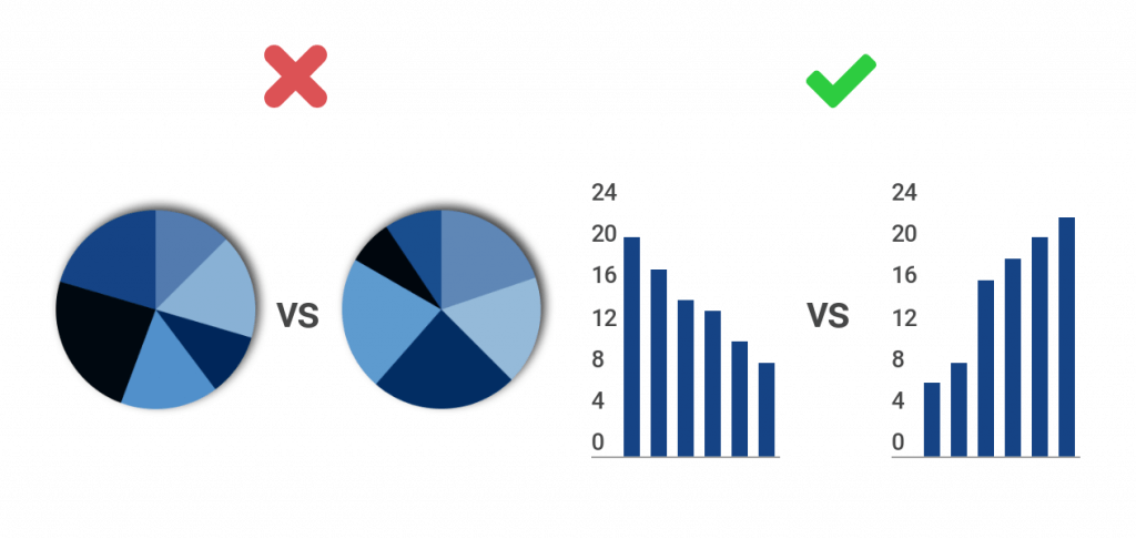
The human brain is very good at distinguishing differences in length and volume, which is why bar and column charts are so popular. What the brain isn’t good at, though, is comparing angles. Never ask your viewer to compare one pie chart with another pie chart. This practice is confusing and time-consuming.
Do This: If you’re looking to compare two datasets side by side that represent parts of a whole, use bar and column charts instead of pie charts. It’s much easier for people to compare the length of bars and columns than it is for them to compare the angles found in a pie chart. When comparing two datasets, try a grouped bar or column chart. This means you don’t have two separate charts to compare. Instead, you have one organized chart that saves space and your viewer’s time.
Maps
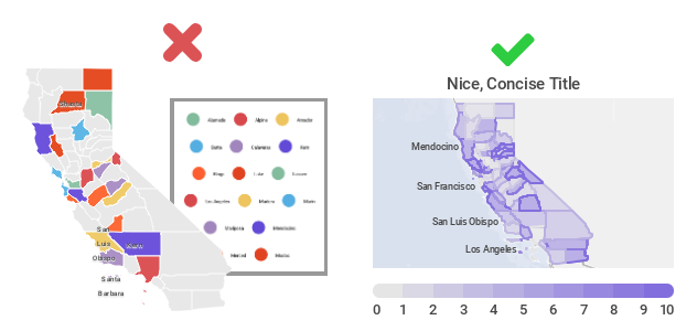
Nothing is worse than a cluttered, hard-to-read map. Don’t make your design so elaborate that people can’t understand your message quickly. Resist the urge to add all of the information you have in the form of legends, text, labels, and images. That being said, you don’t want to leave out crucial information that your viewer needs for context and deeper understanding.
Do this: Craft a map that is clean, simple, and organized. Keep in mind the size of your final map, and where it will be viewed, as this will determine how detailed or general you should be. Give your map a clear title, legend scale, and source for your data. Try different layouts to avoid overcrowding or large blank areas. Everything on your map should have a purpose. Ask yourself – Does this element play an essential function? Can it be simplified? Does it require an explanation? And is it critical for reading comprehension? Always remember that less is more.
Pictorial Charts
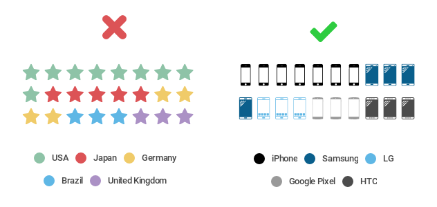
The right icon is key to the perfect pictorial chart. Don’t pick a generic icon that doesn’t relate directly to your story. You want to grab people’s attention and understanding quickly, not leave them wondering what they’re looking at. You also need to think about where people will be viewing your chart. If it’s relatively small, say on a mobile device or a sheet of paper, you don’t want to pick an icon with a lot of detail that’s tough to see.
Do this: Once you’ve honed your overall message, pick an icon that makes your topic pop. There are a lot of great icon options available these days, so it’s easy to find one that is specific to your dataset. Pick an icon that is easy to read, clear, and to the point. If you’re talking about fruit sales, pick an icon that corresponds with the specific fruit you’re selling. If you’re talking about iPhone sales, grab an icon of a smartphone, or a stack of money.
Makeover your pictorial charts
Funnel Charts
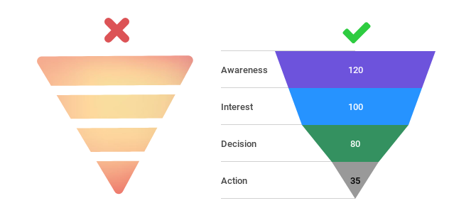
Color can make or break the appearance of your funnel chart. Don’t pick one color for your entire funnel or a gradient that moves seamlessly from the first stage to the last. This will make your chart almost impossible to read. You also don’t want to pick colors that are so dark your viewer can’t clearly read the labels you’ve added.
Do This: Pick colors that make it easy for your viewer to tell the different stages apart. Use clearly different shades of the same color in blocks, from dark to light, to give the impression of flow and connectivity. If you want your stages to reflect different colors that truly stand out, pick an easy to decipher yet pleasing color scheme, like blue, purple, and green.
Interested in discovering how Infogram can enhance your team’s work? Join a brief Zoom session with our Infogram representative to explore key features, get answers to your questions, and understand how we can assist. It’s quick, informative, and just like a coffee break chat. Schedule your call now!
Get data visualization tips every week:
New features, special offers, and exciting news about the world of data visualization.