04.10.2018 by Infogram
Creating amazing charts takes time and experience – that’s why we’ve put together a quick list of the best data visualization resources we have to offer. The Infogram team has spent years putting together educational videos, helpful tutorials, and fun dataviz filled blog posts for you to enjoy. Click away!
Data Visualization Workshop
Welcome to our Data Visualization Workshop video series. This series consists of instructional videos that are simple and easy-to-follow. We want to show you how to make the most of your data, giving you useful skills and helpful advice along the way. We’ve included the pilot episode below – don’t forget to watch episodes one, two, three, four, five, six, seven and eight.
Infogram Support Center
The Infogram Support Center is your go-to resource 24/7 complete with step-by-step guides on project creation, charts, maps, editing, publishing, exporting content and so much more. Simply add a keyword to the search bar to view a list of suggested articles.
Tip: Make sure to check the product updates section often. This is the best place to learn about exciting new developments.
To kickstart your journey with Infogram, here are a few helpful articles:
- Creating a chart or infographic
- Creating a map
- Interactivity and animated data storytelling
- Downloading and printing your project
- Embedding a project online
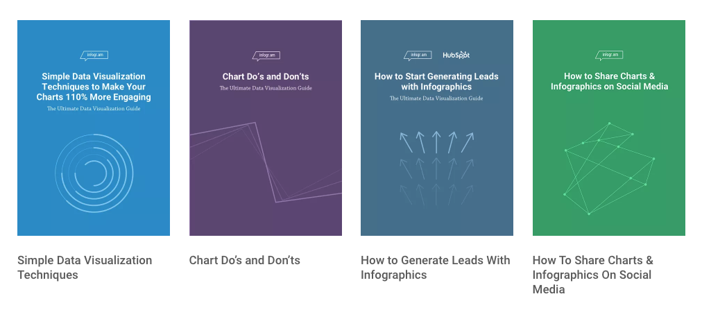
eBooks
Explore our free eBook library for thoughtful content on data visualization, infographics, chart techniques, social media, and more!
Getting Started with Infogram
Learn how to create beautiful infographics, reports, maps, charts and more with Infogram. We offer over 100+ templates, flexible drag-and-drop editor, 1 million images and icons, and a wide variety of data import options.
Learn the Basics
We’ve created a variety of landing pages explaining what charts Infogram offers, how to make them, and colorful examples to help guide you. Check out: treemaps, word clouds, pyramids, dual axis charts, timers, scatter plots, and social media graphics.
Do This, Not That Blog Series

Welcome to Infogram’s ‘Do This, Not That’ blog series – offering insight and best practices for the world’s most common chart types. Each post offers three dos and don’ts specific to each major chart type. Explore each post in the series:
Infogram Customer Stories
Learn how companies around the globe use Infogram to communicate with data in a clear and engaging way. Take a deeper look at how Access to Medicine uses Infogram to shed light on access to crucial medicines around the world, GTB uses Infogram to share social media successes, and how Brazillian think tank FGV uses Infogram to bring awareness to Dengue Fever.
Now that you have fresh data visualization knowledge, it’s time to log in to Infogram and make a chart, map, or infographic for yourself! And remember, if you have any questions or want to learn more, feel free to reach out to our lovely support team.
Interested in discovering how Infogram can enhance your team’s work? Join a brief Zoom session with our Infogram representative to explore key features, get answers to your questions, and understand how we can assist. It’s quick, informative, and just like a coffee break chat. Schedule your call now!
Get data visualization tips every week:
New features, special offers, and exciting news about the world of data visualization.