
Create Interactive Election Data Visualization
Visualize local and national election results with interactive maps and charts that'll captivate your audience.


4.7 out of 5 stars


Overview
Why
Types
Examples
Reviews
Tips
FAQ
Visualize Election Data with Ease
Election data, polling numbers, demographic trends – all of these metrics are essential for broadcasters, crucial for researchers, and vital for voters. Data alone can be difficult to thoroughly understand, analyze, and draw accurate conclusions from. That’s where Infogram, a powerful data visualization tool, steps in to provide an accessible, responsive, and user-friendly ground for creating and sharing election data.
Discover the intricate landscape of electoral maps, polling numbers, and election results visualization with Infogram. Whether you're a data analyst, journalist, or educator, understanding the nuances of visualizing election data is key for making informed decisions and interpreting the pulse of politics. Infogram empowers you to explore interactive election maps and charts and create your own electoral maps and charts with ease. From electoral college charts to national election pie charts, we offer a wide range of tools and resources to visualize election data effectively.
Uncover insights, track trends, and engage with the democratic process through innovative election data visualization techniques. Discover the right tools and methods to communicate complex electoral information and engage your audience like never before.
5 Reasons to Try Infogram's Election Data Visualizations
Discover the reasons why you should try to create interactive election data visualization.

Election Charts
Whether you're analyzing election results from around the world or delving into historical voting trends, Infogram offers features that make data visualization accessible to all. With its intuitive drag-and-drop interface and extensive library of chart types, Infogram allows you to create stunning visualizations that capture the complexity and nuance of electoral data.
From pie charts illustrating vote share by party to bar graphs showcasing voter demographics, Infogram provides the flexibility needed to convey key insights in an engaging way.

Electoral Maps
Electoral maps offer a bird's eye view of how each state or region voted, allowing for easy identification of trends and patterns.
Infogram is the perfect electoral map maker that offers an intuitive interface for creating custom interactive election maps, where you can easily import your data and tailor the design of your map in just a few clicks.

Easily Embed Interactive Content
Keep your audience focused and engaged by embedding interactive projects directly into your website or blog with Infogram's digital media solutions. This feature creates a dynamic and immersive user experience, allowing your audience to interact directly with your content right from your site.
Enhancing their understanding of your data and boosting engagement has never been easier. Plus, by keeping the audience on your site, you’ll increase the likelihood of them exploring other content, thereby increasing time spent on your site and potentially boosting your SEO rankings. It also offers a smooth user experience by removing the need for audience members to navigate to external pages to view your data.

Seamless Data Import
Data accessibility is essential for any digital publisher, and with Infogram's solutions, connecting to your data has never been simpler. Importing data from a wide variety of online databases, such as MySQL, PostgreSQL, Amazon Redshift, Oracle, and Microsoft SQL Server is easy. Infogram ensures your data entry process is straightforward and efficient, so your visualizations always have access to the most current information.
In return, you can invest the time saved in creating more insightful and impactful content. In addition, accurate, up-to-date data is crucial for establishing trust with your audience and making informed business decisions.

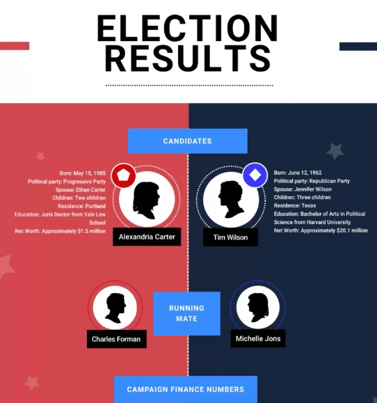
Election-Themed Templates
We offer a wide range of election-themed templates designed to help you effectively cover all types of elections, from local to national. These templates are perfect for journalists and content writers who need to present election results, polls, and voter turnout data in a visually appealing and easy-to-understand way.
With Infogram’s customizable options, you can create engaging infographics, charts, and maps that will make your election coverage stand out. Whether you’re reporting on a presidential race or local city council elections, these templates will ensure your audience stays informed and engaged.
Explore Most Loved Features

Map Library
Infogram's map library lets you visually represent geographic data in a compelling and easy-to-understand format. Choose from various styles and formats to best fit your narrative.

Custom map upload
Elevate your data-driven narratives with precise data using custom map uploads.

Data Import
Infogram enables you to seamlessly import data from Excel, Google Sheets, databases, and more. Leverage our integrations and import capabilities to bring your data effortlessly into the reporting environment.

API Integration
Integrate, update, and publish visualizations effortlessly with Infogram API.

Streamline Workflow With AI
Try AI-powered chart suggestions or create tables and infographics with help of AI from scratch.

Annotations and Callouts
Add context to your data visualizations with annotations and callouts. These features allow you to add explanatory text, highlights, and insights to your reports, ensuring your audience comprehends the presented information fully.

Brand Kit
Infogram's brand kit lets you ensure your brand consistency across all projects. Upload your brand's logos, color schemes, and fonts, and apply them across all your Infogram projects.

Content Engagement Analytics
Get invaluable insight into how your audience interacts with your content. Track their behavior to understand what resonates with them, identify the elements that drive engagement, and use this data to refine and enhance your future content strategy.
Get Inspired by Infogram User Created Projects

FiveThirtyEight: Election Forecast Infographic

Voting Results Interactive Map

Informative Election Infographic

WKMG News 6: WEB Central Florida Early Voting Data in 2020

Voter Intention: UK General Election Chart

Senedd Members 2021 Interactive Map

Council Seats in Wales Line Chart

Norway's PM POP Poll: Solberg vs. Støre Interactive Chart
Customer Reviews
Here is what our customers have to say about us.
2022 Summer & Fall and 2023 Winter leader in Data Visualisation Software 4.7 out of 5 stars
See reviews on G2 ›Empowering 30,000+ Companies Worldwide
From startups to established enterprises, our platform has been embraced by a diverse range of businesses seeking to captivate audiences and simplify complex data. Here are just a few examples of the 30,000+ companies that use Infogram.


Learn More Practical Tips
Business
Best Ways to Visualize and Analyze Polling Data
Media
Your guide to interactive electoral maps
Media
9 charts for visualizing election data [+ examples]
Design
What is a choropleth map and how to create one with Infogram
Media
Essential data journalism skills for every data journalist
Design
Good and bad data visualization examples
Frequently Asked Questions
What types of visualizations are commonly used for election data?
Common visualizations include bar charts, pie charts, line graphs, scatter plots, choropleth maps, and heatmaps. Each type of visualization serves different purposes and can effectively communicate various aspects of election data.
Not sure what chart to use for your data? Discover how to choose the most suitable chart for your data here.
Where can I find reliable election data for visualization?
Reliable sources for election data include government election offices, independent election watchdog organizations, academic research institutions, and reputable news outlets. Many countries also have official election websites where you can access detailed election results.
Discover a great list of free data sources in this article.
How can I ensure the accuracy of my visualized election data?
It's crucial to verify the credibility of your data sources and cross-reference multiple sources to ensure accuracy. Additionally, double-check your data processing and visualization techniques to avoid errors or misinterpretations.
What are some best practices for visualizing election data?
Best practices include selecting appropriate visualization types for your data, clearly labeling axes and data points, providing contextual information, using consistent color schemes, and avoiding misleading visualizations that could skew interpretations.
To learn more useful techniques for visualizing data effectively, read our article on the best data visualization practices.
Can I use election data visualizations for predictive analysis?
While election data visualizations can provide insights into past voting trends and behaviors, they may not always accurately predict future outcomes due to the complexity of political dynamics and the influence of unforeseen events.
How can I make my election data visualizations accessible to a wide audience?
Ensure that your visualizations are easy to understand for people with diverse backgrounds and levels of expertise. Consider using Infogram, a powerful data visualization tool that offers features specifically designed to enhance accessibility:
- Clear design: Infogram offers intuitive templates and customization options for clear, simple visuals.
- Explanations and tooltips: Add annotations and tooltips to provide context and help users interpret data accurately.
- Accessible charts and maps: Choose from various chart and map types optimized for accessibility with clear labels and colors.
- Navigation and compatibility: Infogram supports keyboard navigation and screen readers for users with disabilities.
- Responsive design: Visualizations are mobile-friendly, ensuring accessibility across devices.
With Infogram, you can create inclusive visualizations that are easy for all users to understand and navigate.
What are some advanced techniques for visualizing election data?
Advanced techniques may include interactive visualizations, data animations, sentiment analysis of social media data, network analysis of political connections, and machine learning algorithms for predicting voter behavior.
What factors should I consider when selecting a data visualization tool for polling numbers?
If you want to create your own electoral map, or election pie chart, or visualize any other election or polling numbers, you have first to pick the right data visualization tool. Consider factors such as the tool's ease of use, compatibility with your data sources, available features for creating specific types of visualizations (e.g., maps, charts, graphs), customization options, scalability for handling large datasets, and cost.
To explore different data visualization tools and find out how to choose the right one for you, read our article here.
Can I integrate Infogram with other data analysis or reporting platforms?
Integration capabilities with other tools and platforms, such as data analysis software, database systems, or reporting platforms, can enhance your ability to effectively analyze and present election data. To seamlessly integrate and showcase election data, incorporate Infogram API.
The Infogram API provides you with programmable access to key features like accessing the project library, updating and copying projects, publishing them on websites or private URLs, and exporting them in multiple image formats, PDF, or HTML. This versatility enables a dynamic and automated approach to data visualization, saving you time and resources when visualizing and analyzing polling numbers and election results.
How can I stay updated on new developments and trends in visualizing election data?
Explore valuable tips and best practices for finding reliable data sources and visualizing election data in the following articles:
Didn't find the answer? Check our FAQs

Try Infogram Now
Are you ready to unleash the power of data visualization? Get started with Infogram today and create stunning, interactive content that captivates your audience. Elevate your projects and bring data to life.