
Capture Audience Attention with Interactive Visuals
Turn complex data into engaging stories your audience will explore and remember.


4.7 out of 5 stars


Overview
Why
Types
Examples
Reviews
Tips
FAQ
Capture Audience's Attention
As a media professional, you turn raw data into stories that inform and engage - whether you’re a data journalist uncovering trends, an editor shaping content for clarity, or a producer crafting visuals for broadcast. Infogram makes this easier by helping you create interactive visuals that cut through the noise.
No more static charts or dense spreadsheets. With Infogram, you can transform datasets into visuals that invite your audience to explore, understand, and share your story.
Our tool is designed for your workflow. Import data from Excel or databases, choose from 35+ chart types or 800+ maps, and customize visuals to match your outlet’s brand. AI tools suggest the best charts and handle repetitive tasks, so you can focus on the narrative. Embed visuals in articles or presentations with one click, and track engagement to see what resonates.
From investigative reports to social media graphics, Infogram helps you tell stories that stick.
5 Reasons to Try Infogram Today
Discover how Infogram helps you create data-driven stories that engage your audience.
Transform Data into Interactive Visuals
Infogram lets you turn raw data into compelling stories with interactive and animated visuals. Create a clickable chart showing election results or a zoomable map highlighting regional data for a policy brief. Features like tooltips, clickable legends, and animations (e.g., zoom or fade) let your audience explore data, deepening their understanding.
For example, a news graphic could let readers hover to see detailed stats, while an animated chart for a broadcast segment grabs viewers’ attention, making your story more impactful and shareable.
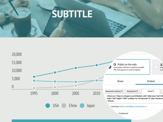
Easily Embed Interactive Content
Share visuals anywhere - no coding needed. Embed responsive, auto-updating charts or maps into your news site, blog, or presentation. For instance, add a live-updating dashboard to a story on audience trends, keeping readers on your site longer.
This boosts engagement, encourages exploration of other content, and supports SEO by reducing bounce rates. Your visuals stay sharp on any device, ensuring a seamless experience.
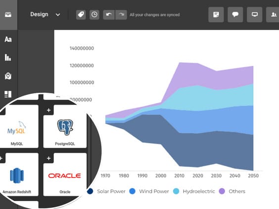
Streamline Data Handling
Import data effortlessly from Excel, Google Sheets, or databases for real-time updates. Infogram’s AI suggests the best chart types and converts images or PDFs to datasets, saving you time.
For example, a journalist tracking public health stats can import a dataset and create an updating chart in minutes. This ensures accuracy and lets you focus on crafting narratives instead of wrestling with data.
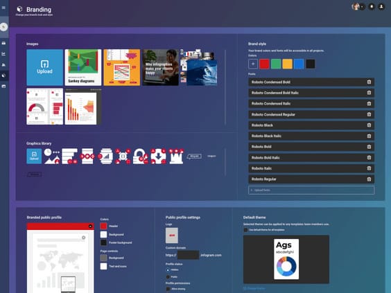
Maintain Brand Consistency
Keep visuals on-brand with Infogram’s brand kit. Upload your outlet’s logos, colors, and fonts, and apply them to every chart or map.
For example, a magazine can ensure all visuals match its style guide, building trust and recognition. Automated styling saves time, letting you focus on storytelling while maintaining a polished, professional look across your content.
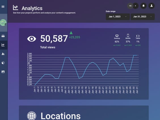
Uncover Insights with Engagement Analytics
Track how your audience interacts with your visuals using Infogram’s analytics. Monitor views, clicks, hovers, and shares to see what drives engagement.
For example, a media analyst could use these insights to refine a dashboard on market trends, ensuring it resonates with readers. Clear, accessible data helps you optimize your content strategy and deliver stories that hit the mark.
Explore Most Loved Features

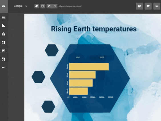
Chart Library
Choose from a diverse range of chart types in Infogram's extensive library. Customize colors and labels to present your data in a visually compelling way, making complex information easily understandable.

Map Library
Visualize geographic data effectively with Infogram's map library. Select from various map styles and formats to enhance the impact of your storytelling and showcase regional insights.

Data Import
Effortlessly import data from various sources into Infogram, ensuring accurate and up-to-date visualizations for your reports. Streamline your data management process and focus on analyzing insights.

Annotations and Callouts
Add explanatory text, highlights, and insights to your data visualizations with Infogram's annotation and callout features. Provide context and enhance audience understanding of your nonprofit's impact.

Real-Time Collaboration
Collaborate seamlessly with your team members, editors, and contributors in real-time. Share projects, leave comments, and track changes, facilitating efficient teamwork and content creation.

Project Embeds
Enhance your website or blog with interactive visualizations by seamlessly integrating them through Infogram's project embeds. Create an engaging and immersive experience for your audience.

Brand Kit
Ensure consistent branding across all your projects with Infogram's brand kit. Effortlessly upload and apply your nonprofit's logos, color schemes, and fonts to maintain a cohesive visual identity.

Content Engagement Analytics
Gain valuable insights into audience behavior and engagement with Infogram's comprehensive analytics. Refine your content strategy based on real-time feedback, ensuring maximum impact and resonance.
Get Inspired by Infogram User Created Projects

Marvels Movies Binge-Watch the Right Way

This Is Our Solar System

Halloween Shopping Season

Women of the Nobel Prize

10 Years After the Deepwater Horizon Oil Spill

Floyd Mayweather Jr. Vs Conor Mcgregor

A Different Kind of March Madness

A Royal Wedding
Customer Reviews
Here is what our customers have to say about us.
2022 Summer & Fall and 2023 Winter leader in Data Visualisation Software 4.7 out of 5 stars
See reviews on G2 ›Empowering 30,000+ Companies Worldwide
From startups to established enterprises, our platform has been embraced by a diverse range of businesses seeking to captivate audiences and simplify complex data. Here are just a few examples of the 30,000+ companies that use Infogram.


Learn More Practical Tips
Marketing
Brand storytelling: 4 brand story examples to inspire you
Business
Best Ways to Visualize and Analyze Polling Data
Media
4 Tips for Telling an Effective Data Story
Marketing
Data storytelling: Ingredients to an effective data story
Design
Data visualization trends you should look out for in 2023
Design
Infographic dos and don'ts
Frequently Asked Questions
How does Infogram help marketers create compelling visuals?
Infogram offers 35+ chart types, 800+ maps, and AI-driven tools to turn data into interactive stories. For example, a content marketing manager can create an infographic for a blog, while a market researcher can build a dashboard for client insights, all without design skills.
Can Infogram handle large or complex datasets?
Yes, Infogram supports large datasets from Excel, Google Sheets, or databases with live updates. AI tools can convert images or PDFs to data, and features like clickable legends or filters help you present complex data clearly, like breaking down audience analytics for a media report.
How do I make visuals accessible for all audiences?
Infogram’s accessibility features meet WCAG standards, ensuring visuals are usable for everyone. Add alt text, adjust colors for readability, or use tooltips to provide context, making your stories inclusive for readers with disabilities.
How can I collaborate with my team on visuals?
Real-time collaboration lets your team edit visuals, share feedback, and finalize projects together. For example, a newsroom can work on a live-updating election chart, ensuring accuracy under tight deadlines.
How do I export visuals for different platforms?
Export visuals as images, PDFs, MP4s, or GIFs for articles, social media, or broadcast. For instance, create an animated chart for a news segment and share it as a GIF on X to boost engagement.
What insights can I gain from content engagement analytics?
Track views, clicks, hovers, and shares to see how audiences interact with your visuals. For example, learn which parts of a policy dashboard get the most clicks, helping you refine stories to maximize impact.
Didn't find the answer? Check our FAQs

Try Infogram Now!
Are you ready to unleash the power of data visualization? Get started with Infogram today and create stunning, interactive content that captivates your audience. Elevate your projects and bring data to life.