
Create Interactive Radial Charts
Create interactive radial charts to compare multiple variables and identify patterns and trends.


4.7 out of 5 stars


Overview
Why
Examples
Reviews
Tips
FAQ
Identify Patterns and Similarities at a Glance
Radial charts, also known as radial graphs, radial plots, or spider charts, are a type of data visualization that displays multivariate data in a two-dimensional circular format. They’re particularly useful for comparing multiple variables and understanding patterns or trends across those variables. In a radial chart, each variable is represented as a spoke or a line extending from the center of the circle to its outer edge, forming a polygonal shape.
Radial charts are helpful when you want to compare multiple data points across various categories simultaneously. However, they might become less effective when you have many categories or a large range of values, as the chart can become cluttered and challenging to interpret. For those wondering how to create radial charts, utilizing a radial chart maker can simplify the process by providing tools and templates to design these visualizations efficiently.
Common use cases for radial charts include performance evaluations, feature comparison in product analysis, and displaying survey results where multiple attributes are rated for different items or individuals. Overall, radial charts offer an easy-to-grasp visualization of multivariate data, helping to identify patterns, similarities, and outliers at a glance.
One of the advantages of radial charts lies in their ability to showcase relationships between variables in a holistic manner. By providing a comprehensive view of the data points relative to each other, these charts enable users to discern overarching trends and dependencies. Additionally, radial charts are valuable in scenarios where the emphasis is on relative proportions or percentages, offering a clear representation of how each variable contributes to the overall pattern.
However, it's essential to exercise caution when using radial charts, especially in situations where precise quantitative values are crucial. The inherent circular design can sometimes distort the perception of lengths and proportions, making bar charts or line graphs more suitable for such cases. Despite this consideration, when used thoughtfully, radial charts remain a powerful tool for quickly grasping the complex interplay of multiple variables within a dataset. Those interested in creating these visualizations can benefit from exploring various radial chart makers available online, which offer step-by-step guidance on how to create radial charts tailored to specific data needs.
Explore Why Radial Charts Are Useful
Explore the power of visual storytelling and understand why radial charts are a must-have.

Holistic View of Relationships
Radial charts provide a holistic view of relationships between multiple variables by displaying them in a circular format. The interconnectedness of spokes or lines extending from the center allows you to quickly spot overarching trends and dependencies, promoting a comprehensive understanding of the data.
This feature is especially valuable when exploring complex systems where variables influence each other, as the circular layout visually connects data points and emphasizes their interplay. For those interested in visualizing such complex relationships, using a radial chart maker can simplify the process by offering tools to create these intricate charts effectively.

Efficient Multivariate Comparison
Radial charts are particularly effective when you need to compare multiple data points across various categories simultaneously. The circular layout facilitates a side-by-side comparison of variables, making it easier to identify patterns, trends, and relative proportions without the need for extensive data analysis.
This efficiency is particularly useful where time is a critical factor, allowing you to quickly understand complex information and make informed decisions. If you're looking for a quick and effective way to create such visualizations, a radial chart maker can be a valuable tool.

Useful for Proportions and Percentages
In scenarios where emphasis is on relative proportions or percentages, radial charts shine. They offer a clear representation of how each variable contributes to the overall pattern. This makes them valuable for tasks such as performance evaluations, feature comparison, or displaying survey results with multiple attributes rated for different items or individuals.
The radial format excels in conveying proportional relationships visually, allowing you to measure the significance of each variable in the context of the entire dataset. This visual clarity is especially advantageous when communicating with diverse audiences, as it reduces the cognitive load associated with interpreting numerical values.

Quick Identification of Patterns and Outliers
Radial charts enable the quick identification of patterns, similarities, and outliers at a glance. The circular design makes it easy to recognize deviations from the norm, helping to identify significant data points and facilitate efficient decision-making in data visualization projects.
This speed in pattern recognition is crucial in dynamic environments or scenarios where real-time insights are essential.
Get Inspired by Infogram User-Created Projects

10 Largest Mining-Focused Funds to Have Closed Historically

Category Evolution

Missions to the Moon

The Working Poor in California

Snapshot of Non-Cash and Cash Trends

TX Operation Lone Star

What Spain Has to Lose from Catalan Independence

Travel Through Space
Customer Reviews
Here is what our customers have to say about us.
2022 Summer & Fall and 2023 Winter leader in Data Visualisation Software 4.7 out of 5 stars
See reviews on G2 ›Empowering 30,000+ Companies Worldwide
From startups to established enterprises, our platform has been embraced by a diverse range of businesses seeking to captivate audiences and simplify complex data. Here are just a few examples of the 30,000+ companies that use Infogram.


Learn More Practical Tips
Marketing
Brand storytelling: 4 brand story examples to inspire you
Business
Best Ways to Visualize and Analyze Polling Data
Marketing
5 tips on writing online articles that people actually want to read
Marketing
3 Unique Ways to Optimize Your Landing Pages with Charts
Business
Best Ways to Visualize and Analyze Polling Data
Data
How to choose the right chart for your data?
Frequently Asked Questions
What kind of integration is Infogram providing to create live-updating charts and maps?
With Infogram, you can create dynamic charts and maps that update live and in real time. We support two integrations for live updates:
- Google Sheets
- JSON feeds
As soon as the data changes in the Google Sheet or JSON file, the chart or map it is linked to will automatically update, even when embedded.
Note: Infogram doesn't support formulas, only raw data. If you use formulas or other scripts in your Google sheet, the calculations may not show on Infogram after the import.
How do I create a live-updating chart or map via a JSON feed?
- Add a chart or map to your project canvas by clicking the Add chart or Add map buttons in the left side panel.
- Double-click the chart to open its editor. Above the data table, you will see data import buttons. Choose the Add JSON feed option.
- Now, when you edit the information in your JSON feed, it will automatically update in your Infogram chart. The chart refreshes data every 30 seconds to a minute. These changes will automatically apply to your embeds and shared URL link.
When to use a radial chart?
Radial charts can be used to present data typically displayed in a bar chart. While bar charts are easier to understand at first glance, radial charts are more eye-catching and will showcase the same information in a more aesthetically pleasing manner.
Consider using a radial chart when you want to:
- Leave an impression on the reader.
- Display your data in a more engaging way.
- Show and compare categories of data.
Interactive radial charts will make a great addition to online presentations, slides, social media posts, reports, infographics, and ebooks. Across multiple industries, whenever you need to compare categories of information to illustrate trends and changes over time, a radial chart is an effective way to tell that story.
What are some best practices for creating radial charts?
Here are some general tips to keep in mind to make an effective radial chart:
- Create a clear title. Providing your radial chart with a concise and informative title is crucial. A well-crafted title helps the reader understand what they're looking at, improving comprehension of the data presented.
- Ensure it's the right fit. Consider the purpose of your data visualization. If clarity in communicating precise values is paramount, you might want to opt for a bar chart instead. Radial charts are visually engaging but may be less effective in situations where numerical precision is a top priority.
- Mindful color choices. Selecting an appropriate color scheme is essential for effective communication. Ensure that the colors used in your radial chart are distinguishable and align with any established color conventions. This is particularly important for conveying categorical information or highlighting specific data points.
- Limit the number of categories. To prevent clutter and maintain clarity, avoid overwhelming your radial chart with an excessive number of categories. A focused and streamlined presentation improves readability and facilitates easier interpretation for your audience.
- Use consistent units and scales. Maintain consistency in the units and scales across the variables represented in your radial chart. This consistency helps to accurately interpret your data, allowing readers to make informed comparisons between different elements.
Provide context and annotations. Include additional context or annotations to guide the reader's understanding. This can involve adding labels to specific data points, including legends, or incorporating explanatory notes. Contextual information enhances the narrative and ensures that readers extract the intended insights.
What are the most popular types of radial charts?
- Sales and marketing radial chart. Tailored for sales and marketing analysis, this radial chart tracks the progress of projects and associated processes. It allows teams to visually compare performance across metrics, facilitating data-driven decision-making and providing insights into strategy effectiveness.
- Population radial chart. Designed for demographic analysis, this chart visualizes trends among different societal groups, helping researchers and policymakers to make informed decisions about social indicators and population-related data.
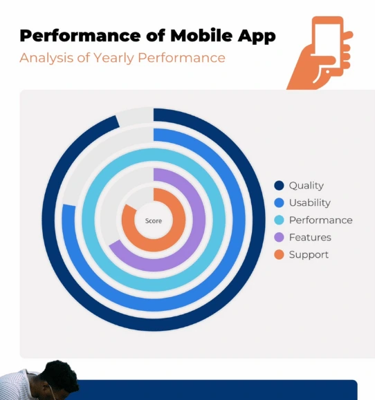
- Performance radial chart. Ideal for evaluating individual or team performance, this radial chart showcases key metrics and KPIs. It offers a comprehensive view of strengths and areas for improvement, aiding in performance assessments and strategic planning.
- Project management radial chart. Specifically tailored for project managers, this chart visualizes project timelines, milestones, and task dependencies in a circular format. It enhances project communication and helps in identifying potential bottlenecks.
- Financial radial chart. Suited for financial analysis, this chart displays financial data, budget allocations, and expenditure trends in a circular layout. It provides a clear overview of financial performance and aids in making informed budgetary decisions.
Risk assessment radial chart. Used in risk management, this chart visualizes potential risks and their impact on a project or business. It helps stakeholders prioritize risk mitigation strategies and make informed decisions to safeguard against uncertainties.
How do I create a radial chart?
Infogram's chart creator allows you to quickly make a radial chart in just 5 steps:
- Log in to Infogram.
- Select the radial chart type.
- Upload or paste your data.
- Customize the labels and adjust the design by changing the background, colors, and fonts.
- Download your radial chart, add it to your project, embed it on your website, or share it on social media.
Infogram is super easy to use and made with non-designers in mind. Even if you don't have any design experience, you'll be able to make radial charts in just a couple of steps.
Didn't find the answer? Check our FAQs

Try Infogram Now
Are you ready to unleash the power of data visualization? Get started with Infogram today and create stunning, interactive content that captivates your audience. Elevate your projects and bring data to life.