
Turn Government Data into Clear Visual Stories
Create interactive reports that make complex data easy to understand for policymakers, stakeholders, or citizens.


4.7 out of 5 stars


Overview
Why
Types
Examples
Reviews
Tips
FAQ
Improve Government Communication
Government institutions often grapple with a common challenge: how to convey complex information in a way that's easily understandable. Sharing data with citizens, stakeholders, and decision-makers can be daunting, especially when individuals have varying levels of familiarity with the subject matter. This is where Infogram steps in to offer a straightforward solution.
Infogram is your partner in enhancing government communication. Our tool empowers you to create engaging and accessible content that resonates with your audience. Whether it's crafting interactive content, creating visually appealing reports, building dynamic maps, or developing informative infographics, Infogram's user-friendly tools ensure that you can present your data without requiring advanced design skills. We're here to make your information not only accessible but also comprehensible to everyone.
By adhering to accessibility guidelines, we're committed to ensuring that your messages reach all individuals, regardless of their abilities. Our goal is to transform intricate data into clear narratives that make sense to everyone.
5 Reasons to Try Infogram Today
Discover how Infogram supports government professionals in presenting data clearly and effectively.

Engage Policymakers with Interactive Reports
Static charts often fail to hold attention. With Infogram’s clickable charts, tooltips, and animations, you can create engaging visuals like an interactive timeline showing program impacts. As a policy writer, you’ll keep council members focused as they explore details. Communication specialists and analysts can also craft dynamic reports that make complex data accessible and compelling for stakeholders.

Share Data on Government Platforms
Embedding visuals into websites or presentations is simple with Infogram - no coding needed. Whether you’re a policy advisor sharing a budget dashboard or a communications specialist adding a real-time map of infrastructure projects to your municipality’s website, Infogram’s responsive, auto-updating visuals look great everywhere.
Program coordinators and designers can also use this to share updates with the public or internal teams.

Reach All Citizens with Accessible Visuals
Creating inclusive visuals is critical for government work. Infogram meets Web Content Accessibility Guidelines, so your reports and infographics, whether designed by a communication specialist or a designer, are clear for all audiences, including those with disabilities. This ensures policy writers and analysts can share data that supports transparent, accessible public communication.

Build Visuals Fast for Tight Deadlines
Government work often comes with tight deadlines. Infogram’s templates and AI tools let you create professional visuals quickly, whether you’re a designer crafting a polished infographic or a communications specialist turning a spreadsheet into a public update in minutes. Policy advisors and analysts can also rely on these tools to meet urgent reporting needs efficiently.

Work Seamlessly with Your Tools
Importing data from spreadsheets or databases is effortless with Infogram, perfect for analysts building detailed reports or program coordinators tracking project metrics.
Real-time collaboration lets you work with policy writers, designers, or advisors to refine visuals together, ensuring a smooth fit into your government workflow. Embed visuals into platforms like WordPress for easy sharing.
Explore Most Loved Features

Image Background Removal
Remove unnecessary backgrounds from images with a simple click. Cut out objects, create photomontages, and more.

Chart Library
Choose from a diverse range of chart types in Infogram's extensive library. Customize colors and labels to present your data in a visually compelling way, making complex information easily understandable.

Map Library
Visualize geographic data effectively with Infogram's map library. Select from various map styles and formats to enhance the impact of your storytelling and showcase regional insights.

Data Import
Effortlessly import data from various sources into Infogram, ensuring accurate and up-to-date visualizations for your reports. Streamline your data management process and focus on analyzing insights.

Annotations and Callouts
Add explanatory text, highlights, and insights to your data visualizations with Infogram's annotation and callout features. Provide context and enhance audience understanding of your nonprofit's impact.

Real-Time Collaboration
Collaborate seamlessly with your team members, editors, and contributors in real-time. Share projects, leave comments, and track changes, facilitating efficient teamwork and content creation.

Auto-Aligning Content
Simplify the layout of your projects with Infogram's auto-align feature. With just a click, you can easily change the alignment of objects on your canvas, enabling you to create image galleries or dashboards with ease.

Project Embeds
Enhance your website or blog with interactive visualizations by seamlessly integrating them through Infogram's project embeds. Create an engaging and immersive experience for your audience.

Brand Kit
Ensure consistent branding across all your projects with Infogram's brand kit. Effortlessly upload and apply your nonprofit's logos, color schemes, and fonts to maintain a cohesive visual identity.

Content Engagement Analytics
Gain valuable insights into audience behavior and engagement with Infogram's comprehensive analytics. Refine your content strategy based on real-time feedback, ensuring maximum impact and resonance.
Get Inspired by Infogram User Created Projects
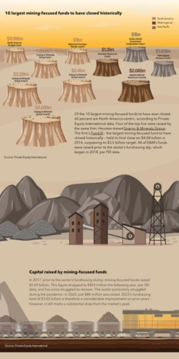
10 Largest Mining-Focused Funds to Have Closed Historically

FiveThirtyEight: Looking to November

Customer Survey Report

The Challenges of Remote Work

A snapshot of greater Portland's need for affordable homes

The Not Enough Impact Report 2018

General Data Protection Regulation

10 Wins You Made Happen
Customer Reviews
Here is what our customers have to say about us.
2022 Summer & Fall and 2023 Winter leader in Data Visualisation Software 4.7 out of 5 stars
See reviews on G2 ›Empowering 30,000+ Companies Worldwide
From startups to established enterprises, our platform has been embraced by a diverse range of businesses seeking to captivate audiences and simplify complex data. Here are just a few examples of the 30,000+ companies that use Infogram.


Learn More Practical Tips
Design
How to Create Accessible Charts and Graphs With Infogram
Design
Map Customization: 3 Essential Learnings to Bring Stories to Your Maps
Design
Good and Bad Data Visualization Examples
Marketing
5 Tips on Writing Online Articles That People Actually Want to Read
Marketing
Boost Engagement With Interactive Data Visualizations
Marketing
Data Storytelling: Ingredients to an Effective Data Story
Frequently Asked Questions
How does Infogram help government professionals present data?
Infogram offers charts, maps, and interactive features to simplify complex data. For example, a policy advisor can create an interactive budget chart for a council briefing, making trends clear and actionable with minimal effort.
Why are interactive visuals important for government work?
Interactive visuals let audiences explore data, like citizens clicking a map to see local stats. This boosts engagement, transparency, and understanding for stakeholders and the public.
How can my team create interactive visuals with Infogram?
Pick a template or start fresh, add charts or maps, and customize with interactive elements like tooltips. Use AI to speed things up and add your branding. No design skills are needed.
Can my government team collaborate using Infogram?
Yes, Infogram supports real-time collaboration. Your team can share projects, give feedback, and build visuals together, whether for internal dashboards or public reports.
How does Infogram improve government data presentation?
With 35+ chart types, 800+ maps, and AI-powered tools, Infogram helps you create engaging, accessible visuals. Turn complex data into clear stories for briefings, websites, or public updates.
What are content engagement analytics, and why do they matter?
Analytics track how audiences interact with your visuals - clicks, views, shares. For example, a communications specialist can see which parts of a health infographic get attention, refining it for better public impact.
Didn't find the answer? Check our FAQs

Try Infogram Now!
Are you ready to unleash the power of data visualization? Get started with Infogram today and create stunning, interactive content that captivates your audience. Elevate your projects and bring data to life.