
Create Interactive Charts with AI Generator
Turn your data into interactive charts in a few clicks with Infogram's AI chart generator.


4.7 out of 5 stars


Overview
Why
Types
Examples
Reviews
Tips
FAQ
Make Better Decisions
Creating charts can take time and effort, especially when trying to find insights in your data. From choosing the right design to presenting data clearly, users often struggle to make their visuals both engaging and accurate. Infogram's AI chart generator helps solve these problems by making the entire chart-making process easier.
The AI chart maker lets you create professional-quality charts quickly and easily, without needing design skills. Whether you're a writer, journalist, analyst, or teacher, it helps you turn data into visually appealing charts in just a few clicks. By simplifying the process, it saves you time and helps to discover key insights that might otherwise go unnoticed.
What makes Infogram’s AI chart generator stand out is its ability to analyze your data and recommend the best chart types, layouts, and even colors. It’s not just about making the charts look good — it’s about helping you make better decisions with your data, no matter your industry or skill level.
Want to improve your data visualizations? Try the AI-powered chart creator today and see how it can make your work faster and more effective! Learn more about this feature here.
Explore Why AI Chart Generator Matter
Learn about the benefits of using an AI chart generator.
Save Time
With an AI chart generator, you can create interactive, visually captivating charts in a fraction of the time it would take to do manually. All you need to do is paste your data or type in a topic, and the AI instantly generates a fully customized chart for you.
Unsure which chart type best suits your data? The AI analyzes your information and suggests the most effective options, making sure your visuals communicate your data clearly and impactfully. By saving time on chart design, you can focus on interpreting your data and delivering your message.
Simplify Reporting Process
No more wasting hours manually designing charts or searching for the right template. The AI chart creator quickly analyzes your data and generates an initial chart in just minutes.
This streamlined process means less time spent creating reports and more time spent uncovering insights and making important decisions. By automating the design, you can focus on what truly matters - telling the story behind your data with clarity and confidence.
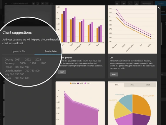
Get Personalized Chart Suggestions
Forget the guesswork - simply upload your data, and the AI chart suggestion feature immediately recommends the most suitable chart types. Whether you’re unsure if a bar chart or a pie chart is best, the AI will analyze your data and suggest the perfect visualization to get your message across.
You’ll be able to explore various chart options, ensuring your data stands out. For instance, what might seem like a simple bar chart could be transformed into something more insightful, like a spider chart, revealing patterns you may have missed.
Uncover Hidden Insights
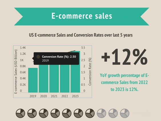
AI chart generator helps you transform complex datasets into clear, engaging visuals within minutes. Discover hidden trends - such as a decade of fluctuating housing prices - and turn them into interactive charts that allow viewers to explore the data in detail.
These dynamic visuals breathe life into your reports, encouraging deeper audience engagement. No matter your profession, you'll benefit from the ability to create charts that captivate and inform.
User-Friendly Interface
Don’t worry about technical expertise - the AI is designed with simplicity in mind. Its user-friendly interface makes it easy for anyone, even with little to no design experience, to create professional-looking charts.
The intuitive controls ensure that you can produce stunning results with just a few clicks. Whether you're a beginner or an experienced designer, you’ll find the process smooth, fast, and enjoyable.
AI Chart Types to Explore
Line Chart
Shows trends over time using an x and y-axis.

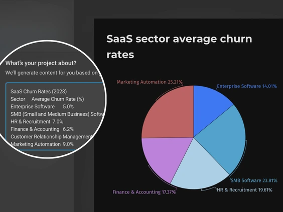
Pie Chart
Displays percentages, with all slices totaling 100%, showing parts of a whole.
Area Chart
Highlights trends over time, shading the area below the line to show volume.

Pictorial Chart
Uses icons or pictures to visually represent data in an engaging way.
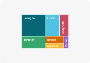
Treemap
Shows hierarchical data as rectangles, with size and color reflecting value.
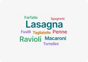
Word Cloud
Visualizes word frequency, showing which terms appear most often.
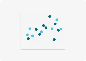
Scatter Chart
Plots data points on x and y-axes, showing relationships between variables.

Bubble Chart
Uses bubble sizes to represent numeric values on an x and y-axis.
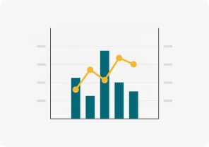
Dual Axis Chart (line and column)
Compares two sets of data with different scales using two axes.

Gantt Chart
Tracks tasks over time with horizontal bars, visualizing project timelines.
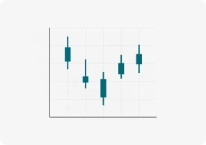
Candlestick Chart
Shows stock price movements, displaying open, close, high, and low prices.
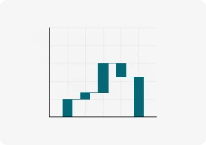
Waterfall Chart
Tracks how positive and negative changes affect a value step by step.

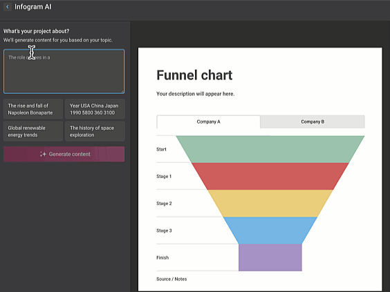
Funnel Chart
Shows data narrowing through stages until the final result at the bottom.
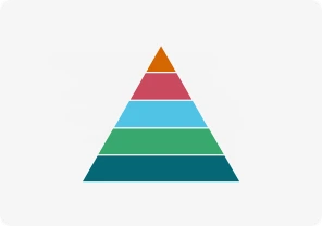
Pyramid Chart
Displays hierarchical data in a triangle-shaped chart with different section sizes.

Radial Chart
Compares categories using circular bars in a polar system.
Column Chart
Uses vertical bars to compare data over time or across categories.

Bar Graphs
Uses rectangular bars to compare values across different groups.
Race Bar Chart
Shows bars moving over time, visualizing rapidly changing data.

Population Pyramid
Shows age and gender distribution using back-to-back bar graphs.

Tornado Diagram
Compares variables' impact on outcomes with horizontal bars.

Sunburst Chart
Displays hierarchical data using concentric rings to represent levels.

Radar/Spider Chart
Compares categories across axes radiating from a central point.

Sankey Diagram
Shows data flow between stages using arrows of varying thickness.

Alluvial Chart
Tracks changes in data categories over time using flowing streams.
Get Inspired by Infogram User-Created Projects
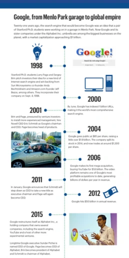
Google, From Menlo Park Garage to Global Empire

Health to the Plants

How Medicaid Helps Your State

Property’s Loftiest Managers
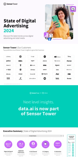
State of Digital Advertising

The Not Enough Impact Report 2018

The Scope and Impact of Free-Roaming Dogs and Cats

TX Operation Lone Star
Customer Reviews
Here is what our customers have to say about us.
2022 Summer & Fall and 2023 Winter leader in Data Visualisation Software 4.7 out of 5 stars
See reviews on G2 ›Empowering 30,000+ Companies Worldwide
From startups to established enterprises, our platform has been embraced by a diverse range of businesses seeking to captivate audiences and simplify complex data. Here are just a few examples of the 30,000+ companies that use Infogram.


Learn More Practical Tips
Design
AI for Charts: Get AI-Powered Suggestions for the Best Chart Type
Design
AI Infographic Generator: Fast, Easy, and Powerful
Marketing
Boost Engagement With Interactive Data Visualizations
Marketing
How to Write an AI Prompt: Pro Tips to Unlock AI Potential
Media
Your Guide to Interactive Electoral Maps
Media
Sports Reporting: 5 Engaging Ways to Report on Sports Events
Frequently Asked Questions
What is Infogram’s AI chart generator?
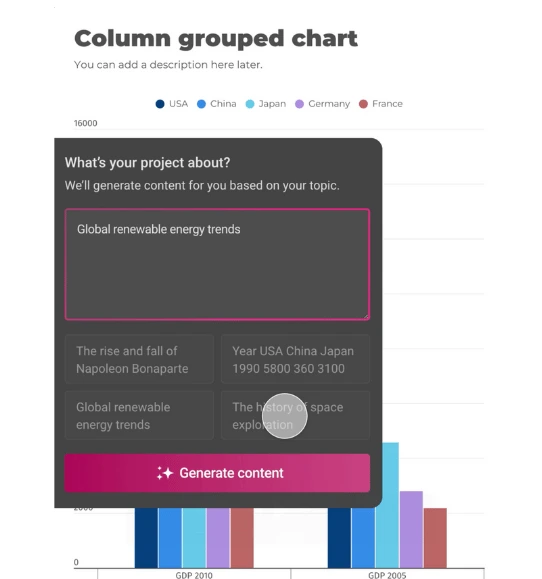
Infogram’s AI chart generator is a tool designed to help you create interactive and visually appealing charts quickly and effortlessly. By either pasting your data into the AI chart generator or typing in a topic, the AI will populate a chart tailored to your needs. If you're unsure which chart type to use, you can use the AI chart suggestions feature that recommends the most suitable options based on your data. You can access the AI chart suggestions feature once you're in the editor.
How do I use AI to create a chart with Infogram?
To use the AI chart maker for creating a chart, follow these steps:
- Log In: Sign in to your Infogram account.
- Enter Data: Paste your data or describe your topic in the AI prompt.
- Generate Chart: The AI chart generator will produce a draft chart based on your input.
- Customize: Use Infogram’s editor to refine and personalize the chart to meet your needs.
Where can I find the AI chart generator and AI chart suggester in Infogram?
After logging in, you can locate the AI chart generator on the templates page. Look for the “Create with AI” option on your dashboard to access the AI chart generator. However, the AI chart suggestion feature you can find in the editor itself. Simply start from a blank page or a template, then click to the chart icon on your left side and locate the AI chart suggestion feature there.
Can AI help me choose the best chart type for my data?
Absolutely! Infogram’s AI chart generator can suggest the most effective chart types for your data. Simply upload your data, and the AI will recommend the best chart options, ensuring your data is presented in the most impactful way.
How does AI speed up the chart creation process?
AI significantly accelerates the chart creation process by quickly analyzing your data and producing a draft chart in minutes. This efficiency eliminates the need for manual chart design and also includes suggestions for the best chart types based on your data.
In what ways can AI generated charts be useful for my work or studies?
Charts created with AI help offer numerous benefits across various fields:
- Content Writers & Journalists: Quickly generate charts to enhance data-driven articles.
- Analysts & Consultants: Transform complex datasets into clear, engaging visuals for presentations.
- Teachers & Students: Create compelling educational materials and presentations.
- Marketers & Salespeople: Visualize market trends and sales figures for more informed decision-making.
Is my data secure when using Infogram’s AI features?
Yes, your data remains secure with Infogram. The AI chart generator processes only a small portion of your data to provide chart recommendations, ensuring that the majority of your data stays private and protected.
How can AI help with creating charts for different types of data?
The AI chart generator is versatile and can handle various data types:
- Textual Data: Suggests visualizations like word clouds for text-heavy content.
- Quantitative Data: Recommends charts such as bar or line graphs for numerical data.
- Complex Datasets: Analyzes data to suggest charts that highlight key trends and insights.
Can I customize the charts after the AI generates them?
Definitely! Once the AI chart generator has created a chart, you can use Infogram’s intuitive editor to adjust colors, layouts, and content to better suit your needs and preferences. Furthermore, you can access the AI chart suggestion feature in the editor and ask for other chart type recommendations based on your data set.
Didn't find the answer? Check our FAQs

Try Infogram Now
Are you ready to unleash the power of data visualization? Get started with Infogram today and create stunning, interactive content that captivates your audience. Elevate your projects and bring data to life.